
@storylite/storylite
v0.15.1
Published
A lightweight alternative to StoryBook, built on top of Vite⚡️. This package contains the React app.
Downloads
2,588

Readme
StoryLite

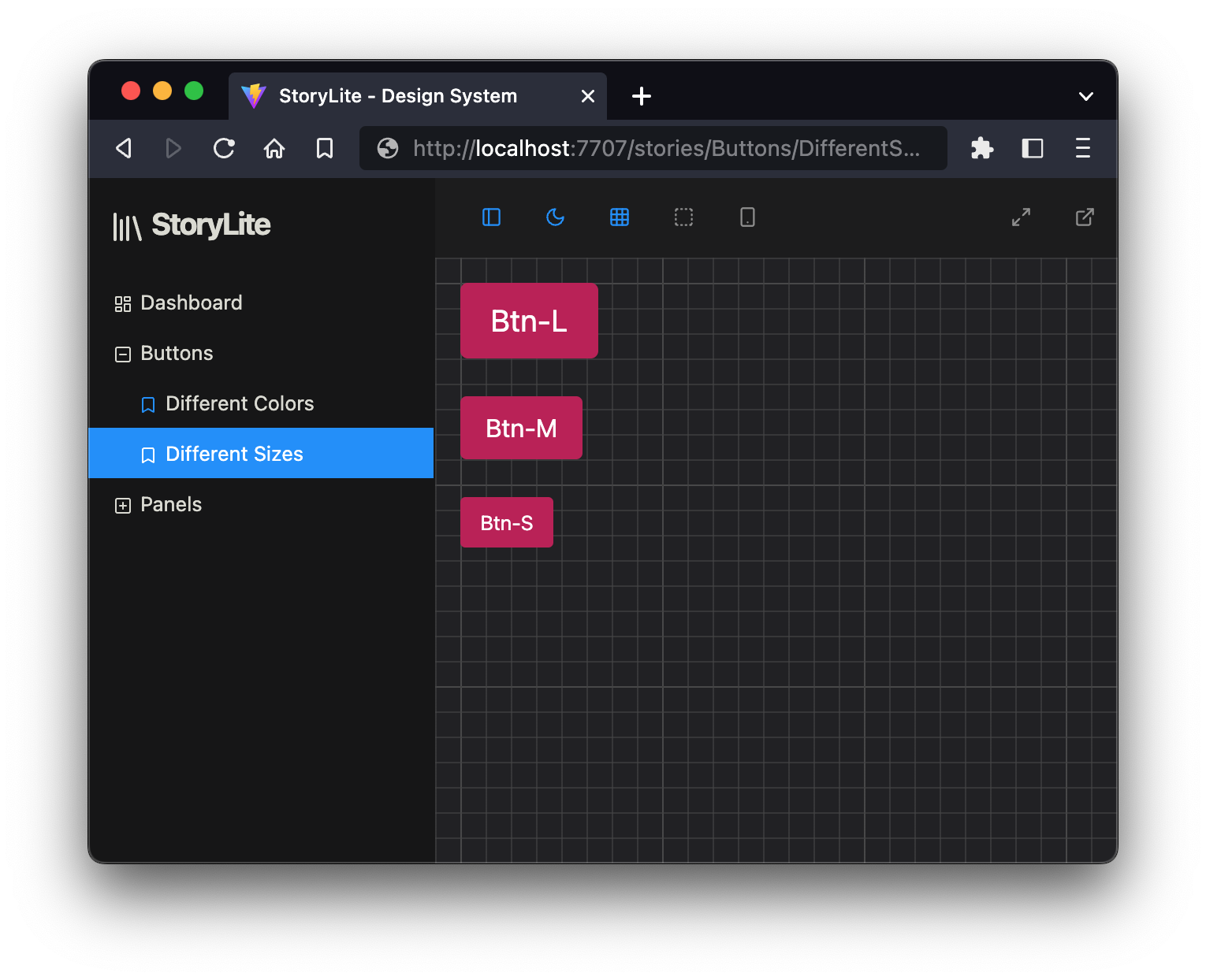
StoryLite is a modern and lightweight toolkit for crafting and managing design systems and components with ease. Inspired by the popular StoryBook UI and powered by Vite⚡️, StoryLite offers a streamlined and familiar developer experience, thanks to the story format compatible with Component Story Format (CSF) 3.0.
With StoryLite, you can quickly create, test, and refine UI components in isolation, ensuring that your application maintains a consistent look and feel.
Tailored for smaller projects that crave simplicity without the overhead of a full StoryBook setup, StoryLite provides an intuitive UI that's customizable to your unique needs.
Features
- Lightweight (36 KB minified, 10KB minified + gzipped), with few dependencies, specially tailored for Single-Page Apps.
- Mobile-friendly UI
- Full control: You decide where to mount the StoryLite React app and how to run it with plain Vite. No custom servers or other uncontrolled moving parts.
- Fully customizable: UI styles, iframe styles, addons, etc.
- Fully isolated: The canvas iframe lands with no styles by default. You control what styles to load.
- Interoperable with StoryBook's CSF 3.0 format: With some minimal changes, you can almost instantly make your StoryBook stories work with StoryLite when they follow the Component Story Format.
- Render modes via
renderFrame: You can decide wether to render your story inside the iframe (iframe), or outside in the same DOM tree as the UI (root). This is useful, e.g. for search engines to be able to index the content. - Built-in Addons with the basics: dark mode, mobile view, grid, outline, maximize, open in new tab, etc.
- HMR (Hot Module Reload) support when story files (or any module they use) change.
- SSG (Static Site Generation) support thanks to Vite.
- Markdown and MDX support via Vite plugins.
Installation
To install StoryLite, simply run one of the following commands in the project where you want to define the stories:
# Using npm
npm install -D @storylite/storylite vite @storylite/vite-plugin

# Using yarn
yarn add -D @storylite/storylite vite @storylite/vite-plugin

# Using pnpm
pnpm add -D @storylite/storylite vite @storylite/vite-plugin
For the next steps, please check the example React directory to learn how to integrate it in your project.
While all examples here show how to integrate it with Vite, StoryLite can be used with any bundler since it is a client-side React app that can be mounted anywhere in your project.
Adding MDX support
Check the docs package to see how to add MDX support to your project:
With this setup you can:
- Import modules from JS and JSX files.
- Define the default story metadata in the MDX's frontmatter block. The body of the MDX will be used as the default story component.
- You can import other MD/MDX files in your stories, they will be ready to be used as JSX components.
- You can export JSX components to define new story variants.
You currently can't:
- You cannot import TS/TSX files in your MDXs. This is a limitation of Vite's MDX plugin.
- You currently cannot export Story objects, instead you can only export JSX components.
Current Focus and Future
While StoryLite is geared towards React components at the moment, the potential exists for broader compatibility with other frameworks supported by Vite. We're continuously enhancing the tool and looking to:
- Better story interoperability with StoryBook.
- Better extensibility and configuration options.
- Expand addons to support multiple resizable viewports, and tools for zoom, accessibility, etc.
- Extend examples to frameworks like Vue, Svelte, Solid, and Qwik.
- Ability to generate code snippets for each story.
- Ability to edit component props and state in the UI.
- Improve documentation and mobile experience of the UI.
- Full test coverage.
Contributing
Contributions are encouraged; Please check out our contributing guidelines before submitting a PR.
License
Acknowledgements
Inspired by:
Built with: