@sreyaj/ng-star-rating
v2.0.0
Published
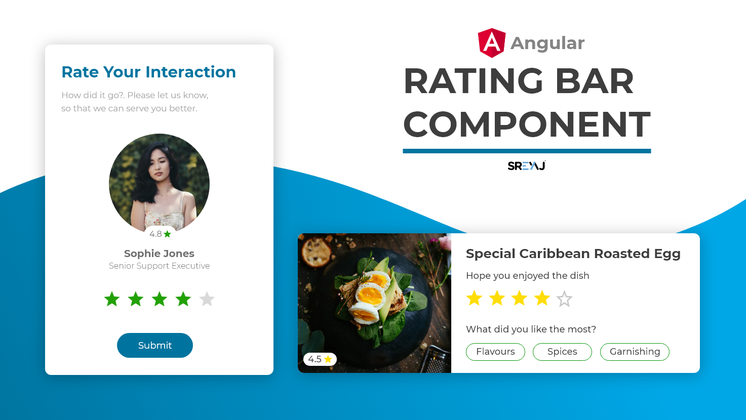
A Simple and Customizable SVG based Star Rating Component For Angular
Downloads
123
Maintainers
Readme
SVG Based Angular Star Rating Component
Simple Rating Component for your next Angular Project. Very simple to setup and use and comes with a lot of customizations.

Features
- Simple and Easy to Setup
- Ease to use
- SVG based super light
- Material Spec Icons for Standard Feel
- Zero Dependencies
- Supports half-star rating
- Supports Rating Mode and also Display only Mode
How to Use the Component
Install the package using the command:
npm i @sreyaj/ng-star-ratingImport the StarRatingModule into your module
import { StarRatingModule } from '@sreyaj/ng-star-rating';
@NgModule({
  ...
  imports: [StarRatingModule],
  ...
})
export class AppModule {}
Now you can use the component inside your application
<ngx-star-rating></ngx-star-rating>You can now customize it with the following attributes
Eg with few options:
<ngx-star-rating [total]="5" [filledColor]="'#ff0000'"></ngx-star-rating>Customizations
| Feature | Description | Attribute | Type | Default | | ------------- | ------------------------------------------------------------ | ----------- | ---------------- | ------- | | No of Stars | You can change the total rating number | total | number | 5 | | Display Mode | Star Rating component can be used to just display the rating | readonly | boolean | false | | Type of Stars | The component supports filled stars and hollow stars design | type | filled or hollow | hollow | | Rating Color | The color for the filled Stars | filledColor | string | #3db700 | | Rating Color | The color for the empty Stars | emptyColor | string | #e0e0e0 | | Rating Event | Rating Emitted when user clicks on the rating | rated | number | nil |
Feel free to open Issues and Pull Requests
