@sreyaj/ng-shimmer
v2.0.0
Published
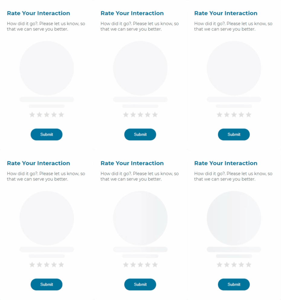
Shimmer Placeholder for Angular Applications. Improve the User Experience on your application by using shimmer placeholders which was made popular by Facebook
Downloads
1,449
Maintainers
Readme
Shimmer Animation for Angular Applications

Simple and easy to user Shimmer Animation placeholder for your Angular applications. An application should be having a good User Experience inorder to succeed. Smaller things like adding a shimmer animation to let the users know that something is being loaded is a great way to improve the application's UX.


Features
- Simple and Easy to Setup
- Ease to use
- CSS based super light
- Zero Dependencies
- Customizable
How to Use the Component
Install the package using the command:
npm i @sreyaj/ng-shimmerImport the StarRatingModule into your module
import { ShimmerModule } from '@sreyaj/ng-shimmer';
@NgModule({
  ...
  imports: [ShimmerModule],
  ...
})
export class AppModule {}
Now you can use the component inside your application
<shimmer></shimmer>You can now customize it with the following attributes
Eg with few options:
<shimmer width="100px" type="circle"></shimmer>
<shimmer width="100px" borderRadius="2px"></shimmer>
Global Configuration
You can now configure the colors and animation durations for the whole application using the Injection token.
Default Options applied:
{
  width: '100%',
  height: '16px',
  borderRadius: '8px',
  colors: {
    background: '#edeef1',
    1: '#edeef1',
    2: '#f6f7f8',
    3: '#f4f4f4',
    4: '#edeef1',
  },
  duration: '1s',
}
Override defaults
You can override the defaults like so:
@NgModule({
  declarations: [],
  imports: [BrowserModule, ShimmerModule],
  providers: [
    {
      provide: SHIMMER_OPTIONS, // <-- provide the token
      useValue: {
        width: '100%',
        height: '24px',
        borderRadius: '8px',
        colors: {
          background: 'red',
          1: '#edeef1',
          2: '#f6f7f8',
          3: '#f4f4f4',
          4: '#edeef1',
        },
        duration: '4s',
      },
    },
  ],
  bootstrap: [AppComponent],
})
export class AppModule {}
Customizations
| Feature | Description | Attribute | Type | Default | | --------------------- | ------------------------------------------------------------------- | ------------ | ------------------------------ | ------- | | Type Of Shimmer | You can change the appearance of the shimmer | type | 'line' or 'circle' or 'square' | 'line | | Width of the Shimmer | Shimmer width can be customized according to your need | width | string | '100%' | | Height of the Shimmer | Shimmer height can be customized according to your need | height | string | '12px' | | Animation Duration | Shimmer animation duration can be customized according to your need | duration | string | '1s' | | Border Radius | Custom border radius values can be specified | borderRadius | string | - | | Rounded | Shimmer corners can be rounded of for 'line' or 'square' type | rounded | boolean | false |
Breaking Changes
- In v2, the extra div that is added by
shimmercomponent is removed. Instead the styles are applied to the host directly
Feel free to open Issues and Pull Requests
