@snappywc/calendar
v1.0.6
Published
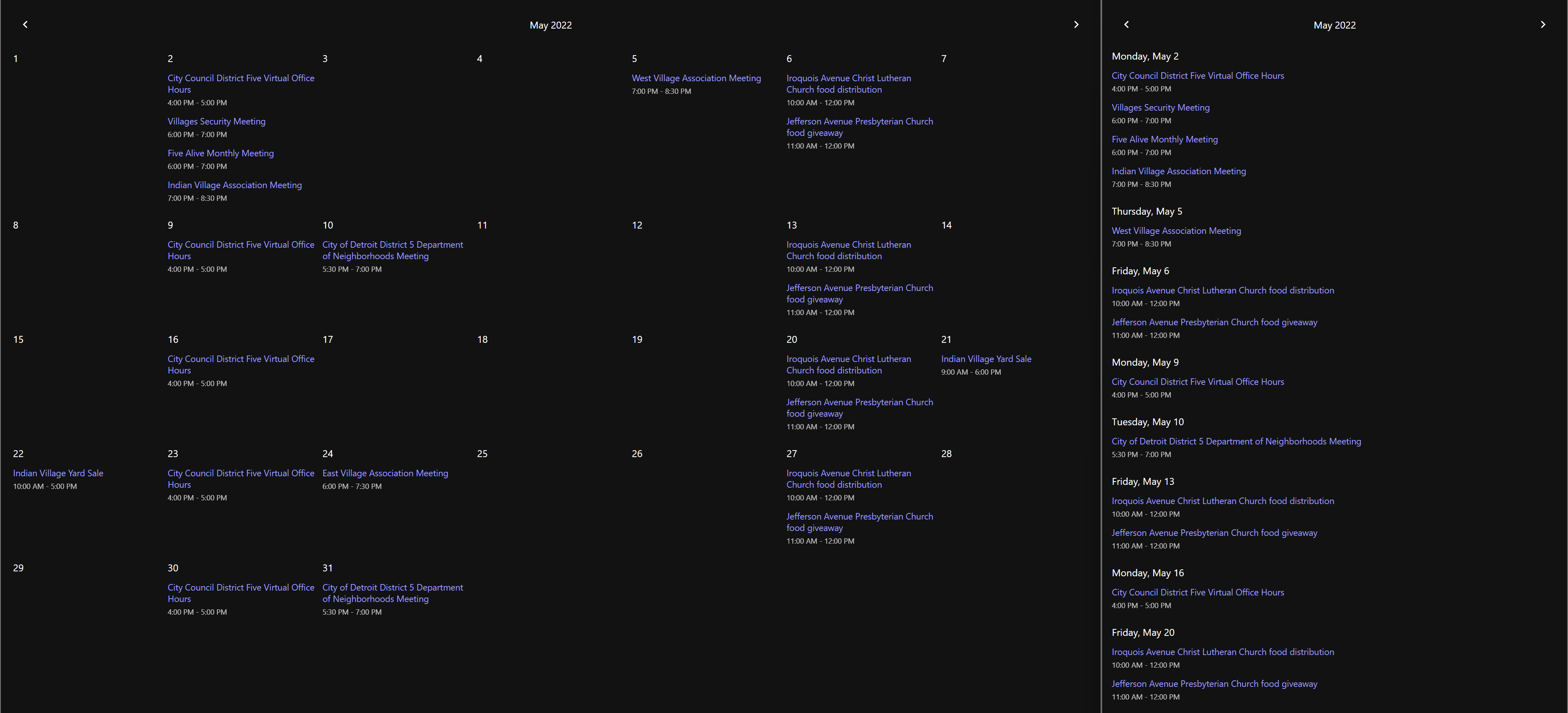
A Google Calendar element that's easy to use and customize. 1kb (brotli)
Downloads
24
Maintainers
Readme
<snappy-calendar>
A Google Calendar element that's easy to use and customize. 1.7kb (brotli).

Why Make Another Calendar Element?
I was using @fullcalendar for a site and I got frustrated with customization options and package size. Instead of scouring the internet for something better, I though it would be fun to make my own and see how minimal I can make it.
Features
- Supports list and grid views for the selected month.
- Responsive by default, but list or grid format can be forced.
- Full localization support, including prev/next aria labels.
- Detects user locale by default, but locale can be manually specified.
- Minimal styling using CSS Grid, with many
partselectors available. - Customizable controls using slots.
Installation
Option 1: As a package.
npm i @snappywc/calendarimport '@snappywc/calendar'Option 2: In your markup.
<script type="module">
  import '//unpkg.com/@snappywc/calendar'
</script>
Usage
<snappy-calendar
  calendar="your google calendar id"
  key="your google calendar api key"
  format="accepts 'grid' or 'list' (defaults to responsive)"
  locale="any locale string ('en', 'fr', etc, defaults to navigator.language)"
  prev-aria-label="any string (defaults to 'show previous month')"
  next-aria-label="any string (defaults to 'show next month')"
></snappy-calendar>
Does it get any easier than that? If your answer is yes, open an issue or make a pull request!
Calendar Methods
The following methods can be used to control the calendar. The calendar will also reinitialize when the calendar, key or locale attributes are modified.
| Method | Description | | ----------------------- | ------------------------- | | .prev() | go to the previous month | | .next() | go to the next month | | .goToMonth(year, month) | go to the specified month |
Customization
The default styles, part selectors and slots for this element were carefully considered to be as minimal and un-opinionated as possible.
Slots
Two slots, prev and next, are provided to customize the icons, text, or other content inside the prev/next buttons.
Parts
The following parts are available, and should be fairly self-explanatory.
- header
- prev
- date
- next
- grid
- day
- event
- event-name
- event-time
Example Use (SCSS)
snappy-carousel {
  &::part(header) {
    background: #eee;
  }
  &[format='list'] {
    &::part(day) {
      margin-bottom: 1rem;
    }
    &::part(event-name) {
      color: #222;
    }
  }
}