
@samdy-chan/vue3-goto-top-or-bottom
v1.0.1
Published
This vue3 custom component is independently developed by the author Samdy_Chan. The main function of this component is to automatically display/hide the [Scroll to Top/Bottom] icon according to whether the parent container has a vertical scroll bar. Click
Downloads
1
Maintainers
 samdy_chan
Readme
@samdy-chan/vue3-goto-top-or-bottom
点击 <README_zh-CN.md> 查看简体中文版使用说明。
Preview image of the usage effect of this component
GIF dynamic effect image when using this component:
Functional Description
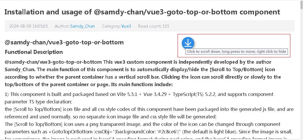
@samdy-chan/vue3-goto-top-or-bottom This vue3 custom component is independently developed by the author Samdy_Chan. The main function of this component is to automatically display/hide the [Scroll to Top/Bottom] icon according to whether the parent container has a vertical scroll bar. Clicking the icon can scroll directly or slowly to the top/bottom of the parent container or page. Its main functions include the following:
- This component is built and packaged based on Vite 5.3.1 + Vue 3.4.29 + TypeScript(TS) 5.2.2, and supports component property TS type declaration; the [Scroll to Top/Bottom] icon file and all css style codes of this component have been packaged into the generated js file, and are referenced and used normally, so no separate icon image file and css style file will be generated; The [Scroll to Top/Bottom] icon uses a png transparent image, and the color of the icon can be changed through component properties such as
<GotoTopOrBottom :cssObj="{backgroundColor: '#2c8ce6'}" />(the default is light blue). Since the image is small, for convenience, the image is packaged in base64 encoding format during packaging, and the base64 encoding format image is directly referenced in the packaged js file;
If the content of the parent container (HTML parent tag element) of this component exceeds the height of the parent container (the parent container CSS property height or max-height needs to be set), and a vertical scroll bar appears (the parent container CSS property "overflow: auto;" or "overflow-y: auto;" needs to be set), the arrow icon of this component (scroll to top/bottom) will be automatically displayed. Click the icon to scroll directly or slowly to the top/bottom of the parent container or page;
This component will automatically determine that if the scroll bar has scrolled to the top of the parent container (including manually dragging the scroll bar to the top, or clicking the [Scroll to Top] icon of this component to scroll to the top), the [Scroll to Top] icon will be hidden and only the [Scroll to Bottom] icon will be displayed. Vice versa, when scrolling to the bottom, only the [Scroll to Top] icon will be displayed;
The [Scroll to Top/Bottom] icon of this component can be dragged and moved freely within the parent container (when the default parentIsWindow property or value is false) or page (when the parentIsWindow property value is true) to facilitate reading the content of the parent container. Press and hold the icon with the left mouse button for 0.5 seconds to drag and move the icon;
Right-click the [Scroll to Top/Bottom] icon of this component and click the [Hide] menu item in the pop-up shortcut menu to temporarily hide the [Scroll to Top/Bottom] icon of this component during this browsing, so as to facilitate reading the contents of the parent container;
When using this component, you can set whether to enable the slow scrolling animation animateObj.enable (default true, enabled) and the scrolling duration animateObj.duration (default 300 milliseconds, it is recommended to keep this default value. If it is not set properly, it may cause scrolling to be stuck and not smooth). How to use it, for example:
<GotoTopOrBottom :animateObj="{enable:true, duration: 300}" />By default, it is not set. By default, the scrolling effect is turned on and the scrolling duration is 300 milliseconds.
Installation
a)、For npm:
npm install @samdy-chan/vue3-goto-top-or-bottom --save
b)、For yarn:
yarn add @samdy-chan/vue3-goto-top-or-bottom
c)、For pnpm:
pnpm add @samdy-chan/vue3-goto-top-or-bottom --save
Usage
Method 1: Register this component globally
Register this component globally in main.js / main.ts, so that you can directly use this component tag in all other components and .vue pages without importing it. The global registration code is as follows:
// main.js or main.ts

import { createApp } from 'vue';

import App from './App.vue';

// 1、Import this component (must use default import method)

import GotoTopOrBottom from '@samdy-chan/vue3-goto-top-or-bottom';

// Create a Vue app instance based on the App. Vue component

const app = createApp(App);

// 2、Global registration of this component

app.use(GotoTopOrBottom);

// Mount Vue app instance to DOM node with id 'app'

app.mount('#app');
Method 2: Import and register this component as needed (including the Props property description of the component)
For more detailed instructions on using the components Props and Events, please refer to the Props&Events Instructions section
Import this component into every Vue file that requires its use (Must be imported separately this component), as follows:
// 1、Import this component
<script setup lang="ts">
// Must use separate import method (if globally registered in main.js or main.ts, default import method must be used)
import { GotoTopOrBottom } from '@samdy-chan/vue3-goto-top-or-bottom';
/**** Component properties and supported custom event settings ****/
/** This component currently supports configuring and passing two optional custom events, namely: @ topFinished and @ bottomFinished. The explanation is as follows:
@topFinished: Click on the [Scroll to Top] icon or scroll bar to after scroll to the top then call the custom event callback function;
@bottomFinished: Click on the [Scroll to bottom] icon or scroll bar to after scroll to the bottom then call the custom event callback function;
**/
/** This component currently supports configuring and passing 7 Props properties, namely: timeout, parentIsWindow, showIconTips, showWhichIcon, scrollDistance, cssObj, animateObj, Among them, cssObj and animateObj are object type configuration properties,The effect and descriptions of these properties are as follows (see also the TS type declaration file<<goto-top-or-bottom. vue. d.ts>>for details). If you are using this component in the Vite+TS environment, after importing this component, holding down Ctrl+left clicking on the component name will automatically pop up the type declaration or jump to the type declaration file)
**/
// Property 1 (timeout): An optional property that delays the display of the component's scroll icon when loading or refreshing the page. The default value is 2000 milliseconds (2 seconds). Because the content of the parent container may be obtained asynchronously (such as reading files or requesting backend API interfaces), at the beginning, the parent container does not have any content and there will be no scrollbar. The scrollbar will only appear when the asynchronous data is filled into the parent container and exceeds its allowed height. At this point, it is determined that a scroll icon needs to be displayed. The delay property can be adjusted according to your system and network conditions, in milliseconds. Generally, the default value of 2000 milliseconds should be sufficient.
const timeout = 2000;
// Property 2 (parentIsWindow): Optional property, whether the parent container is a top-level element (window/document/body), default value is false,Placing this component in which HTML tag container means using this component to control the scrolling of which HTML tag container (parent container).
const parentIsWindow = false;
/** If you need to add this scroll icon component to a block level parent container (such as div/main/section/article/side/display: block, etc.), simply place this component in the first level child of the parent container, as follows:
<div class="parent-container">
......
<GotoTopOrBottom />
</div>
**/
/** If you need to control the scrolling of top-level objects (window/document/body) with this scroll icon component, that is, to display and use this component when scrolling the scrollbar of the entire page window, you can place this component in any HTML tag on the page, but you need to specify the parentIsWindow property or set it to true, as follows:
......
<GotoTopOrBottom :parentIsWindow="true" />
**/
// Property 3(showIconTips):Optional property, whether to display the prompt content of the tag title attribute when the mouse is placed on the [Return to Top/Bottom] icon, default value is true.
const showIconTips = true;
// Property 4 (showWhichIcon): Optional property, which scroll icon to display based on the current scrolling situation:
// 'both':Display [Scroll to Top/Bottom] two icons (default),
// 'top':Only display the [Scroll to Top] icon,
// 'bottom':Only display the [Scroll to Bottom] icon.
const showWhichIcon = 'both';
// Property 5 (scrollDistance): Optional property, how much distance to scroll before displaying the [Scroll to Top/Bottom] icon, default value 1.
const scrollDistance: 1;
// Property 6 (cssObj): Optional property, object for setting CSS style properties for components. The following are default values. If this property is not passed, the default values will be used for each attribute.
// If you only want to modify certain CSS properties, you only need to set the properties that need to be modified, such as:
// <GotoTopOrBottom :cssObj="{width: '30px', height: '30px'}" />
// The default values for the properties of the cssObj style setting object are as follows:
const cssObj = {
// The distance between the scroll icon of this component and the top of the parent container or page is 50% by default. Top: '50%'+translateY: '-50%' is vertically centered.
top: '50%',
// The distance between the scroll icon of this component and the right margin of the parent container or the page is 30px by default.
right: '30px',
// This component's scroll icon moves up by half of its own distance (-50%, default).
translateY: '-50%',
// The distance from the top of the [Scroll to bottom] icon to the bottom of the [Scroll to top] icon is 10px by default.
marginTop: '10px',
// The width and height of the scroll icon in this component are set to 40px by default.
width: '40px',
height: '40px',
// The curvature setting of the four corners of the scroll icon in this component, with a value of 50%, is a regular circle, and the default value is 50%.
borderRadius: '50%',
// The color of the scroll icon in this component defaults to #2c8ce6.
backgroundColor: '#2c8ce6',
// The transparency setting of the scroll icon in this component is set to 0.6 by default.
opacity: '.6',
// The spacing value retained when dragging the scroll icon to the top, bottom, left, and right boundaries, with a default value of 0px.
sideMargin: '0px'
}
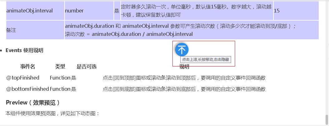
// Property 7 (animateObj): Optional property, component scrolling animation effect property setting, the following are default values. If this property is not passed, the following default values will be used:
const animateObj = {
// Whether to enable scrolling animation, if not enabled, immediately scroll to the top/bottom at once, default to enable true.
enable: true,
// The animation duration is in milliseconds, with a default value of 300 milliseconds. The animation needs to be turned on for it to take effect(animateObj.enable=true). The larger the number, the slower the scrolling. It is recommended to keep the default value.
duration: 300,
// The timer controls how often to scroll, in milliseconds. The default value is 15 milliseconds, and the animation needs to be turned on for it to take effect(animateObj.enable=true). The larger the number, the more unsmoothly the scrolling. It is recommended to keep the default value.
interval: 15
}
// Explanation: The animateObj. duration and animateObj. interval properties can generate the number of scrolls (how many times do you need to scroll to the top/bottom).
// number of scrolls = animateObj.duration / animateObj.interval
</script>// 2、Use this component
// 2.1、Use this component in the parent container of block boxes such as div (to control the scrolling of block parent containers such as div)
<template>
<div class="parent-container">
<!-- Usage 1: Basic use, no need to pass any properties, using default values is generally sufficient, this component must be placed in the parent container tag first level hierarchy.
-->
<GotoTopOrBottom />
<!-- Usage 2: Pass the specified properties set as above. -->
<!--
<GotoTopOrBottom
:timeout="2000"
:parentIsWindow="false"
:showIconTips="true"
showWhichIcon="both"
:scrollDistance="1"
:cssObj="cssObj"
:animateObj="animateObj" />
-->
<!-- Usage 3: Passing non default values of setting properties. -->
<!--
<GotoTopOrBottom
:timeout="1500"
showWhichIcon="top"
:scrollDistance="50"
:cssObj="{width: '30px', height: '30px', backgroundColor: '#00ff00'}"
:animateObj="{duration: 500}" />
-->
</div>
</template>
// 2.2、Use this component in the top-level parent container of window/document/body (to control the scrolling of the top-level parent container).
<template>
<!-- It is necessary to specify the parentIsWindow property or set it to a boolean value of true. Other property settings are as described in section 2.1 above.
When using window/document/body as the parent container, this component can be placed inside any HTML tag.
-->
<GotoTopOrBottom :parentIsWindow="true" />
</template>Props & Events Usage Instructions
Props usage instructions
Events usage instructions
Preview image of the usage effect of this component
GIF dynamic images when using this component (The image may appear blurry after compression):
- The component will be based on the language used by the current browser, if it is a Chinese environment, the Chinese prompt is displayed, otherwise the English prompt is displayed, as shown in the following images:
Versions history:
From v1.0.0 to v1.0.1, the changes and improvements in v1.0.1 version are as follows:
1.1、Optimized the component code;
1.2、We have made changes and improvements to the instruction documents <README.md> and <README_zh-CN. md>;