
@rodrigodagostino/svelte-sortable-list
v0.10.10
Published
A package to create accessible sortable lists in Svelte.
Downloads
814

Readme
Svelte Sortable List
A package to create accessible sortable lists in Svelte.


Live demo:
Table of contents
Features
- Accessibility focused (keyboard navigation and screen reader support).
- Drag and drop.
- Handle.
- Drop marker.
- Varying heights.
- Vertical and horizontal direction.
- Lockable axis.
- Remove on drop outside.
- Touch screen support.
- RTL support.
- Un-opinionated styling.
- Typescript definitions.
- No dependencies.
Get started
Install it
pnpm install @rodrigodagostino/svelte-sortable-listnpm install @rodrigodagostino/svelte-sortable-listyarn add @rodrigodagostino/svelte-sortable-listImport it
<script lang="ts">
	import {
		SortableItem,
		SortableList,
		type SortableListProps,
	} from '@rodrigodagostino/svelte-sortable-list';
</script>
Use it
<script lang="ts">
import {
SortableItem,
SortableList,
type SortableItemData,
sortItems
} from '@rodrigodagostino/svelte-sortable-list';
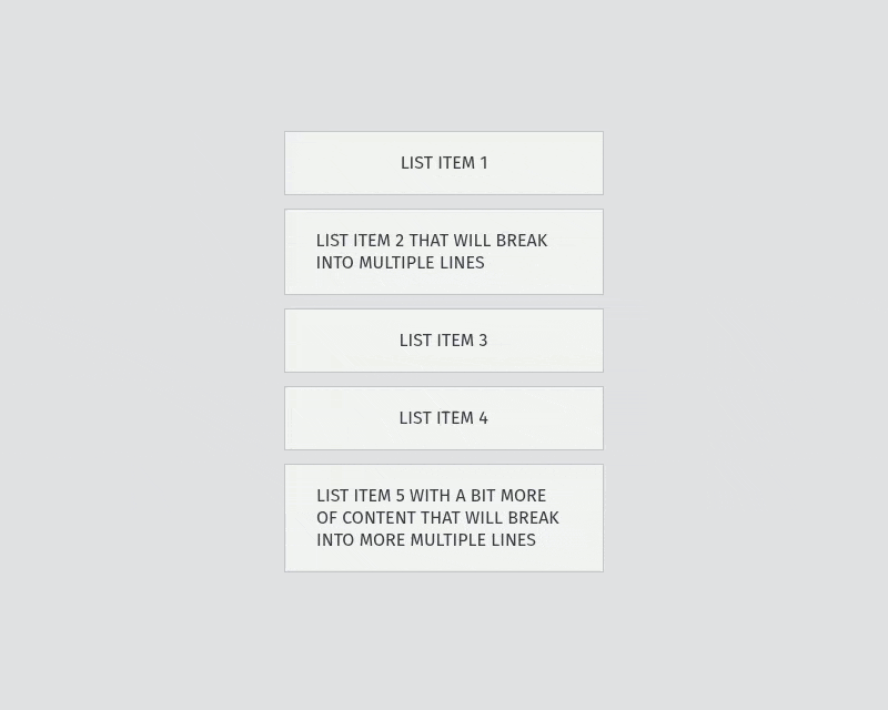
let items: SortableItemData[] = [
{
id: 'list-item-1',
text: 'List item 1',
},
{
id: 'list-item-2',
text: 'List item 2',
},
{
id: 'list-item-3',
text: 'List item 3',
},
{
id: 'list-item-4',
text: 'List item 4',
},
{
id: 'list-item-5',
text: 'List item 5',
},
];
function handleSort(event: CustomEvent<SortEventDetail>) {
const { prevItemIndex, nextItemIndex } = event.detail;
items = sortItems(items, prevItemIndex, nextItemIndex);
}
</script>
<SortableList on:sort={handleSort}>
{#each items as item, index (item.id)}
<SortableItem id={item.id} {index}>
<div class="ssl-item__content">
{item.text}
</div>
</SortableItem>
{/each}
</SortableList>Keyboard navigation
The following is a list of steps to navigate and operate the Sortable List:
- Press
Tabto focus the list. - Press
Arrow Up,Arrow Left,Arrow DownorArrow Rightto focus the first item in the list. - Press
Arrow UporArrow Leftto move the focus to the previous item. - Press
Arrow DownorArrow Rightto move the focus to the next item. - Press
Hometo move the focus to the first item. - Press
Endto move the focus to the last item. - Press
Spaceto drag or drop an item. - Press
Arrow UporArrow Leftto move the dragged item to the previous position. - Press
Arrow DownorArrow Rightto move the dragged item to the next position. - Press
Hometo move the dragged item to the first position. - Press
Endto move the dragged item to the last position. - Press
Escapeto cancel the drag and return the item to its initial position.
Components
The following is a list of the available components inside the package:
| Component | Description |
| ---------------- | ------------------------------------------------------------------------------------------------------------------------------------------------------------------------- |
| <SortableList> | The primary container. Provides the main structure, drag-and-drop interactions and emits the available events. |
| <SortableItem> | An individual item within <SortableList>. Holds the data and content for each list item, as well as the <Handle> and <Remove> components when needed. |
| <Handle> | An element that limits the draggable area of a list item to itself. Including it inside a <SortableItem> will directly activate the handle functionality for that item. |
| <Remove> | A <button> element that (when pressed) removes an item. Including it inside a <SortableItem> will directly allow it to dispatch the remove event for that item. |
| <IconHandle> | A grip icon. Since it doesn’t include any kind of interactivity, you can use your own icon instead. |
| <IconRemove> | An x mark icon. Since it doesn’t include any kind of interactivity, you can use your own icon instead. |
You can create your own <Remove> component if you require it that way. Do so by importing the dispatch() function from this package (or create your own dispatcher), and make sure to use the event name and detail included in the example:
<script lang="ts">
	import { dispatch } from '@rodrigodagostino/svelte-sortable-list';
	import { Button } from '$lib/components';

	function handleRemove(event: MouseEvent) {
		const target = event.target as HTMLElement;
		if (target) dispatch(target, 'requestremove', { item: target.closest('.ssl-item') });
	};
</script>

<Button on:click={handleRemove}>Remove</Button>
<SortableList> props
| Prop | Type | Default | Possible values | Description |
| ------------------------- | ------- | ------------ | ------------------------------ | ------------------------------------------------------------------------------------------------------------------------------------------------------------------------------------------------------------------------------------------------------------------------------------------------------------------------------------------------------------------------------------------------------------------------------- |
| gap | Number | 12 | Number equal to or above 0. | Separation between items (in pixels). |
| direction | String | 'vertical' | 'vertical' or 'horizontal' | Orientation in which items will be arranged. |
| swapThreshold | Number | 1 | Number between 0.5 and 2. | Portions of the dragged item and the target item that need to overlap for the items to interchange positions. This value will be honored as long as there is only one item colliding with the dragged item. Otherwise, the item with the most covered area by the dragged item will be marked as the target. For example, 0.5 stands for half of the dragged and target item, 1 for the full size, 2 for double the size. |
| transitionDuration | Number | 320 | Number equal to or above 0. | Time the transitions for the ghost (dropping) and items (translation, addition, removal) take to complete (in milliseconds). Assign it a value of 0 to remove animations. |
| hasDropMarker | Boolean | false | true or false | If true, displays a position marker representing where the dragged item will be positioned when drag-and-dropping. |
| hasLockedAxis | Boolean | false | true or false | If true, prevents the dragged item from moving away from the main axis. |
| hasBoundaries | Boolean | false | true or false | If true, items will only be draggable inside the list limits. |
| canClearTargetOnDragOut | Boolean | false | true or false | If true, the target item will be cleared when an item is dragged by a pointing device while not colliding with any of the items in the list.. This will cause the dragged item to return to its initial position when dropped. Otherwise, it will take the position of the last item it collided with. |
| canRemoveItemOnDropOut | Boolean | false | true or false | If true, items will be removed when dragged and dropped outside of the list boundaries. This needs to be coupled with the on:remove event handler for it to complete the removal process. |
| isLocked | Boolean | false | true or false | If true, will allow every item in the list to be focused, but will prevent them from being dragged (both through pointer and keyboard). Interactive elements inside will operate normally. |
| isDisabled | Boolean | false | true or false | If true, will allow every item in the list to be focused, but will prevent them from being dragged (both through pointer and keyboard) and change its appearance to be dimmed. Interactive elements inside will be disabled. |
<SortableList> events
| Name | Type | Trigger | Returns |
| ----------- | -------------------------------- | -------------------------- | ------------------------------------------------------------------------------------------------------------------------------------------------------------------------------------------------------------------------------------------------------------------- |
| on:sort | CustomEvent<SortEventDetail> | An item switches position. | event: { detail: { prevItemId: string, prevItemIndex: number, nextItemId: string, nextItemIndex: number }} |
| on:remove | CustomEvent<RemoveEventDetail> | An item is removed. | event: { detail: { itemId: string, itemIndex: number }} |
<SortableItem> props
| Prop | Type | Default | Possible values | Description |
| ------------ | ------- | ----------- | ----------------- | ------------------------------------------------------------------------------------------- |
| id | String | undefined | Unique string. | Unique identifier for each item. |
| index | Number | undefined | Unique number. | Position of the item in the list. |
| isLocked | Boolean | false | true or false | If true, will prevent the item from being dragged. |
| isDisabled | Boolean | false | true or false | If true, will prevent the item from being dragged and change its appearance to be dimmed. |
Utilities
| Function | Description |
| -------------- | ----------------------------------------------------------------------------------------------------------------------------------------------- |
| sortItems() | Provides an easy mechanism to reorder items (should be used in combination with the on:sort event). |
| removeItem() | Provides an easy mechanism to remove an item from your list (should be used in combination with the on:remove event). |
Example:
<script lang="ts">
	import {
		SortableList,
		SortableItem,
		Remove,
		IconRemove,
		removeItem,
		sortItems,
	} from '$lib/index.js';
	import type { SortableItemData } from '$lib/types/index.js';

	let items: SortableItemData[] = [
		{
			id: 'list-item-1',
			text: 'List item 1',
		},
		{
			id: 'list-item-2',
			text: 'List item 2',
		},
		{
			id: 'list-item-3',
			text: 'List item 3',
		},
		{
			id: 'list-item-4',
			text: 'List item 4',
		},
		{
			id: 'list-item-5',
			text: 'List item 5',
		},
	];

	function handleSort(event: CustomEvent<SortEventDetail>) {
		const { prevItemIndex, nextItemIndex } = event.detail;
		items = sortItems(items, prevItemIndex, nextItemIndex);
	}

	function handleRemove(event: CustomEvent<RemoveEventDetail>) {
		const { itemIndex } = event.detail;
		items = removeItem(items, itemIndex);
	}
</script>

<SortableList on:sort={handleSort} on:remove={handleRemove}>
	{#each items as item, index (item.id)}
		<SortableItem id={item.id} {index}>
			<div class="ssl-item__content">
				{item.text}
			</div>
			<Remove>
				<IconRemove />
			</Remove>
		</SortableItem>
	{/each}
</SortableList>
Types
| Type | Description |
| ------------------- | --------------------------------------------------------------------------------------------------- |
| RemoveEventDetail | Provides definitions for the <SortableList> remove custom event detail. |
| SortEventDetail | Provides definitions for the <SortableList> sort custom event detail. |
| SortableItemData | Provides definitions for your list of items. |
Example:
<script lang="ts">
	import type { RemoveEventDetail, SortEventDetail, SortableItemData } from '$lib/types/index.js';

	let items: SortableItemData[] = [
		{
			id: 'list-item-1',
			text: 'List item 1',
			isDisabled: false,
		},
		{
			id: 'list-item-2',
			text: 'List item 2',
			isDisabled: true,
		},
		{
			id: 'list-item-3',
			text: 'List item 3',
			isDisabled: true,
		},
		{
			id: 'list-item-4',
			text: 'List item 4',
			isDisabled: false,
		},
		{
			id: 'list-item-5',
			text: 'List item 5',
			isDisabled: false,
		},
	];

	function handleSort(event: CustomEvent<SortEventDetail>) {
		const { prevItemIndex, nextItemIndex } = event.detail;
		items = sortItems(items, prevItemIndex, nextItemIndex);
	}

	function handleRemove(event: CustomEvent<RemoveEventDetail>) {
		const { itemIndex } = event.detail;
		items = removeItem(items, itemIndex);
	}
</script>
Styles
If you want to make use of the styles present in the demo pages, import them in your project like so:
import 'svelte-sortable-list/styles.css';Selectors
[!IMPORTANT] To customize the appearance of the list items and not cause any conflicts or interferences with the core styles and transitions, the usage of the
.ssl-itemselector must be avoided, pointing instead to.ssl-item__inner, which is the direct child of the aforementioned selector.
This is a list of the selectors you can use to style the list and the list items to your heart’s desire:
| Selector | Points to |
| --------------------------------------- | ------------------------------------------------------------------------------------------------------- |
| .ssl-list | The <SortableList> main container. |
| .ssl-list.has-drop-marker | The <SortableList> main container while hasDropMarker is enabled. |
| .ssl-list.can-remove-item-on-drop-out | The <SortableList> main container while canRemoveItemOnDropOut is enabled. |
| .ssl-list.is-locked | The <SortableList> that is locked. |
| .ssl-list.is-disabled | The <SortableList> that is disabled. |
| .ssl-item | Each <SortableItem> main container. |
| .ssl-item.is-pointer-dragging | The <SortableItem> that is being dragged by a pointing device. |
| .ssl-item.is-pointer-dropping | The <SortableItem> that is being dropped by a pointing device. |
| .ssl-item.is-keyboard-dragging | The <SortableItem> that is being dragged by the keyboard. |
| .ssl-item.is-keyboard-dropping | The <SortableItem> that is being dropped by the keyboard. |
| .ssl-item.is-locked | Each <SortableItem> that is locked. |
| .ssl-item.is-disabled | Each <SortableItem> that is disabled. |
| .ssl-item[aria-disabled="true"] | Each <SortableItem> that is disabled. |
| .ssl-item.is-removing | The <SortableItem> that is being removed by dropping it outside the list limits by a pointing device. |
| .ssl-item__inner | The content wrapper element inside each <SortableItem>. |
| .ssl-ghost | The shadow element displayed under the pointer when dragging. |
| .ssl-ghost.is-dragging | The shadow element while it’s being dragged by a pointing device. |
| .ssl-ghost.is-dropping | The shadow element while it’s being dropped by a pointing device. |
| .ssl-ghost.is-between-bounds | The shadow element while it’s inside the list limits. |
| .ssl-ghost.is-out-of-bounds | The shadow element while it’s outside the list limits. |
| .ssl-handle | The <Handle> main container. |
| .ssl-remove | The <Remove> main container. |
Custom properties
| Custom property | Description |
| ----------------------- | ---------------------------------------------------------------------------------------------------------------------------- |
| --transition-duration | Time the transitions for the ghost (dropping) and items (translation, addition, removal) take to complete (in milliseconds). |
Motivation
While working on a SvelteKit project, I ran into the need of adding drag-and-drop capabilities to a couple of items lists, for which I decided to make use of SortableJS, which is certainly a popular option. I implemented it through a Svelte Action and it provided just what I needed, or so it seemed. After a while I realized I was not only missing touch screen support (since it was built with the HTML Drag and Drop API), but also accessibility was nowhere to be seen, and seems there are no plans to work on it.
I was not able to find any other suitable option, so this problem felt like a good opportunity to build my own package. And so while doing some research to try and understand the implications of such feature, I ran into a very interesting article and a very interesting talk by Vojtech Miksu which really guided me through the different paths available, their advantages, pain points and limitations to create a drag-and-drop system, putting particular focus on accessibility and touch screen support.
Even though React Movable was built for React, it served as my main inspiration when building this package. So thank you again, Vojtech :)