
@onemin-table/elem-cascader
v0.7.5
Published
@onemin-table/elem-cascader
Downloads
7
Maintainers
 orekish
Readme
🚀 schema-based级联选择器模板组件, 集成el-popover组件,实现关注点集中的反馈模式.
安装
首先安装 Element v2.x
接着安装组件
$ npm i @onemin-table/elem-cascader
# OR
$ yarn add @onemin-table/elem-cascader
用法
在 HTML 中以 UMD 的形式使用:
<!DOCTYPE html>
<html lang="en">
<head>
<meta charset="UTF-8">
<meta name="viewport" content="width=device-width, initial-scale=1.0">
<link href="https://cdn.bootcdn.net/ajax/libs/element-ui/2.15.0/theme-chalk/index.min.css" rel="stylesheet">
</head>
<body>
<main id="app">
<elem-cascader
v-model="foo"
:options="options"
:emit-path="false"
check-strictly
multiple
/>
</main>
<script src="https://cdn.bootcdn.net/ajax/libs/vue/2.6.12/vue.min.js"></script>
<script src="https://cdn.bootcdn.net/ajax/libs/element-ui/2.15.0/index.min.js"></script>
<script src="./packages/elem-cascader/dist/elem-cascader.min.js"></script>
<script>
new Vue({
el: '#app',
components: {
ElemCascader,
},
data() {
return {
foo: [],
};
},
computed: {
options() {
return [{
label: '分组1',
value: 11,
children: [{
label: 'aaaaaaaaaaa',
value: 1,
}, {
label: 'bbbbbbbbbbb',
value: 2,
}, {
label: 'c',
value: 3,
}],
}, {
label: '分组2',
value: 12,
children: [{
label: 'd',
value: 4,
disabled: true,
}, {
label: 'e',
value: 5,
}],
}];
},
},
});
</script>
</body>
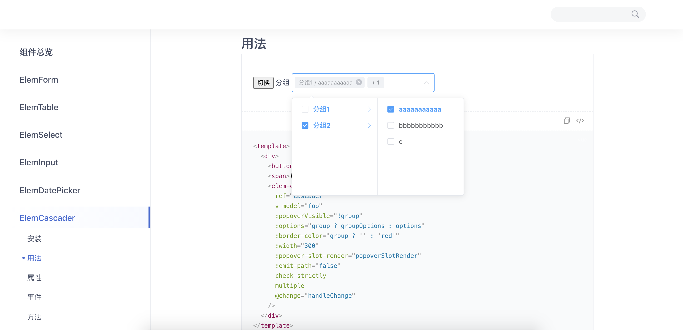
</html>在工程项目中以 CommonJS / ESM 的形式使用:
<template>
  <div>
    <button @click="group = !group">切换</button>
    <span>{{ !group ? '单选' : '分组' }}</span>
    <elem-cascader
      ref="cascader"
      v-model="foo"
      :popover-visible="!group"
      :options="group ? groupOptions : options"
      :border-color="group ? '' : 'red'"
      :width="300"
      :popover-slot-render="popoverSlotRender"
      :emit-path="false"
      check-strictly
      multiple
      @change="handleChange"
    />
  </div>
</template>

<script>
  export default {
    data() {
      return {
        foo: [],

        group: true,
        groupOptions: [],
      };
    },

    computed: {
      options() {
        return [{
          label: 'aaaaaaaaaaa',
          value: 1,
        }, {
          label: 'bbbbbbbbbbb',
          value: 2,
        }, {
          label: 'c',
          value: 3,
        }];
      },
    },

    mounted() {
      this.fetchGroupOptions();
    },

    methods: {
      fetchGroupOptions() {
        setTimeout(() => {
          this.groupOptions = [{
            label: '分组1',
            value: 11,
            children: this.options,
          }, {
            label: '分组2',
            value: 12,
            children: [{
              label: 'd',
              value: 4,
              disabled: true,
            }, {
              label: 'e',
              value: 5,
            }],
          }];
        }, 200);
      },

      handleChange(val) {
        console.warn(this.foo, val);
      },

      popoverSlotRender() {
        return (
          <div>
            <i style="color: #F46A6A;margin-right: 10px;" class="el-icon-error" />
            错误
          </div>
        );
      },
    },
  };
</script>

<style>
</style>
代码预览
属性
| 参数 | 说明 | 类型 |
| ------------- |---------------| ------|
| options(必填) | 级联选择器下拉列表数据 | Array<{ label: string, value?: any, disabled?: boolean, children?: Array }> |
| label-key | options中标签值的key, 优先级低于props.label, 默认值label | String |
| value-key | options中value值的key, 优先级低于props.value, 默认值value | String |
| children-key | options中子节点的key, 优先级低于props.children, 默认值children | String |
| disabled-key | options中禁用状态的key, 优先级低于props.disabled, 默认值disabled | String |
| multiple/... | multiple等<el-cascader>的props属性中的值, 支持同时支持和中划线写法(kebab case)和小驼峰(camel case)写法 | String |
| empty-slot-render | 选择器无选项时列表渲染函数, 相当于el-cascader的empty slot | Function |
| data-prop | 元素标识,会被绑定到DOM元素的data-prop属性上, 默认为空 | String |
| width | 选择器宽度, 传入数字会被识别为像素值(px) | String|Number |
| border-color | 选择器边框颜色, 可用于校验不通过的提示,设为空字符串可还原 | String |
| background-color | 选择器背景颜色, 可用于校验不通过的提示,设为空字符串可还原 | String |
| color | 选择器字体颜色, 可用于校验不通过的提示,设为空字符串可还原 | String |
| popover-visible | <el-popover>弹出框是否显示 | Boolean |
| popover-content | <el-popover>弹出框内容 | String |
| popover-attrs | <el-popover>的属性 | Object |
| popover-listeners | <el-popover>的事件 | Object |
| popover-slot-render | 弹出框渲染函数, 相当于el-popover的default slot | Function |
其他继承自el-cascader的属性见element-ui文档
事件
继承自el-cascader的事件见element-ui文档
方法
继承自el-cascader的方法见element-ui文档