
@nstudio/nativescript-fancyalert
v4.0.1
Published
Fancy alerts for NativeScript.
Downloads
264


Readme
@nstudio/nativescript-fancyalert
Fancy alerts for NativeScript.
Based on:
- iOS SCLAlertView
- Android ColorDialog
Install
iOS Specifications
Usage Examples
import { TNSFancyAlert, TNSFancyAlertButton } from 'nativescript-fancyalert';
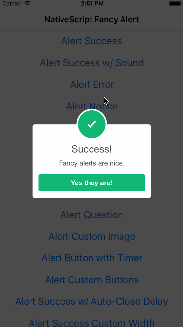
// show success
TNSFancyAlert.showSuccess('Success!', 'Fancy alerts are nice.', 'Yes they are!');
// set customizations
TNSFancyAlert.showAnimationType = TNSFancyAlert.SHOW_ANIMATION_TYPES.SlideInFromLeft;
TNSFancyAlert.hideAnimationType = TNSFancyAlert.HIDE_ANIMATION_TYPES.SlideOutToRight;
TNSFancyAlert.backgroundType = TNSFancyAlert.BACKGROUND_TYPES.Blur;
TNSFancyAlert.soundURL = 'bell.mp3';
TNSFancyAlert.showSuccess('Sound?', 'You can use sound and customize many aspects like animation in/out, color, background style and much more.', 'Amazing!');
// show custom image
TNSFancyAlert.showCustomImage('nativescript.png', '#2B33FF', 'Custom Image', `Using your own images is sure nice.`, 'Yes!');
// show custom button timer
TNSFancyAlert.showCustomButtonTimer(0, true, undefined, undefined, 'Mission Impossible', `This will self-destruct in 5 seconds.`, 'Ok');
// show custom buttons
let buttons = [
new TNSFancyAlertButton({
label: 'One',
action: () => {
console.log('One');
},
}),
new TNSFancyAlertButton({
label: 'Two',
action: () => {
console.log('Two');
},
}),
new TNSFancyAlertButton({
label: 'Three',
action: () => {
console.log('Three');
},
}),
new TNSFancyAlertButton({
label: 'Four',
action: () => {
console.log('Four');
},
}),
new TNSFancyAlertButton({
label: 'Really? More?',
action: () => {
console.log('more');
},
}),
];
TNSFancyAlert.showCustomButtons(buttons, undefined, undefined, 'Got Buttons?', `Add as many as you'd like.`, 'Ok');
// show with custom width
TNSFancyAlert.showSuccess('Success!', 'This uses a custom width of 300.', `Oh that's nice.`, 0, 300);
// show textfield
let initialValue = null;
TNSFancyAlert.showTextField(
'Enter your name',
initialValue,
new TNSFancyAlertButton({
label: 'Save',
action: (value: any) => {
console.log(`User entered ${value}`);
},
}),
undefined,
undefined,
'User Input?',
`Yeah, sure we can.`,
'Ok, lots of options.'
);
// show switch
TNSFancyAlert.showSwitch(
`Don't show again`,
'#58B136',
new TNSFancyAlertButton({
label: 'Save',
action: (isSelected: boolean) => {
console.log(`Don't show again was selected: ${isSelected}`);
},
}),
'switch.png',
'#B3714F',
'Need a switch?',
`It can be useful.`,
'Got it.'
);TNSFancyAlert - Properties
| Property | Description |
| ---------------------------------------------------------------- | ---------------------------------------------------------------------------------------------------------------------------------------------------------------------------- |
| TNSFancyAlert.SUPPORTED_TYPES: IFancyAlertSupportedTypes | Different supported style types. |
| TNSFancyAlert.shouldDismissOnTapOutside: boolean | Should dismiss when tapped outside. |
| TNSFancyAlert.dismissCallback: () => void | Callback for when alert is dismissed. |
| TNSFancyAlert.hideAnimationType: IFancyAlertHideAnimationTypes | Use TNSFancyAlert.HIDE_ANIMATION_TYPES to set. Supports: FadeOut, SlideOutToBottom, SlideOutToTop, SlideOutToLeft, SlideOutToRight, SlideOutToCenter, SlideOutFromCenter. |
| TNSFancyAlert.showAnimationType: IFancyAlertShowAnimationTypes | Use TNSFancyAlert.SHOW_ANIMATION_TYPES to set. Supports: FadeIn, SlideInFromBottom, SlideInFromTop, SlideInFromLeft, SlideInFromRight, SlideInFromCenter, SlideInToCenter. |
| TNSFancyAlert.backgroundType: IFancyAlertBackgroundTypes | Use TNSFancyAlert.BACKGROUND_TYPES to set. Supports: Shadow, Blur, Transparent. |
| TNSFancyAlert.customViewColor: string | Overwrite (Buttons, top circle and borders) colors. |
| TNSFancyAlert.iconTintColor: string | Set custom tint color for icon image. |
| TNSFancyAlert.titleColor: string | Set custom title color. |
| TNSFancyAlert.bodyTextColor: string | Set custom body text color. |
| TNSFancyAlert.tintTopCircle: string | Override top circle tint color with background color |
| TNSFancyAlert.cornerRadius: number | Set custom corner radius. |
| TNSFancyAlert.backgroundViewColor: string | Overwrite background color |
| TNSFancyAlert.useLargerIcon: boolean | Make the top circle icon larger |
| TNSFancyAlert.soundURL: string | Use mp3 from App_Resources when alert shows. |
| TNSFancyAlert.textDisplayOptions: IFancyAlertTextOptions | IOS Only. Text display options |
TNSFancyAlert - Methods
showSuccess(title: string, subTitle?: string, closeBtnTitle?: string, duration?: number, width?: number, buttons?: Array<TNSFancyAlertButton>)showError(title: string, subTitle?: string, closeBtnTitle?: string, duration?: number, width?: number, buttons?: Array<TNSFancyAlertButton>)showNotice(title: string, subTitle?: string, closeBtnTitle?: string, duration?: number, width?: number, buttons?: Array<TNSFancyAlertButton>)showWarning(title: string, subTitle?: string, closeBtnTitle?: string, duration?: number, width?: number, buttons?: Array<TNSFancyAlertButton>)showInfo(title: string, subTitle?: string, closeBtnTitle?: string, duration?: number, width?: number, buttons?: Array<TNSFancyAlertButton>)showEdit(title: string, subTitle?: string, closeBtnTitle?: string, duration?: number, width?: number, buttons?: Array<TNSFancyAlertButton>)showWaiting(title: string, subTitle?: string, closeBtnTitle?: string, duration?: number, width?: number)showQuestion(title: string, subTitle?: string, closeBtnTitle?: string, duration?: number, width?: number, buttons?: Array<TNSFancyAlertButton>)showCustomButtonTimer(buttonIndex: number, reverse?: boolean, imageName?: string, color?: string, title?: string, subTitle?: string, closeBtnTitle?: string, duration?: number, width?: number)showCustomImage(imageName: string, color: string, title: string, subTitle?: string, closeBtnTitle?: string, duration?: number, width?: number)showCustomButtons(buttons: Array<TNSFancyAlertButton>, imageName: string, color: string, title: string, subTitle?: string, closeBtnTitle?: string, duration?: number, width?: number)showCustomTextAttributes(attributionBlock: Function, button: TNSFancyAlertButton, imageName: string, color: string, title: string, subTitle?: string, closeBtnTitle?: string, duration?: number, width?: number)showTextField(placeholder: string, initialValue: string, button: TNSFancyAlertButton, imageName: string, color: string, title: string, subTitle?: string, closeBtnTitle?: string, duration?: number, width?: number)showSwitch(switchLabel: string, switchColor: string, button: TNSFancyAlertButton, imageName: string, color: string, title: string, subTitle?: string, closeBtnTitle?: string, duration?: number, width?: number)showCustomView(customView: any, imageName?: string, color?: string, title?: string, subTitle?: string, closeBtnTitle?: string, duration?: number, width?: number)show(type: string, title: string, subTitle?: string, closeBtnTitle?: string, duration?: number, width?: number, buttons?: Array<TNSFancyAlertButton>)showCustom(alert: any, imageName: string, color: string, title?: string, subTitle?: string, closeBtnTitle?: string, duration?: number)createAlert(width?: number)
Android Specifications
Usage Examples
NOTE: Android supports only a subset of the iOS features, but will return a Promise on every call:
import { TNSFancyAlert, TNSFancyAlertButton } from 'nativescript-fancyalert';

// show success
TNSFancyAlert.showSuccess('Success!', 'Fancy alerts are nice.', 'Yes they are!').then(() => {
	/* user pressed the button */
});

// show error
TNSFancyAlert.showError('Error!', 'Something bad happened.', 'Close').then(() => {
	/* user pressed the button */
});
TNSFancyAlert - Methods
showSuccess(title: string, subTitle?: string, closeBtnTitle?: string): Promise<any>showError(title: string, subTitle?: string, closeBtnTitle?: string): Promise<any>showNotice(title: string, subTitle?: string, closeBtnTitle?: string): Promise<any>showWarning(title: string, subTitle?: string, closeBtnTitle?: string): Promise<any>showInfo(title: string, subTitle?: string, closeBtnTitle?: string): Promise<any>showColorDialog( title: string, subTitle?: string, okBtnTitle?: string, cancelBtnTitle?: string, backgroundColor?: string, titleTextColor?: string, contextTextColor?: string, contentImage?: any ): Promise<any>```
TNSFancyAlertButton (iOS only)
This class can be instantiated on iOS to configure buttons in the fancy alerts.
export class TNSFancyAlertButton {
  public label: string;
  public action: Function;
  public applyStyle: (btn: any) => void;

  constructor(model?: any) {
    if (model) {
      this.label = model.label;
      this.action = model.action;
      this.applyStyle = model.applyStyle;
    }
  }
}label: display text on the buttonaction: the method to invoke when the button is tapped onapplyStyle: a method you can configure to style the button however you'd like using iOS properties. This method will hand back an instance ofSLCButtonwhich inherits fromUIButton. You can see more of what methods are available on this class here.
Here's an example of how to setup a custom background color:
new TNSFancyAlertButton({
  label: 'Ok',
  action: () => {
    // the action to take
  },
  applyStyle: (btn: UIButton) => {
    // we can use UIButton typing when using tns-platform-declarations
    // however we can cast to any since you are likely not using SLCAlertView typings (they are in this repo if you want to use them :) )
    // refer to https://github.com/dogo/SCLAlertView/blob/develop/SCLAlertView/SCLButton.m on what properties are available to customize

    (<any>btn).buttonFormatBlock = () => {
      // set a custom backgroundColor
      return new (NSDictionary as any)([new Color('#3a3939').ios], ['backgroundColor']);
    }
  }
}),
Tutorials
Need extra help getting these fancy alerts working in your application? Check out these tutorials that make use of the plugin:
Fancy Alerts in a NativeScript with Angular Application
License
Apache License Version 2.0, January 2004