@ngx-file-upload/ui
v8.0.0
Published
Angular 16 file upload components for @ngx-file-upload/core
Downloads
465
Maintainers
Readme
ngx file upload / ui
Angular 16 components for @ngx-file-upload / core to create a UI. All components were packed in separate modules which can be integrated and used separately as required.
Angular 9
Use ngx-file-upload/ui v2.2.1.
This package is build with angular 9 and typescript ^3.7.5 which is not supported by angular 8 by default. Typings for 3.5.5 and 3.7.5 are diffrent, if u want use this package in Angular 8 Project update your Angular 8 Project to Typescript ^3.7.5.
We also change all namespaces to have NgxFileUpload as prefix @see breaking change 1.1.2 to 2.0.0
Angular 8
Use ngx-file-upload/ui v1.1.2, compiled with typescript 3.5.x which is used default by angular 8.
@dependencies
@Install
npm i --save @ngx-file-upload/ui @ngx-file-upload/coreLanguage Support
To add a specific language to @ngx-file-upload/ui components create a new language file where you define custom translations which will only work for predefined components we provide with @ngx-file-upload/ui.
import { NGX_FILE_UPLOAD_UI_I18N, NgxFileUploadUiI18n } from "@ngx-file-upload/ui";

/**
 * define translation json data all sections are optional
 * if not set it will take default value
 */
const ngxFileUploadI18n: NgxFileUploadUiI18n = {
    common: {
        SELECT_FILES: "Select File"
    },
    item: {
        UPLOADED: "uploaded"
    },
    toolbar: {
        CLEAN_UP: "Remove invalid and completed",
        REMOVE_ALL: "Remove all",
        UPLOADS: "Progessing File Uploads",
        UPLOAD_ALL: "Upload All"
    }
};

@NgModule({
    ...
    providers: [
        ...
        /**
         * @optional bind language data to injection token
         * if not provided it will use default text labels
         */
        { provide: NGX_FILE_UPLOAD_UI_I18N, useValue: ngxFileUploadI18n },
        ...
})
export class AppModule {
}
Read Docs for more Informations: Language Support
@Modules
NgxFileUploadUiModule
containing all UI modules, should imported if all resources should be used.
NgxFileUploadUiCommonModule
Includes following Pipes
- StateToStringPipe - converts NgxFileUploadState to string value
- FileSizePipe - converts file size into human readable value
- IsCancelAblePipe - returns true if upload can canceled
app.module.ts
import { NgModule } from "@angular/core";
import { CommonModule } from "@angular/common";
import { NgxFileUploadCoreModule } from "@ngx-file-upload/core";
import { NgxFileUploadUiCommonModule } from "@ngx-file-upload/ui";

@NgModule({
    imports: [
        CommonModule,
        NgxFileUploadCoreModule
        NgxFileUploadUiCommonModule,
    ])],
    declarations: [...],
    entryComponents: [...],
    providers: [],
})
export class AppModule { }
app.component.html
<ul>
    <!-- array of UploadRequests -->
    <li *ngFor="upload of uploads">
        <div>State: {{upload.data.state | stateToString }}</div>
        <div>Uploaded: {{upload.data.uploaded | fileSize }}</div>
        <div>Size: {{upload.data.size | fileSize }}</div>
        <button [disabled]="!(upload.data.state | isCancelAble)">Cancel</div>
    </li>
</ul>
Read Docs for more Informations: Pipes
NgxFileUploadUiProgressbarModule
Contains progress bars for visualization of the upload progress.
CircleProgressbar

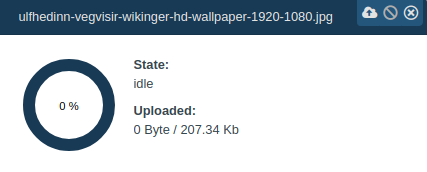
Circle Progressbar which can be split into parts with gap or display completly as one. Can be animated by css.
Progressbar

Progressbar which can be split into parts with gap or display completly as one. Could not animated via css but animation is included and can turned off.
Read Docs for more Informations: ProgressbarModule
NgxFileUploadUiItemModule

Contains customize able upload item
app.module.ts
import { NgModule } from "@angular/core";
import { CommonModule } from "@angular/common";
import { NgxFileUploadCoreModule } from "@ngx-file-upload/core";
import { NgxFileUploadUiItemModule } from "@ngx-file-upload/ui";

@NgModule({
    imports: [
        CommonModule,
        NgxFileUploadCoreModule
        NgxFileUploadUiItemModule,
    ])],
    declarations: [...],
    entryComponents: [...],
    providers: [],
})
export class AppModule { }
app.component.html
<ul>
    <!-- array of UploadRequests -->
    <li *ngFor="upload of uploads" class="upload-item">
        <ngx-file-upload-ui--item [upload]="upload">
        </ngx-file-upload-ui--item>
    </li>
</ul>
Read Docs for more Informations: Upload Item
NgxFileUploadUiToolbarModule

Contains UploadToolbar for visualisation of current upload progress and control to start, stop or clean up uploads.
app.module.ts
import { NgModule } from "@angular/core";
import { CommonModule } from "@angular/common";
import { NgxFileUploadCoreModule } from "@ngx-file-upload/core";
import { NgxFileUploadUiToolbarModule } from "@ngx-file-upload/ui";

@NgModule({
    imports: [
        CommonModule,
        NgxFileUploadCoreModule
        NgxFileUploadUiToolbarModule,
    ])],
    declarations: [...],
    entryComponents: [...],
    providers: [],
})
export class AppModule { }
app.component.html
<ngx-file-upload-ui--toolbar [storage]="uploadStorage"></ngx-file-upload-ui--toolbar>
<ul>
    <!-- array of UploadRequests -->
    <li *ngFor="upload of uploads" class="upload-item">
        <!-- display upload data -->
    </li>
</ul>
NgxFileUploadUiFileBrowserModule
Simple directive for browse or drop files.
import { NgModule } from "@angular/core";
import { CommonModule } from "@angular/common";
import { NgxFileUploadCoreModule } from "@ngx-file-upload/core";
import { NgxFileUploadUiFileBrowserModule } from "@ngx-file-upload/ui";

@NgModule({
    imports: [
        CommonModule,
        NgxFileUploadCoreModule
        NgxFileUploadUiFileBrowserModule,
    ])],
    declarations: [...],
    entryComponents: [...],
    providers: [],
})
export class AppModule { }
app.component.html
<div ngxFileUpload (add)="dropFiles($event)">
    <div class="file-browser">
        <span>Drop or Browse</span>
    </div>
</div>
Read Docs for more Informations: Upload File Browser
@Demo
Demo can be found here.
@Credits
Special thanks for code reviews, great improvements and ideas to
||||
|:-:|:-:|:-:|
|Konrad Mattheis| Thomas Haenig|
Alexander Görlich|
Author
Ralf Hannuschka Github


