
@ng-ar/modal
v14.0.5
Published
This angular npm library package will help us create modal with more custom controls.
Downloads
2
Maintainers
 actionanand
Readme
Angular modal
This angular npm library package will help us create modal with more custom controls.
Installation
This is how to install the components:
npm install @ng-ar/modalor
yarn add @ng-ar/modalMinimum angular version needed for this library is v14.0.2.
And on your application module:
import { ModalModule } from '@ng-ar/modal';

@NgModule({
  declarations: [ ...],
  imports: [
    BrowserModule,
    ....,
    ModalModule.forRoot()
],
})
export class AppModule { }
We can use them as below in HTML view (general pattern) - with template pattern:
- You have to use property binding
body, to achieve template pattern
<div class="container">
  <ng-template #modalBody>
    ...your own html logic
  </ng-template>

  <ng-ar-modal [hideOnEsc]="true" [body]="modalBody" [hideOnClickOutside]="true" [showCloseIcon]="true"
    *ngArModalOpenOnClick="myModalButton" closeIconSymbol="square">
  </ng-ar-modal>

  <div class="modal-buttons">
    <button #myModalButton>Open My Modal</button>
  </div>
</div>
We can use them as below in HTML view (general pattern) - with content projection:
<div class="container">
  <ng-ar-modal [hideOnEsc]="true" [hideOnClickOutside]="true" [showCloseIcon]="true"
    *ngArModalOpenOnClick="[myModalBtn1, myModalBtn2]" closeIconSymbol="square">
      ...your own html logic
  </ng-ar-modal>

  <div class="modal-buttons">
    <button #myModalBtn1>My Modal 1</button>
    <button #myModalBtn2>My Modal 2</button>
  </div>
</div>myModalBtn1andmyModalBtn2are the references for the buttons to open our modal. To make this button open our modal, we've to pass the reference to thengArModalOpenOnClickdirective. This directive can accept single html reference or array of references.hideOnEsc(to hide modal on clicking escape button),hideOnClickOutside(to hide modal on clicking outside the modal) andshowCloseIcon(showing 'x' mark in modal to close the modal popup) are by defaulttrue. You can disable them by passingfalse.closeIconSymbolproperty can be bound with 3 values. They arecross,squareandcircle. Andcircleis the default value.
Using custom closing icon design(general pattern)
<ng-ar-modal [hideOnEsc]="true" [body]="modalBody" [hideOnClickOutside]="true" [showCloseIcon]="false"
  *ngArModalOpenOnClick="[myModalBtn1, myModalBtn2]" #ngArModal>
  <div class="modal-close-i" (click)="ngArModal.onCloseModal()"> X </div>
</ng-ar-modal>- To achieve this, property
showCloseIconshould be bound with valuefalse. Then we can use content projection to create close icon. Here I have used 'X'. You can use any icon or image, etc as per your design. ngArModalis the template reference to the modal. Modal npm package exposes public api methodonCloseModal(). We can use this to close the modal.- One important thing is that we should add
modal-close-icss class to your custom design.
We can pass any object to our modal. The object can be used as data. This can be passed to the input property context as below:
<ng-ar-modal [body]="authModalBody" *ngArModalOpenOnClick="[loginButton, signUpButton]"
[context]="{loginTabActive: loginActive, title: 'Login and Sign Up Modal'}">
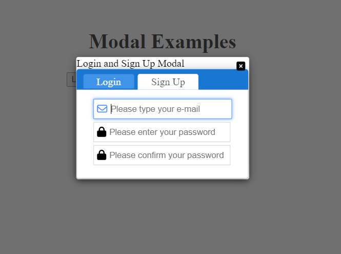
</ng-ar-modal>Demo preview.
I've used two of other npm packages in this demo. They are @ng-ar/fa-input and @ng-ar/tab.
Html code for the demo as below:
<div class="container">
  <h1>Modal Examples</h1>

  <ng-template #authModalBody let-loginTabActive="loginTabActive" let-title="title">
    {{ title }}
    <ng-ar-tab-panel>
      <ng-ar-tab title="Login" [selected]="loginTabActive">
        <form>
          <div class="form-field">
            <ng-ar-fa-input [icon]="iconEmail" [iconType]="typeReg">
              <input class="normal-input" type="email" name="email" placeholder="Please type yourE-mail">
            </ng-ar-fa-input>
          </div>
          <div class="form-field">
            <ng-ar-fa-input [icon]="iconPassword" [iconType]="typeSolid">
              <input class="normal-input" type="password" name="password" placeholder="Please enter your password">
            </ng-ar-fa-input>
          </div>
        </form>
      </ng-ar-tab>

      <ng-ar-tab title="Sign Up" [selected]="!loginTabActive">
        <form>
          <div class="form-field">
            <ng-ar-fa-input [icon]="iconEmail" [iconType]="typeReg">
              <input class="normal-input" type="email" name="email" placeholder="Please type yourE-mail">
            </ng-ar-fa-input>
          </div>
          <div class="form-field">
            <ng-ar-fa-input [icon]="iconPassword" [iconType]="typeSolid">
              <input class="normal-input" type="password" name="password" placeholder="Please enter your password">
            </ng-ar-fa-input>
          </div>
          <div class="form-field">
            <ng-ar-fa-input [icon]="iconPassword" [iconType]="typeSolid">
              <input class="normal-input" type="password" name="confirm-password" placeholder="Please confirm your password">
            </ng-ar-fa-input>
          </div>
        </form>
      </ng-ar-tab>
    </ng-ar-tab-panel>
  </ng-template>

  <ng-ar-modal [hideOnEsc]="true" [body]="authModalBody" [hideOnClickOutside]="true" [showCloseIcon]="true"
    *ngArModalOpenOnClick="[loginButton, signUpButton]" closeIconSymbol="square" #ngArModal
    [context]="{loginTabActive: loginActive, title: 'Login and Sign Up Modal'}">
  </ng-ar-modal>

  <div class="modal-buttons">
    <button #loginButton (click)="setLoginActive(true)">Login</button>
    <button #signUpButton (click)="setLoginActive(false)">Sign Up</button>
  </div>
</div>
Component logic for the above one:
import { Component } from '@angular/core';

import { ICON_TYPE, ICON_NAME } from '@ng-ar/fa-input';

@Component({
  selector: 'ar-modal',
  templateUrl: './modal.component.html',
  styleUrls: ['./modal.component.scss'],
})
export class ModalComponent {

  loginActive = true;

  typeSolid = ICON_TYPE.SOLID;
  typeReg = ICON_TYPE.REGULAR;
  typeBrand = ICON_TYPE.BRAND;

  iconEmail = ICON_NAME.REG_SOLID.ENVELOPE;
  iconPassword = ICON_NAME.SOLID.LOCK;

  setLoginActive(loginState: boolean) {
    this.loginActive = loginState;
  }
}
SCSS for the said demo app:
.container {
  margin: 0 auto;
  max-width: 300px;
  padding-top:65px;
}

label {
  width: 100px;
  text-align: right;
}

.form-row {
  width:500px;
  margin-bottom: 10px;
}

.form-field {
  margin-bottom: 5px;
}

input {
  height: 25px;
}

.normal-input {
  width:150px;
}

h1 {
  text-align: center;
  margin-bottom: 30px;
  margin-top: 50px;
}

.modal-buttons {
  margin-top: 20px;
}