
@ng-ar/fa-input
v14.0.5
Published
This angular npm library package contains a couple of Angular Input box components that allow to add an icon inside a text input, which helps better identify common input fields like for example email, etc.
Downloads
2
Maintainers
 actionanand
Readme
Angular faInput
This angular npm library package contains a couple of Angular Input box components that allow to add an icon inside a text input, which helps better identify common input fields like for example email, etc.
This small module contains only the HTML and CSS necessary to implement this very common HTML pattern.
The default theme of the input is designed to look just like a plain HTML input, including the focus blue border (tab and shift-tab are supported)
Demo
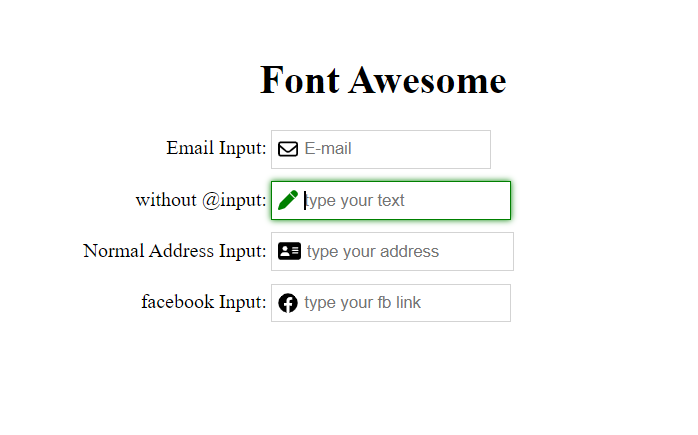
Here is how the inputs with the icons look like on the screen:
Installation
This is how to install the components:
npm install @ng-ar/fa-inputor
yarn add @ng-ar/fa-inputMinimum angular version needed for this library is v14.0.0.
And on your application module:
import { FaInputModule } from '@ng-ar/fa-input';

@NgModule({
  declarations: [ ...],
  imports: [
    BrowserModule,
    ....,
    FaInputModule
],
})
export class AppModule { }
And in your component.ts file
import { ICON_TYPE, ICON_NAME } from '@ng-ar/fa-input';
...
export class AppComponent {

  typeSolid = ICON_TYPE.SOLID;
  typeReg = ICON_TYPE.REGULAR;
  typeBrand = ICON_TYPE.BRAND;

  iconEmail = ICON_NAME.REG_SOLID.ENVELOPE;
  iconAddress = ICON_NAME.REG_SOLID.ADDRESS_CARD;
  iconFb = ICON_NAME.BRAND.FACEBOOK;
}
Then we can use the Font Awesome Input like this:
<div class="container">
  <h1>Font Awesome</h1>
  <div class="form">

    <div class="form-row">
      <label>Normal Input:</label>
      <input type="text" placeholder="not from lib">
    </div>

    <div class="form-row">
      <label>Email Input:</label>
      <ng-ar-fa-input [icon]="iconEmail" [iconType]="typeReg">
        <input class="normal-input" type="email" name="email" placeholder="E-mail">
      </ng-ar-fa-input>
    </div>

    <div class="form-row">
      <label>Normal Address Input:</label>
      <ng-ar-fa-input [icon]="iconAddress" [iconType]="typeSolid">
        <input type="text" placeholder="type your address">
      </ng-ar-fa-input>
    </div>

    <div class="form-row">
      <label>facebook Input:</label>
      <ng-ar-fa-input [icon]="iconFb" [iconType]="typeBrand">
        <input type="url" placeholder="type your fb link">
      </ng-ar-fa-input>
    </div>
</div>
The html core components to be added
  <ng-ar-fa-input [icon]="iconAddress" [iconType]="typeSolid">
    <input type="text" placeholder="type your address">
</ng-ar-fa-input>- The inputs receive an input property named
iconthat identifies which Font Awesome icon we want to apply. iconTypeis to feed icon type. Say(far - regular, fas- solid and fab - brand).- You can add all the things as per your requirement inside
<input>html element. - If you are not providing
iconandiconType, default icon and theme will be applied.
Using add-on extra theme
  <div class="form-row fa-input-green-theme">
    <label>without @input:</label>
    <ng-ar-fa-input>
      <input type="text" placeholder="type your text">
    </ng-ar-fa-input>
</div>- Add
fa-input-green-themeto the ancestor of the selector (say<ng-ar-fa-input></ng-ar-fa-input>), then the particular them will be applied to the child.
Sample scss (you can uses css also)
.container {
  padding-top: 4.1rem;
  padding-bottom: 2rem;
  display: flex;
  flex-direction: column;
  justify-content: center;
  align-items: center;

  & h1{
    text-align: center;
  }
}

.form-row {
  width:500px;
  margin-bottom: 10px;

  & label {
    width: 157px;
    text-align: right;
    padding-right: 3px;
    display: inline-block;
  }

  & input {
    height: 25px;
  }
}