
@mvpleung/taro-skeleton
v1.0.14
Published
基于Taro的一个骨架屏组件,支持微信小程序、支付宝小程序、H5、自定义骨架屏内容
Downloads
5

Readme
Skeleton 骨架屏
基于 taro 到一个简单易用的骨架屏组件,支持微信小程序、支付宝小程序、H5、自定义骨架屏内容,fork 自 https://github.com/lentoo/taro-skeleton
支持多端平台使用
- 微信小程序
- h5
- 支付宝小程序
- 其它平台未测试
安装
npm install @mvpleung/taro-skeleton -S引入
import Skeleton from '@mvpleung/taro-skeleton'代码演示
基础用法
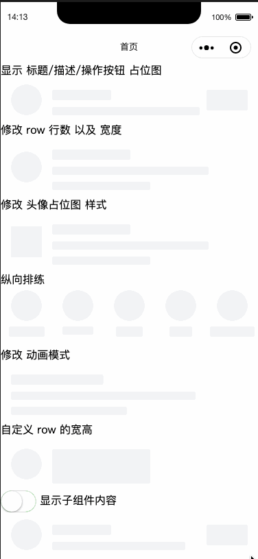
通过title属性显示标题占位图,通过row属性配置占位段落行数
<Skeleton title row={3} />显示头像
通过avatar属性显示头像占位图
<Skeleton title avatar row={3} />不同排列方式
通过type属性来控制排列方式,默认值为 row,可选column
<Skeleton type="column" title titleProps={{ width: "80%" }} avatar />展示子组件
将loading属性设置成false表示内容加载完成,此时会隐藏占位图,并显示Skeleton的子组件
<Skeleton title avatar row={3} loading={loading}>
  <Text>实际内容</Text>
</Skeleton>
export default class Index extends Component {
state = {
loading: false
}
render() {
return (
<View className="index">
<Skeleton
loading={this.state.loading}
title
avatar
row={2}
action
></Skeleton>
</View>
)
}
}效果截图
API
Props
| 参数 | 说明 | 类型 | 默认值 | 版本 |
| --------------- | --------------------------------------------------------------------------------------------- | --------------------------------- | --------------------------------- | ------ |
| className | 样式表名称 | string | `` | 1.0.14 |
| skeletonStyle | 行内样式 | AttrProps: Object | {} | 1.0.14 |
| type | 定义排列方式 | row/column | row | 1.0.12 |
| row | 段落占位图行数 | number | 0 | - |
| rowWidth | 段落占位图宽度,可传数组来设置每一行的宽度 | number/string/number[]/string[] | 100% | - |
| rowHeight | 段落占位图高度,可传数组来设置每一行的高度 | number/string/number[]/string[] | 24 | 1.0.7 |
| rowProps | 用于定制 row 的宽跟高,可传数组来设置每一行的宽跟高,如果配置了该属性,则 row-height 配置无效 | AttrProps/AttrProps[] | - | 1.0.13 |
| title | 是否显示标题占位图 | boolean | false | - |
| titleProps | 标题占位图属性 | AttrProps | {width: '40%', height: '30rpx'} | 1.0.13 |
| avatar | 是否显示头像占位图 | boolean | false | - |
| avatarSize | 头像占位图大小 | number/AttrProps | 90 | 1.0.13 |
| avatarShape | 头像占位图形状,可选值为square | string | round | - |
| action | 显示右边操作按钮占位图 | boolean | false | - |
| actionProps | 操作按钮占位图属性 | AttrProps | - | 1.0.13 |
| loading | 是否显示占位图,传false时会展示子组件内容 | boolean | true | - |
| animate | 是否开启动画 | boolean | true | - |
| animateName | 动画类型,可选值为elastic | string | blink | 1.0.9 |
| skeletonColor | 骨架颜色 | string | #f2f3f5 | 1.0.13 |
| custom | 是否为自定义骨架内容,为 true 时,会使用 renderSkeleton 作为内容填充 | boolean | false | 1.0.13 |
| renderCustom | 自定义骨架内容,仅当 custom 为 true 时有效 | JSX.Element | - | 1.0.13 |
AttrProps
| 参数 | 说明 | 类型 | 默认值 | 版本 |
| ------ | --------------- | --------------- | ------ | ------ |
| width | 占位图宽数 | number/string | - | 1.0.13 |
| height | 占位图高度 | number/string | - | 1.0.13 |
| - | 其他 Style 属性 | - | - | 1.0.13 |