@miaguila/theme
v0.0.114
Published
Mi Águila Theme library
Downloads
38
Readme
@miaguila/theme
The Mi Aguila Theme Library consists of predefined variables for basic design elements such as color, typography, and spacing. These system properties allow for building layouts and visual styles from defined constraints. This library has to "speak" the same design language as the Design Team resources.
File structure
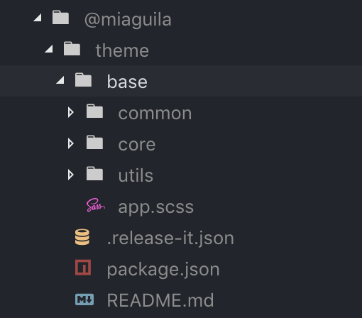
theme library has 3 main folders: core, common and utils.

common: Sometimes there are some simple components that don't need to be a UI Angular component (e.g. links, labels, etc). Designing a UI Angular component could be a long process (e.g. add logic, add different states, unit test, etc) or the component is so simple that it doesn't make sense to turn it into a complex Angular component. As a result of this, the common folder contains the styles of these simple CSS components.
core: It includes all the design basis of Mi Águila:
- Mi Águila foundations (e.g. color palette, typography, typescale).
- Utility classes (e.g. bg-dark-snow, w-full, text-left, etc).
- Global SASS variables (e.g. breakpoint-sm, font-size-base, line-height, etc).
utils: You can find all the global mixins, functions, and so on.
Usage
1. In order to use this library within any Mi Aguila's Web project, you have to install the respective npm package (in this case theme library), running the following command:
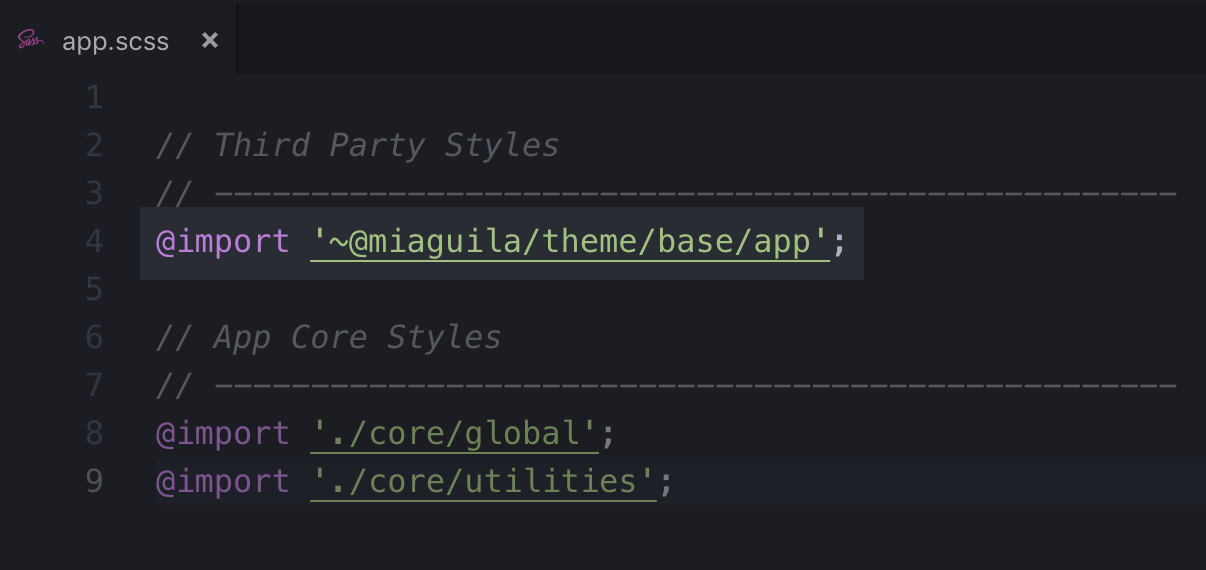
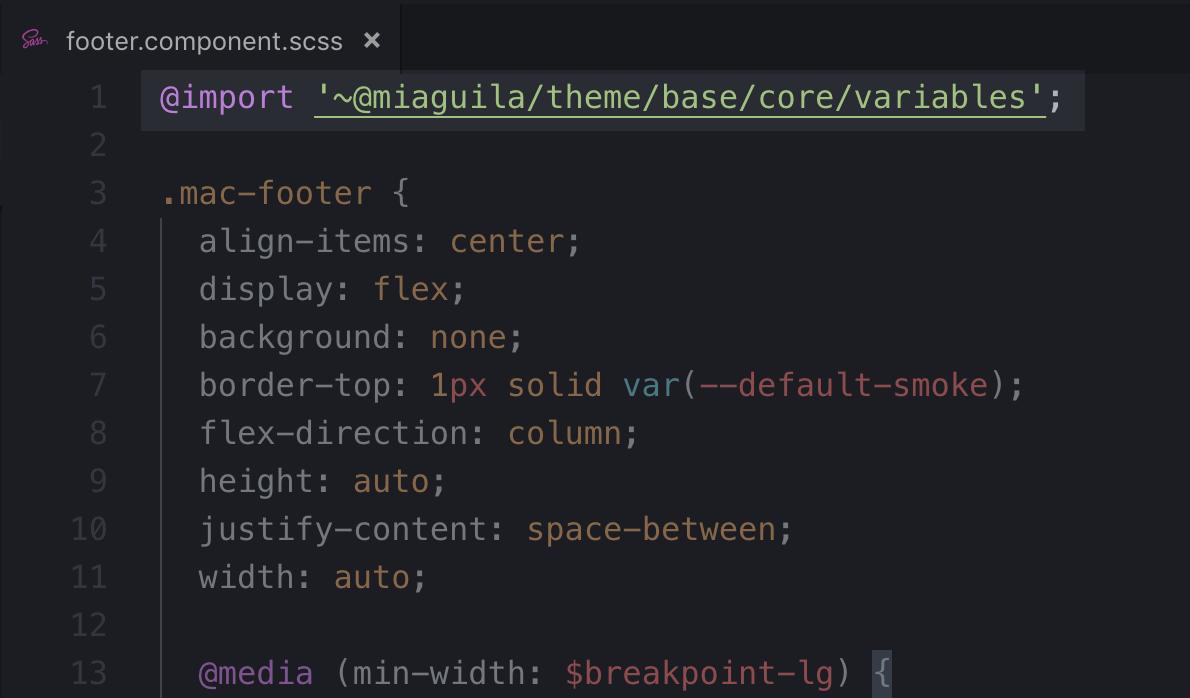
npm install @miaguila/theme --save-dev2. Import the needed library's files on each project's SCSS file that requires the core elements. You could either import the entry point file (@miaguila/theme/base/app.scss) in order to have access to each core element, or just import the specific required file (e.g. variables.scss):


3. Within the file where you import the theme library resources, you can have access to the variables, utility classes, mixins, etc:
Utility classes
<div class="steps-block">
	<h2 class="title2 text-slate mb-12 text-center">
		Hello world
	</h2>
</div>
Sass variables
// $breakpoint-lg: global responsive breakpoint
.puv-block {
  @media (min-width: $breakpoint-lg) {
    left: 160px;
    top: 45%;
    transform: translate(0px, -50%);
  }
}
Primitive variables (color palette, font size base, etc)
.mac-footer {
  align-items: center;
  background: none;
  border-top: 1px solid var(--default-smoke);
	font-size: var(--font-size-base);
	display: flex;
}
Push and Deploy new features
Whenever someone wants to make a change on the core in theme library, it's needed to follow the bellow steps:
1. Clone the Github project:
git clone [[email protected]:MiAguila/miaguila-kit-theme.git]([email protected]:MiAguila/miaguila-kit-theme.git)2. The library is within the projects folder

3. This project has 2 main branches
master: It's the main branch (it is the Production environment). It's up to date with each library in npm packages repo (https://www.npmjs.com/).
develop: It's the branch where gather all the new features before being approved by the reviewer in order to merge with master branch.
4. Create a new branch from the respective parent branch: For example, If you are going to add or change something in theme library, you should create the new branch from develop.
when you will push your changes, you have to follow the below flow:
(theme)-my-branch → lib-theme → develop → master
- Make your changes in the new branch (e.g. **feature/**add-new-color).
- If everything is Ok (all the test pass, code reviewer approves, etc), make a pull request from **feature/**add-new-color to develop branch.
- If everything is Ok (all the test pass, code reviewer approves, etc), make a pull request from develop to master branch.
- The continuous integration system is going to take the new changes pushed in the master branch, it will auto-increment version number of each library, publish new changes in npm packages repo and deploy it to the storybook environment.
