
@mdbootstrap/react-slider
v1.0.1
Published
Responsive React Sliders built with Bootstrap 5. Range slider bar with label or a carousel image slider? No matter what you are looking for, we've got you covered.
Downloads
6
Maintainers
 mdbootstrap
Readme
Responsive React Sliders built with Bootstrap 5. Range slider bar with label or a carousel image slider? No matter what you are looking for, we've got you covered.
Check out React Bootstrap Slider Documentation for detailed instructions & even more examples.
:warning: Important!:The term "Bootstrap Slider" is currently very ambiguous. There are two distinct components, that are both colloquially referred to as "Slider" by some developers. We created this page to help you find the proper component that you are looking for. You will find more examples of each one in the main documentation pages that are linked below.
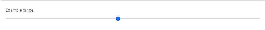
Range Slider
If you were looking for something that looks like the "slider" below, check out the Range Slider documentation, for more examples & customization options for this component.
import React from "react";
import { MDBRange } from "mdb-react-ui-kit";

export default function App() {
  return (
    <MDBRange defaultValue={50} id="customRange" label="Example range" />
  );
}
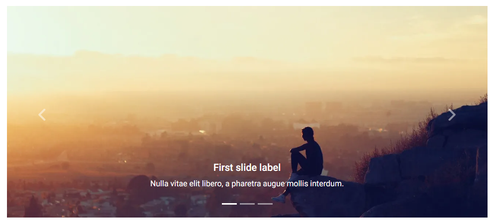
Carousel Slider
If you were looking for something that looks like the "slider" below, check out the Carousel Slider documentation, for more examples & customization options for this component.
import React from "react";
import { MDBCarousel, MDBCarouselItem } from "mdb-react-ui-kit";

export default function CarouselSlider() {
  return (
    <MDBCarousel showIndicators showControls fade>
      <MDBCarouselItem
        className="w-100 d-block"
        itemId={1}
        src="https://mdbootstrap.com/img/Photos/Slides/img%20(15).jpg"
        alt="..."
      >
        <h5>First slide label</h5>
        <p>Nulla vitae elit libero, a pharetra augue mollis interdum.</p>
      </MDBCarouselItem>

      <MDBCarouselItem
        className="w-100 d-block"
        itemId={2}
        src="https://mdbootstrap.com/img/Photos/Slides/img%20(22).jpg"
        alt="..."
      >
        <h5>Second slide label</h5>
        <p>Lorem ipsum dolor sit amet, consectetur adipiscing elit.</p>
      </MDBCarouselItem>

      <MDBCarouselItem
        className="w-100 d-block"
        itemId={3}
        src="https://mdbootstrap.com/img/Photos/Slides/img%20(23).jpg"
        alt="..."
      >
        <h5>Third slide label</h5>
        <p>
          Praesent commodo cursus magna, vel scelerisque nisl consectetur.
        </p>
      </MDBCarouselItem>
    </MDBCarousel>
  );
}
How to use?
Download MDB React - free UI KIT
Choose your favourite customized component and click on the image
Copy & paste the code into your MDB project
▶️ Subscribe to YouTube channel for web development tutorials & resources