
@material-spirit/ngx-split-button
v1.0.1
Published
[](https://openbase.com/js/@material-spirit/ngx-split-button?utm_source=embedded&utm_medium=badge&u
Downloads
5

Readme
Angular Material Split Button

DEMO → https://split-button.material-spirit.dev
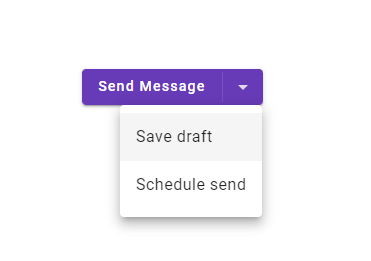
A split button is a type of button that allows users to select a default action and access additional options with a dropdown menu.
The idea behind the MasSplitButton design is to create a split button component that is unified with Angular Material
in terms of approach, API and styling/theming.
- It uses Angular Material Menu in order to implement the dropdown menu feature.
- Its Sass API consumes standard Angular Material theme config in order to ensure a consistent user experience.
- It reuses a lot of Angular Material Button's code to ensure maximum compatibility with future versions.
Getting Started
yarn add @material-spirit/ngx-split-buttonImport MasSplitButtonModule module in your app's module.
app.module.ts
import { MasSplitButtonModule } from "@material-spirit/ngx-split-button";
...

@NgModule({
    ...
    imports: [ MasSplitButtonModule ],
    ...
});
You can choose from pre-built CSS theme files, or apply your custom Angular Material theme using Sass API.
Option 1. Using pre-built CSS files
The package includes four pre-built CSS files, which match standard Angular Material pre-built themes:
@material-spirit/ngx-split-button/prebuilt/deeppurple-amber.css@material-spirit/ngx-split-button/prebuilt/indigo-pink.css@material-spirit/ngx-split-button/prebuilt/pink-bluegrey.css@material-spirit/ngx-split-button/prebuilt/purple-green.css
Similar to including Angular Material pre-built theme, to include Split Button's pre-built theme in your application, add your chosen CSS file to the styles array of your project's angular.json file.
angular.json
...
    "styles": [
      "@material-spirit/ngx-split-button/prebuilt/pink-bluegrey.css"
    ],
...
Option 2. Using custom Angular Material theme via Sass API
@use '@angular/material' as mat;
@use '@material-spirit/ngx-split-button' as mas-split-button;

// Emit core Split Button styles.
@include mas-split-button.core-styles;


// If you have not already done so, define your custom Angular Material theme.
$my-primary: mat.define-palette(mat.$indigo-palette, 500);
$my-accent: mat.define-palette(mat.$pink-palette, A200, A100, A400);

$my-theme: mat.define-light-theme((
 color: (
   primary: $my-primary,
   accent: $my-accent,
 ),
 density: 0,
));


// Emit styles that depend on the theme config.
@include mas-split-button.theme($my-theme);
Use
<mas-split-button
  type="elevated"
  color="primary"
  [matMenu]="buttonMenu">
  Split Button
</mas-split-button>

<mat-menu #buttonMenu="matMenu">
  <button mat-menu-item>Action 2</button>
  <button mat-menu-item>Action 3</button>
</mat-menu>
See documentation for MatSplitButton for more information.