@marxlnfcs/ngx-grid
v2.5.0
Published
Angular library to create a simple grid layout
Downloads
122
Maintainers
Readme

Installation
npm i @marxlnfcs/ngx-grid
Usage
Module:
Import NgxGridModule from @marxlnfcs/ngx-grid
import { NgxGridModule } from '@marxlnfcs/ngx-grid-alt';

@NgModule({
  imports: [
    NgxGridModule.forRoot({ ... })
  ]
})
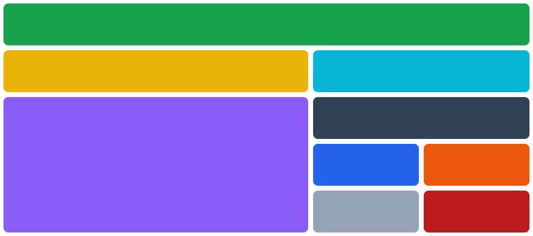
Grid component
Simple component to build a dynamic and easy to use grid layout
<ngx-grid>
  <ngx-grid-column>...</ngx-grid-column>
  <ngx-grid-column>...</ngx-grid-column>
  <ngx-grid-group>
    <ngx-grid-column>...</ngx-grid-column>
    <ngx-grid-column>...</ngx-grid-column>
  </ngx-grid-group>
</ngx-grid>
Options for Grid component: <ngx-grid>
strategy- Defines the strategy of the grid component. SCREEN uses the media queries and CONTAINER uses the container queries which is experimental, Possible values: screen, containerbaseBreakpoint- Defines the base breakpoint of this component. (default isxs), Possible values: xs, sm, md, lg, xl, 2xl, 3xl, 4xlbaseSize- Defines the default column size of the grid. (default is12), Possible values: 2, 4, 6, 8, 10, 12gap- Sets the spacing between all columns and rows. (default is1rem)columnGap- Sets the spacing between all columns. (default is the value of thegapoption)rowGap- Sets the spacing between all rows. (default is the value of thegapoption)autoRows- Whether to use the grid-auto-rows feature. (default isfalse)rows- Accepts a list of strings to define the size of each row statically. (default isnull)
Options for the grid column directive: <ngx-grid-column>
For every directive there are multiple size, offset and order options for each breakpoint.
The [size], [offset] and [order] input uses the current base breakpoint.
Breakpoints: xs, sm, md, lg, xl, 2xl, 3xl and 4xl
Sizes: 1-12
Offset sizes: 2, 4, 6, 8, 10
size- Sets the width (1-12) of the column. (default is12)*:size- Sets the width (1-12) of the column. (default is12)offset- Sets the distance from the left. (default isnull)*:offset- Sets the distance from the left. (default isnull)order- Sets the position of the column. (default isnull)*:order- Sets the position of the column. (default isnull)
Options for the grid group directive: <ngx-grid-group>
For every directive there are multiple size, offset and order options for each breakpoint.
The [size], [offset] and [order] input uses the current base breakpoint.
Breakpoints: xs, sm, md, lg, xl, 2xl, 3xl and 4xl
Sizes: 1-12
Offset sizes: 2, 4, 6, 8, 10
gap- Sets the spacing between all columns and rows. (default is1rem)columnGap- Sets the spacing between all columns. (default is the value of thegapoption)rowGap- Sets the spacing between all rows. (default is the value of thegapoption)autoRows- Whether to use the grid-auto-rows feature. (default istrue)rows- Accepts a list of strings to define the size of each row statically. (default isnull)size- Sets the width (1-12) of the column. (default is12)*:size- Sets the width (1-12) of the column. (default is12)offset- Sets the distance from the left. (default isnull)*:offset- Sets the distance from the left. (default isnull)order- Sets the position of the column. (default isnull)*:order- Sets the position of the column. (default isnull)
Grid centered component
Simple component to center a specific size of container
<ngx-grid-centered>
  ...
</ngx-grid-centered>
Options for the grid centered component: <ngx-grid-centered>
For every breakpoint, there is a native size option.
The [size] input uses the current base breakpoint.
Breakpoints: xs, sm, md, lg, xl, 2xl, 3xl and 4xl
Sizes: 1-12
size- Sets the width (1-12) of the column. (default is12)*:size- Sets the width (1-12) of the column. (default is12)autoRows- Whether to use the grid-auto-rows feature. (default isfalse)
*ngxScreenSize structural directive
Structural directive to add/remove an element if the defined breakpoint fits.
<div *ngxScreenSize"'xs'">
...
</div>[.class] and [.style] directive
Directive to add classes and/or styles based on the breakpoint
<div
  [xs.class]="'class1, class2'"
  [xs.class]="['class1', 'class2']"
  [xs.class]="{ class1: true, class2: true }"

  [xs.style]="'display: none; color: black;'"
  [xs.style]="['display: none', 'color: black; background-color: green;']"
  [xs.style]="{ 'display': 'none', 'color': 'black' }"
>
  ...
</div>
Global Options
In the forRoot method when importing the grid module in the app module you can specify the following options that will be globally applied to all grid instances.
strategy- Defines the strategy of the grid component. SCREEN uses the media queries and CONTAINER uses the container queries which is still experimental, Possible values: screen, containerbaseBreakpoint- Defines the base breakpoint of this component. (default isxs), Possible values: xs, sm, md, lg, xl, 2xl, 3xl, 4xlbaseSize- Defines the default column size of the grid. (default is12), Possible values: 2, 4, 6, 8, 10, 12gap- Sets the spacing between all columns and rows. (default is1rem)columnGap- Sets the spacing between all columns. (default is the value of thegapoption)rowGap- Sets the spacing between all rows. (default is the value of thegapoption)autoRows- Whether to use the grid-auto-rows feature. (default isfalse)breakpoints- Key-Value object with name of breakpoint as key and minWidth as number
