@mariohamann/wc-storybook-helpers
v1.3.5
Published
Helpers designed to make integrating Web Components with Storybook easier. Fork from https://github.com/break-stuff/wc-storybook-helpers
Downloads
1,147
Maintainers
Readme
Storybook Helpers for Web Components
This is a fork from https://github.com/break-stuff/wc-storybook-helpers. Maybe the original is more up-to-date than this fork.
Helpers designed to make integrating Web Components with Storybook easier.
There are a number of things that this helper library does to provide devs with a better experience with Storybook and Web Components:
- Uses types to intelligently provide better controls
- Prevents name collisions when attributes, properties, slots, and CSS shadow parts share the same name
- Provides a template with bindings for attributes, properties, CSS custom properties, and CSS shadow parts.
- Provides two-way binding for controls and attributes in the template to help keep control values in sync with the component
Before You Install
- Follow the installation steps in the Storybook docs
- Load you custom elements manifest into Storybook in the
preview.jsfile:
import { setCustomElementsManifest } from "@storybook/web-components";
import customElements from "../custom-elements.json";

setCustomElementsManifest(customElements);- Add the expanded controls to your config in the
preview.jsfile:
export const parameters = {
  ...
  controls: {
    expanded: true,
    ...
  },
}
Installation
npm i -D wc-storybook-helpersSetup
Import the storybook helpers into your story:
import { getWcStorybookHelpers } from "wc-storybook-helpers";Pass your element's tag name into the Storybook helper function.
const {
	events,
	args, // for Storybook 7
	argTypes,
	template,
	manifest, // if you want to use the manifest for something else
} = getWcStorybookHelpers("my-element", {
	/* options */
});
l You can set the following option:
showArgRef: boolean; // default: false; show the arg ref in the descriptionAdd the args, argTypes and events to your story config:
export default {
	title: "Components/My Element",
	component: "my-element",
	args, // for Storybook 7
	argTypes,
	parameters: {
		actions: {
			handles: events,
		},
	},
};
Add the template to your story's template and pass in the story args into the template function (this is an optional parameter, but required for arguments to function properly):
const DefaultTemplate = (args: any) => template(args);

export const Default: any = DefaultTemplate.bind({});
Default.args = {};
argTypes
Based on the data in the custom elements manifest, the helpers will apply appropriate descriptions and control types to your arguments.
Control Types
The default control types are not always the most helpful. The helper will use your types try to identify the appropriate input and options for your control.
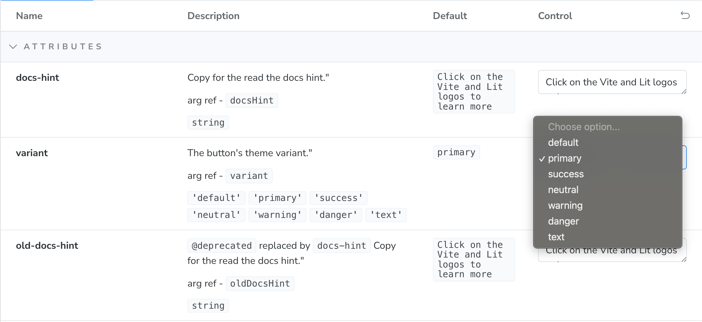
For example if your component has an attribute called variant with predefined values, the helper will convert it to a select that is pre-populated with the appropriate values and the default value selected.

Name-Spaced Controls
One of the challenges with the default implementation is that if there are multiple properties with the same name, they will be overridden. For example, if there is an attribute named label as well as a slot named label only one will display. In order to ensure every argument is displayed properly, arguments will be suffixed with -attr, -prop, ans -slot respectively (CSS Custom Properties don't receive one because they already have a unique property value).
The reference name will be documented with the control's description.

That reference can then be used to bind default values to the template.
const DefaultTemplate = (args: any) => template(args);

export const Default: any = DefaultTemplate.bind({});
Default.args = {
	"docs-hint-attr": "Some other value than the default",
};
Deprecated Controls
If you use the @deprecated tag in your jsDoc descriptions, those will also display in the description.
/**
 * @deprecated replaced by `docs-hint`
 * Copy for the read the docs hint.
 */
@property({ attribute: "old-docs-hint", reflect: true })
oldDocsHint = "Click on the Vite and Lit logos to learn more";
Overriding Controls
If you would like to change any of your controls, you can easily override it using the spread operator and passing in an updated argType after the helper argTypes.
export default {
  title: "Components/My Element",
  component: "my-element",
  argTypes: {
    ...argTypes,
    'docs-hint-attr': {
      name: 'docs-hint',
      description: '...',
      defaultValue: '...',
      control: {
        type: '...',
      },
      table: {
        category: 'attributes',
        defaultValue: {
          summary: '...',
        },
        type: {
          summary: '`string`',
        },
      },
  },
  ...
};
Events
If you want to capture the events output by your component, you can map them to your story's config under the parameter's section.
Note: They will only be captured if the bubbles option on your CustomEvent is set to true (it is true by default).
export default {
  ...
  parameters: {
    actions: {
      handles: events,
    },
  },
};
If you would like to map additional events to your story, you can use the spread operator to extend the values.
export default {
  ...
  parameters: {
    actions: {
      handles: [...events, 'my-other-event'],
    },
  },
};
Templates
Templates are configured to automatically map the control's attributes, properties, CSS custom properties, and CSS shadow parts to your element as well as provide two-way data binding for the component attributes back to the controls to keep them in sync.
Templates take 2 arguments - story arguments and slot data. You can use the controls and story args to provide slot data, but if you want more granular control, using the slot parameter on the template with more editor support.
const SelectTemplate = (args: any) =>
	template(
		args,
		html`
			<span slot="label">My Select</span>
			<my-option>Option 1</my-option>
			<my-option>Option 2</my-option>
			<my-option>Option 3</my-option>
		`
	);

export const Default: any = SelectTemplate.bind({});
Default.args = {
	"docs-hint-attr": "Some other value than the default",
};
Extending Templates
Templates can be interpolated into a template with additional content.
const FormTemplate = (args: any) => html`
	<form>
		${template(
			args,
			html`
				<span slot="label">My Select</span>
				<my-option>Option 1</my-option>
				<my-option>Option 2</my-option>
				<my-option>Option 3</my-option>
			`
		)}

		<button>Submit</button>
	</form>
`;
The template also exposes a variable named component that references the custom element so you can use custom logic with it.
const ComponentTemplate = (args: any) => html`
	${template(
		args,
		html`
			<span slot="label">My Select</span>
			<my-option value="1">Option 1</my-option>
			<my-option value="2">Option 2</my-option>
			<my-option value="3">Option 3</my-option>
		`
	)}
	<script>
		// set property values
		component.value = "2";

		// call component methods
		component.show();
	</script>
`;