@littleplusbig/gatsby-theme-faqs-prismic
v1.0.20
Published

Downloads
20
Maintainers
Readme

Gatsby Theme FAQs Prismic
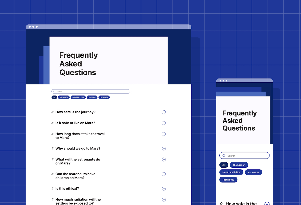
- Gatsby Theme for adding a pretty FAQ page for Gatsby projects, out of the box 🌻🙋
- Responsive across Mobiles 📱, Tablets 💊 and Desktops 🖥️
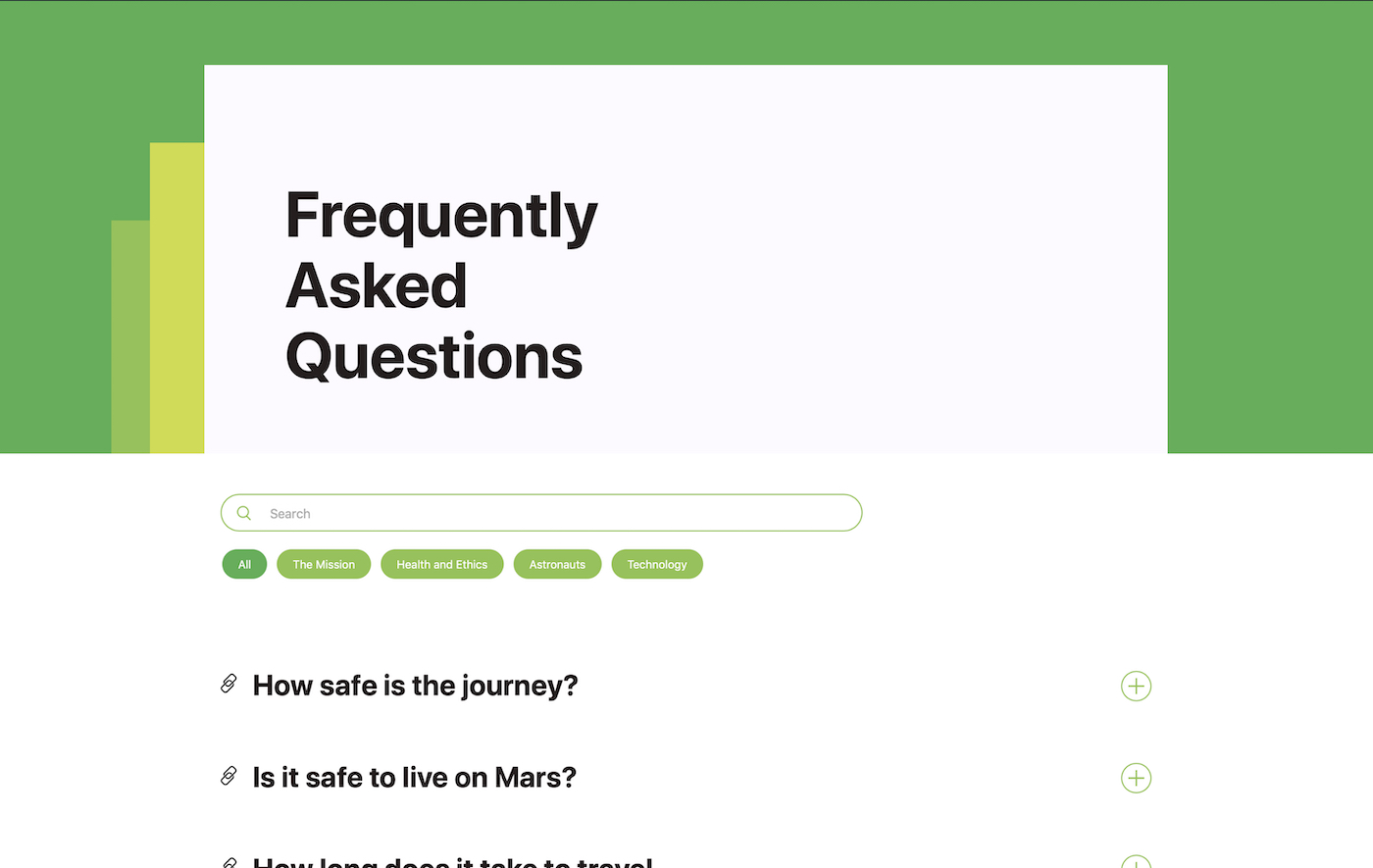
- Customisable to your brand using Theme UI 🎨
- Builds FAQ page(s) sourced from content in Prismic
- Demo at https://gatsby-theme-faqs.netlify.com/
- Made by Little & Big
Why?
The Frequently Asked Questions (FAQ) is a common place page on most website. Though, it doesn't exactly summon the creative juices, it's a pretty basic page, much like legal pages.
The idea of gatsby-theme-faqs-prismic is do it once well - a super neat, clean and responsive implementation. It's reusable, theme-able and customisable 🎉
Installation
yarn add @littleplusbig/gatsby-theme-faqs-prismicConfiguration
In your gatsby-config.js, under plugins add:
{
  resolve: "gatsby-theme-faqs-prismic",
  options: {
    prismicRepositoryName: PRISMIC_REPO_NAME,
    prismicAccessToken: PRISMIC_API_KEY,
    siteName: YOUR_SITE_NAME, // (Optional)
    homePath: HOME_PATH // (Optional) Defaults to '/'
  },
},
Replacing PRISMIC_REPO_NAME, PRISMIC_API_KEY, YOUR_SITE_NAME and HOME_PATH with their respective values.
Prismic Configuration
- Create a new custom type in your Prismic repository.
- Make sure that it is repeatable and name it
Question Category. - Using the JSON Editor paste in the following content structure:
{
  "Main" : {
    "category_name" : {
      "type" : "StructuredText",
      "config" : {
        "single" : "heading1",
        "label" : "Category Name",
        "placeholder" : "Category Name"
      }
    },
    "uid" : {
      "type" : "UID",
      "config" : {
        "label" : "Category Slug",
        "placeholder" : "category-slug"
      }
    }
  }
}
Create one or more
Question CategoryContent pages.Next, create another custom type in your Prismic repository, singular or repeatable depending on your needs, and name it
Frequently Asked Questions.Using the JSON Editor paste in the following content structure:
{
  "Main": {
    "page_name": {
      "type": "StructuredText",
      "config": {
        "single": "heading1",
        "label": "Page Name",
        "placeholder": "Enter page name"
      }
    },
    "uid": {
      "type": "UID",
      "config": {
        "label": "Slug",
        "placeholder": "Enter slug"
      }
    },
    "hero_subtitle": {
      "type": "StructuredText",
      "config": {
        "single": "paragraph",
        "label": "Hero Subtitle",
        "placeholder": "You have questions, we have answers"
      }
    },
    "questions": {
      "type": "Group",
      "config": {
        "fields": {
          "question": {
            "type": "StructuredText",
            "config": {
              "single": "heading2",
              "label": "Question",
              "placeholder": "How safe is the journey?"
            }
          },
          "answer": {
            "type": "StructuredText",
            "config": {
              "multi": "paragraph, heading3, heading4, heading5, heading6, strong, em, hyperlink, image, embed, list-item, o-list-item, o-list-item",
              "allowTargetBlank": true,
              "label": "Answer",
              "placeholder": "The trip to Mars cannot be called risk free. Like any venture..."
            }
          },
          "category": {
            "type": "Link",
            "config": {
              "select": "document",
              "customtypes": [
                "question_category"
              ],
              "label": "Category"
            }
          }
        },
        "label": "Questions"
      }
    }
  },
  "SEO": {
    "meta_title": {
      "type": "StructuredText",
      "config": {
        "single": "heading1",
        "label": "Meta Title",
        "placeholder": "Enter meta title"
      }
    },
    "meta_description": {
      "type": "StructuredText",
      "config": {
        "single": "paragraph",
        "label": "Meta Description",
        "placeholder": "Enter meta description"
      }
    },
    "open_graph_image": {
      "type": "Image",
      "config": {
        "constraint": {
          "width": 1200,
          "height": 630
        },
        "thumbnails": [],
        "label": "Open Graph Image"
      }
    }
  }
}- Create a
Frequently Asked Questioncontent page.
Overriding the Theme
Colors and Styles
This project uses theme-ui, allowing some of the styling to be customised to your project's brand.
In order to override the styles, in the src directory of your project, add a folder titled gatsby-plugin-theme-ui, and within that folder a file named index.js.
Inside of this file (your-gatsby-project/src/gatsby-plugin-theme-ui/index.js) add the following:
import baseTheme from '@littleplusbig/gatsby-theme-faqs-prismic/src/gatsby-plugin-theme-ui';

export default {
  ...baseTheme,
  fonts: {
    ...baseTheme.fonts,
    body: '-apple-system, BlinkMacSystemFont, Segoe UI, Roboto, sans-serif',
    heading: '-apple-system, BlinkMacSystemFont, Segoe UI, Roboto, sans-serif',
  },
  colors: {
    ...baseTheme.colors,
    text: '#333333',
    background: '#FFFFFF',
    primary: '#1e3799',
    primaryLight: '#4a69bd',
    primaryDark: '#0c2461',
    white: '#FFFFFF',
    offWhite: '#FCFAFF',
    black: '#000000',
    offBlack: '#333333',
    grey: '#F3F3F3',
  },
};
Above are the default values for the theme, which you can change depending on your project.
For example, here is how I might change the theme colours from shades of purple, to a refreshing green:
import baseTheme from '@littleplusbig/gatsby-theme-faqs-prismic/src/gatsby-plugin-theme-ui';

export default {
  ...baseTheme,
  colors: {
    ...baseTheme.colors,
    primary: '#8BC34A',
    primaryLight: '#CDDC39',
    primaryDark: '#4CAF50',
  },
};

The complete set of customisable theme values can be explored in gatsby-theme-faqs-prismic/src/styles/theme.js
More information about gatsby-plugin-theme-ui here.
Components
The components that make up the Frequently Asked Questions pages can be some what customised too. This can be done through concept new to Gatsby Themes called 'Component Shadowing'.
If you wish to override a component, in the src directory of your project, create the following directory structure: @littleplusbig/gatsby-theme-faqs-prismic/components.
There are several components that a Frequently Asked Questions page, they can all be viewed here: gatsby-theme-faqs-prismic/src/components
An example of how these components might be customised is adding your project's <Header /> and <Footer /> components to the layout.
In order to do this I create a shadowing layout.js in the directory we've just created (your-gatsby-project/src/@littleplusbig/gatsby-theme-faqs-prismic/components/layout.js):
import React from 'react';
import { Header, Footer } from '../../somewhere-in-your-project'

export default ({ children }) => (
  <>
    <Header />
    {children}
    <Footer />
  </>
);