@kokotree-inc/ng-bootstrap-date-range-picker
v1.2.5
Published
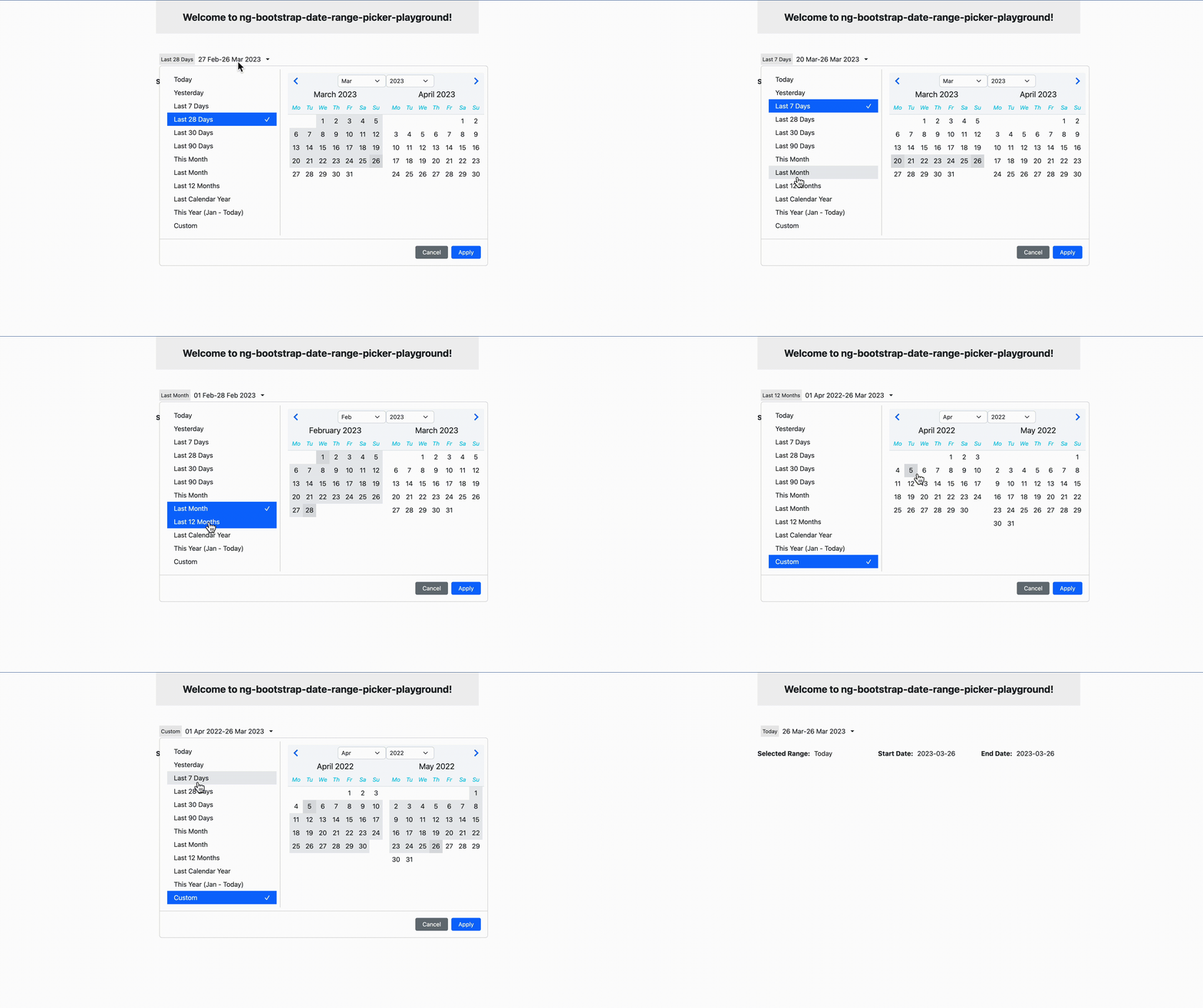
Angular library for displaying a customizable date range picker with support for presets, date ranges, and calendar views using the ng-bootstrap library.
Downloads
29
Maintainers
Readme
Preview

Installation
$ npm i @kokotree-inc/ng-bootstrap-date-range-pickerUsage
Import the DateRangePickerModule module in your app module or page module:
    import { DateRangePickerUtils, DateRangePickerModule } from '@kokotree-inc/ng-bootstrap-date-range-picker';
    import { NgbModule } from '@ng-bootstrap/ng-bootstrap';

    @NgModule({
        declarations: [....],
        imports: [...., DateRangePickerModule, NgbModule],
        providers: [DateRangePickerUtils],
        bootstrap: [....]
    })
    export class AppModule {}
Also add the DateRangePickerUtils provider to your app module or page module providers.
Include the DateRangePickerComponent in your page template HTML:
<app-date-range-picker [dateRangeKey]="dateRangeKey" (rangeChanged)="onRangeChanged($event)"> </app-date-range-picker>In your page script, define the onRangeChanged function to receive the date range selection changes:
import { DateRangeChange, DATE_RANGE_OPTIONS } from '@kokotree-inc/ng-bootstrap-date-range-picker';

export class YourComponent implements OnInit {
  dateRangeKey = DATE_RANGE_OPTIONS.Last28Days;

  constructor() {}

  onRangeChanged(dateRangeChange: DateRangeChange) {
    const { dateRange, startDate, endDate } = dateRangeChange;
    console.log('Date range:', dateRange);
    console.log('Start date:', startDate.format('YYYY-MM-DD'));
    console.log('End date:', endDate.format('YYYY-MM-DD'));
    // do something with the selected date range
  }
}
Inputs
- dateRangeKey: The default date range option to show. Possible values are defined in the DATE_RANGE_OPTIONS enum exported by ng-bootstrap-date-range-picker. Default value is DATE_RANGE_OPTIONS.Last28Days.
- btnApplyClass: The CSS class to apply to the "Apply" button. Default value is 'btn-primary'. pickerCustomClass: The CSS class to apply to the date range picker. Default value is ''.
Outputs
- rangeChanged: Emitted when the date range selection is changed. The output is an object of type DateRangeChange, which contains the selected date range, start date, and end date.
Playground Project
There is an included playground project for the ng-bootstrap-date-range-picker component, located at projects/ng-bootstrap-date-range-picker-playground.
To run the playground project, navigate to the project directory in the terminal and run:
ng serveThis will start a local server at http://localhost:4200/, where you can run and test the component.
Please note that ng-bootstrap-date-range-picker-playground project is intended for testing and experimentation purposes only, and should not be used in a production environment.
