
@knowbly/vue-virtual-collection
v1.0.0
Published
Vue component for efficiently rendering large collection data
Downloads
5
Maintainers
 knowblynpm
Readme
vue-virtual-collection


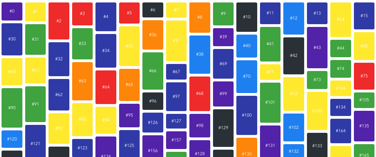
Vue component for efficiently rendering large collection data. Inspired by react-virtualize
Usage
Install
npm i vue-virtual-collectionimport
import Vue from 'vue'
import VirtualCollection from 'vue-virtual-collection'

Vue.use(VirtualCollection)
Use it !
<template>
    <div>
        <VirtualCollection :cellSizeAndPositionGetter="cellSizeAndPositionGetter" :collection="items" :height="500" :width="330">
            <div slot="cell" slot-scope="props">{{props.data}}</div>
        </VirtualCollection>
    </div>
</template>

<script>
    export default {
        data () {
            return {
                /**
                 * This will create 1000 items like:
                 * [
                 *   { data: '#0' },
                 *   { data: '#1' },
                 *   ...
                 *   { data: '#999' }
                 * ]
                 */
                items: new Array(1000).fill(0).map((_, index) => ({ data: '#' + index }))
            }
        },
        methods: {
            cellSizeAndPositionGetter(item, index) {
                // compute size and position
                return {
                    width: 100,
                    height: 150,
                    x: (index % 2) * 110,
                    y: parseInt(index / 2) * 160
                }
            }
        }
    }
</script>
Props
cellSizeAndPositionGetter
Type: Function
(item: object, index: number) -> ({ height: number, width: number, x: number, y: number })
Required: ✓
Callback responsible for returning size and offset/position information for a given cell
function cellSizeAndPositionGetter(item, index) {
    return {
        width: item.width,
        height: item.height,
        x: item.x,
        y: item.y
    }
}
collection
Type: Array
Required: ✓
The Data for cells to render. Each object in array Must contains data property, which will be passed into slot scope.
const collection = [
    { data: { text: "#1" } },
    { data: { text: "#2" } },
    { data: { text: "#3" } },
    // ...
]
width
Type: number
Required: ✓
The width of collection
height
Type: number
Required: ✓
The height of collection
sectionSize
Type: number
Optionally override the size of the sections a Collection's cells are split into. This is an advanced option and should only be used for performance tuning purposes.
Slots
cell
<div slot="cell" slot-scope="yourOwnScope">{{yourOwnScope.data.text}}</div>The data property in items of collection will be passed into the slot scope.
const collection = [
    { data: { text: "#1" } },
    { data: { text: "#2" } },
    { data: { text: "#3" } },
    // ...
]