@iyio/at-dot-css
v0.8.18
Published
A fast and lightweight css-in-js library. The at-dot-css is a superset of css with a few simple additions to make it a little easier to scope component styles, work with variables and define responsive breakpoints.
Readme
at-dot-css
A fast and lightweight css-in-js library. The at-dot-css is a superset of css with a few simple additions to make it a little easier to scope component styles, work with variables and define responsive breakpoints.
The syntax is designed to be vary simple to implement, only requiring a simple find and replace algorithm which keeps parsing times to a minimum. There is no nesting, functions or mixins, just good old css with a couple of extra goodies 🤓
Usage
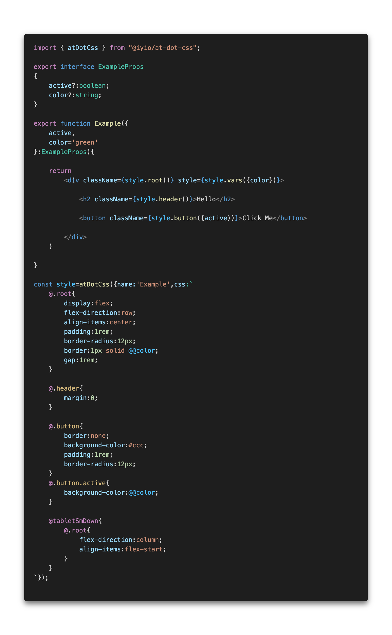
AtDot styles are defined using the atDotCss function. The atDotCss function returns a ParseAtDotStyle
object with functions that correspond to each of the @. selectors defined in the style. After the
first call to a selector function the style is parsed and a new style sheet is inserted into the
head of the document or added to a custom style sheet renderer.
 (note - css-in-js syntax highlighting is provided by the
 high-js vscode extension)
The css in the example above is converted to the css below.
.Example{
    display:flex;
    flex-direction:row;
    align-items:center;
    padding:1rem;
    border-radius:12px;
    border:1px solid var(--Example-color);
    gap:1rem;
}

.Example-header{
    margin:0;
}

.Example-button{
    border:none;
    background-color:#ccc;
    padding:1rem;
    border-radius:12px;
}
.Example-button.active{
    background-color:var(--Example-color);
}

@media(max-width:768px){
    .Example{
        flex-direction:column;
        align-items:flex-start;
    }
}
Using with NextJs
When using at-dot-css in a NextJS project and rending server side or at build time styles are added
to a style queue that is then rendered using the NextJsStyleSheets component from the
@iyio/nextjs-common package. Using the NextJsStyleSheets component allows css generated by
at-dot-css to be included in the css bundles generated by NextJs.
Installation
npm install @iyio/at-dot-cssConfiguration
There is no configuration 🥹, no extra build steps, no messing with webpack. Just install the package and start using it 🥳
The Syntax
All the code examples below assume the name of the current style is "Example".
Root Selector
@.root - The root selector is replaced with the current style name.
/* at-dot */
@.root{
    padding:1rem;
}

/* converted css*/
.Example{
    padding:1rem;
}
Named Selector
@.{selector-name} - Named selectors are prefixed with the name of the current style.
/* at-dot */
@.title{
    margin:1rem 0;
}

/* converted css*/
.Example-title{
    margin:1rem 0;
}
Variables
@@{variable-name} - Variable names are prefixed with the current style name and wrapped in a var function call.
/* at-dot */
.some-name{
    color:@@color;
    width:calc( 100% - @@extraMargin )
}

/* converted css*/
.some-name{
    color:var(--Example-color);
    width:calc( 100% - var(--Example-extraMargin) )
}
(note - when using vars in calculations a space after the var name is required for typescript intellisense to function correctly)
Breakpoint Media Queries
@{break-point} - Breakpoint media queries allow you to quickly define media queries for standard
breakpoints.
/* at-dot */
@tabletSmDown{
    .my-component{
        flex-direction:column;
    }
}
@tabletSmUp{
    .my-title{
        font-size:2rem;
    }
}

/* converted css*/
@media(max-width:768px){
    .my-component{
        flex-direction:column;
    }
}
@media(min-width:577px){
    .my-title{
        font-size:2rem;
    }
}
Breakpoints:
@mobileSmUp- Small mobile breakpoint and up - (all breakpoints)@mobileUp- Mobile breakpoint and up@tabletSmUp- Small tablet breakpoint and up@tabletUp- Tablet breakpoint and up@desktopSmUp- Small desktop breakpoint and up@desktopUp- Desktop breakpoint and up@mobileSmDown- Small mobile breakpoint and down@mobileDown- Mobile breakpoint and down@tabletSmDown- Small tablet breakpoint and down@tabletDown- Tablet breakpoint and down@desktopSmDown- Small desktop breakpoint and down@desktopDown- Desktop breakpoint and down - (all breakpoints)
Syntax Highlighting
Syntax highlighting is provided using the high-js vscode extension
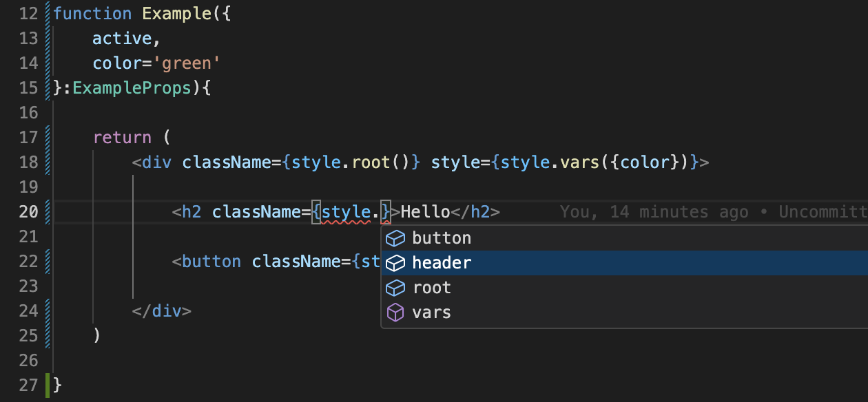
Type Safety
When using at-dot-css with TypeScript you get full type safety and intellisense.

