@interopio/components-react
v0.5.2
Published
React components for the interop.io platform.
Downloads
420
Readme
Overview
The @interopio/components-react library enables you to create your own Components App that will provide system apps for io.Connect Desktop (Channel Selector, dialogs, notifications and more). The library allows complete customization of the io.Connect Desktop system apps. The provided default components can be replaced or extended with your custom ones.
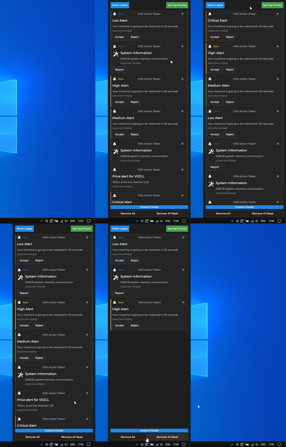
Customized Notification Panel for io.Connect Desktop with custom header, footer and custom text on the buttons for clearing notifications:

Contents
src/assets- contains common asset files;src/components- contains default components for shared UI elements like buttons, forms, icons and more;src/contexts- contains context provider components that are used across the io.Connect Desktop system apps;src/features- contains the default components and hooks for all customizable io.Connect Desktop system apps;src/hooks- contains hooks that are used across the io.Connect Desktop system apps;src/utils- contains reusable functions that are used across the io.Connect Desktop system apps;
Prerequisites
For a io.Connect Desktop project, you must have io.Connect Desktop 9.0 or later.
Install
Components Library
To use the @interopio/components-react library in your project, execute the following command:
npm install @interopio/components-reactStorybook
Storybook is integrated into the project and the currently supported components are added to it. You can use it during development to test components and visualize states more easily.
To build Storybook:
npm run build-storybookTo run Storybook:
npm run storybookUsage
The @interopio/components-react library provides default components and hooks which you can use to build your own Components App for io.Connect Desktop by using, modifying or replacing the available components and functionalities.
The following example demonstrates how to provide customized components for the Channel Selector and the dialogs apps of io.Connect Desktop:
import React, { Suspense, lazy } from "react";
import { RouterProvider, createHashRouter } from "react-router-dom";
import { IODialogs } from "@interopio/components-react";
// Using the default io.Connect themes.
import "@interopio/theme";

// Your custom Channel Selector.
const CustomChannelSelector = lazy(() =>
    import("./my-components/CustomChannelSelector")
);

// Your custom dialog component.
const CustomDialog = () => {
    const { DialogsProvider } = IODialogs;
    const Dialog = lazy(() => import("./my-components/CustomDialog"));

    return (
        <DialogsProvider>
            <Dialog />
        </DialogsProvider>
    );
};

const Loading = () => <div>Loading...</div>;

// Routes used by io.Connect Desktop for loading the system apps.
const routes = [
    {
        path: "channel-selector",
        element: <CustomChannelSelector />,
    },
    {
        path: "dialogs",
        element: <CustomDialog />,
    },
];

// By default, io.Connect Desktop loads its system apps from the file system.
// If your custom apps are hosted remotely, use `createBrowserRouter()` instead.
const router = createHashRouter(routes);

const App = () => {
    return (
        <Suspense fallback={<Loading />}>
            <RouterProvider router={router} />
        </Suspense>
    );
};

export default App;
To replace the default Components App of io.Connect Desktop, you must build your app and place it in the %LocalAppData%\interop.io\io.Connect Desktop\Desktop\assets\components folder.
Features
The @interopio/components-react library currently contains default components and hooks for the following io.Connect Desktop system apps:
- Channel Selector - UI allowing the user to switch between the io.Connect Channels;
- Dialogs - app used for the system dialogs of io.Connect Desktop and for showing dialogs programmatically;
- Download Manager
- Issue Reporting - app used for the Feedback Form of io.Connect Desktop;
- Notifications - apps used for the Notification Panel and the notification toasts of io.Connect Desktop;
