
@heumlabs/vue-datepicker
v0.1.0
Published
[](https://badge.fury.io/js/%40heumlabs%2Fvue-datepicker)
Downloads
12


Readme
Heumlabs Vue Datepicker
Install via npm
npm install @heumlabs/vue-datepickerUsage
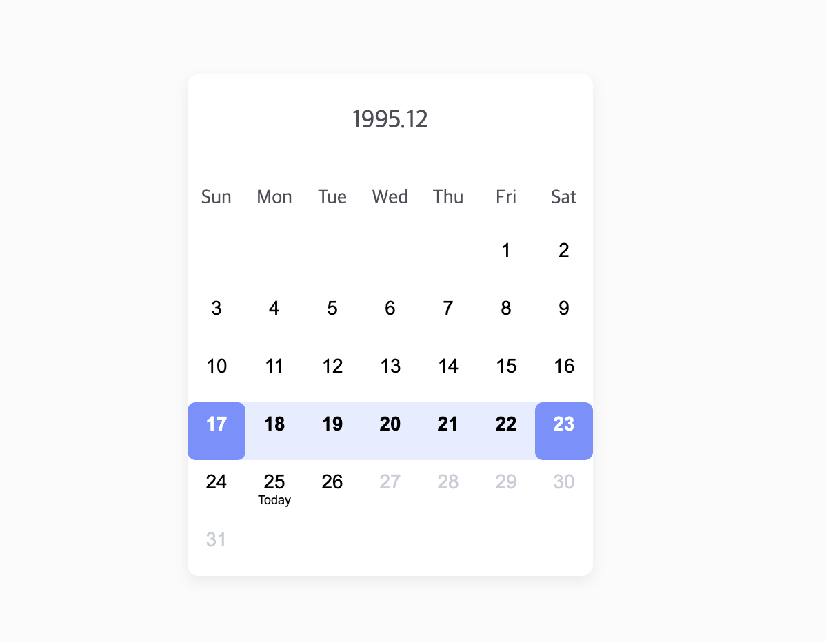
<script lang="ts" setup>
  import { DatePicker } from '@heumlabs/vue-datepicker';
  import '@heumlabs/vue-datepicker/dist/style.css';

  // all date will be converted to start of the day (ex. '1995-12-17T00:00:00')
  const startDate = new Date('1995-12-17T03:24:00');
  const endDate = new Date('1995-12-23T03:24:00');

  const disableDatesAfter = new Date('1995-12-26T18:24:00');

  const customCurrentDate = new Date('1995-12-25T13:07:00');

  const onSelect = (dateString: string) => {
    console.log(dateString) // '2023-01-01'
  }
</script>

<template>
  <div>
    <DatePicker
      :year="2023"
      :month-index="0"
      :start-date="startDate"
      :end-date="endDate"
      :current-date="customCurrentDate"
      :disable-dates-after="disableDatesAfter"
      @select="onSelect"
    />
  </div>
</template>
API
DatePicker
Props
| Name | Description | Type | Required | Default |
|--------------------|-----------------------------------------------------------|-----------|----------|-----------------------------------------------|
| year | year to show | number | yes | |
| monthIndex | month to show (0 ~ 11) | number | yes | |
| headerFormat | header text format | string | no | 'YYYY.M' |
| dayLabels | day labels start from sunday | string[]| no | ['Sun','Mon','Tue','Wed','Thu','Fri','Sat'] |
| todayLabel | text shown below today | string | no | 'Today' |
| startDate | start date for select range | Date | no | |
| endDate | end date for select range | Date | no | |
| selectedDates | dates to show selected | Date[] | no | [] |
| currentDate | to customize current date to show today on different date | Date | no | new Date() |
| disableDatesAfter | show dates disabled after disableDatesAfter | Date | no | |
| disableDatesBefore | show dates disabled before disableDatesBefore | Date | no | |
Events
| Name | Description | Parameters | |--------|---------------------------------------------------|-----------------------------------| | select | date click event. dateString format: 'YYYY-MM-DD' | dateString: string, event: Event |
DateInput
Props
| Name | Description | Type | Required | Default |
|--------------------|---------------------------------------------------------------------------------------|-----------|----------|-------------|
| label | input label text | string | yes | |
| value | formatted date string ('YYYY-MM-DD') or empty string if input string value is invalid | string | yes | |
| disableDatesAfter | property for validation | Date | no | |
| disableDatesBefore | property for validation | Date | no | |
Events
| Name | Description | Parameters | |--------|---------------------------------------------------|-----------------------------------| | input | date input event. dateString format: 'YYYY-MM-DD' | dateString: string | | focus | input focus event. | event: Event | | blur | input blur event. | event: Event |
Changelog
All notable changes to this project will be documented in the Releases Page.
License
The MIT License. Please see for more information.
Thanks to
- Sukyeong Hong([email protected]) for the design