@glue42/notifications-ui-react
v0.1.0
Published
React version of the Glue42 Notifications UI library
Downloads
54


Readme
Overview
The @glue42/notifications-ui-react library enables you to create your own Notifications App for Glue42 Enterprise. The library allows complete customization of the Glue42 Notifications Panel and the notification toasts. The provided default components can be replaced or extended with your custom ones.
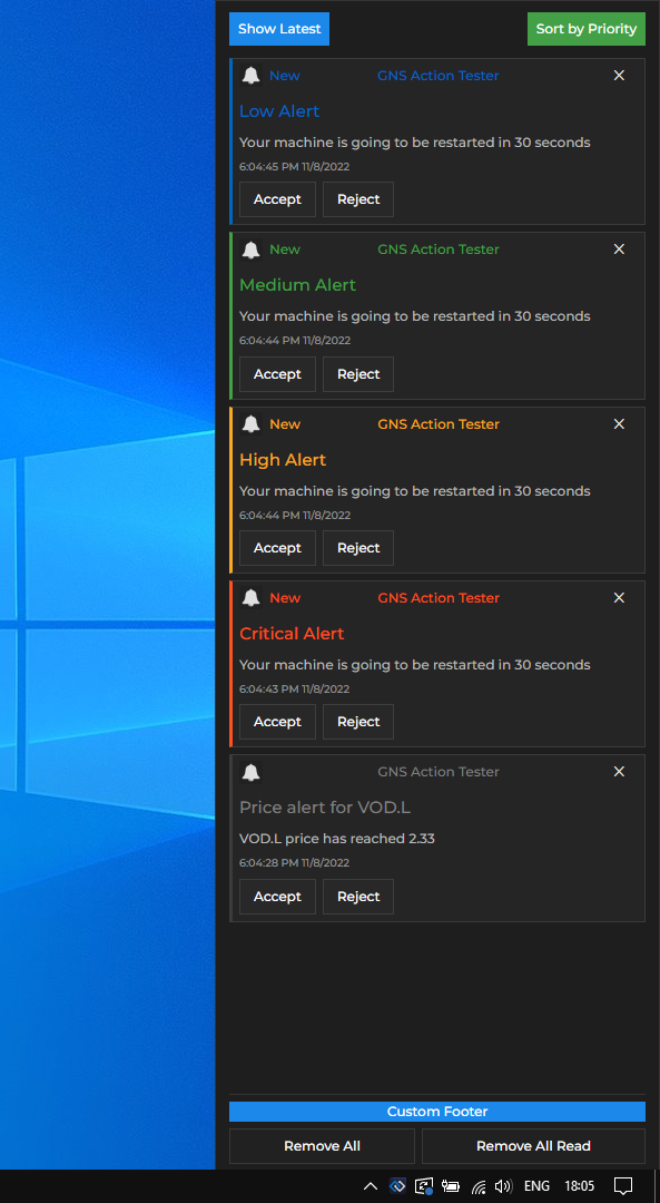
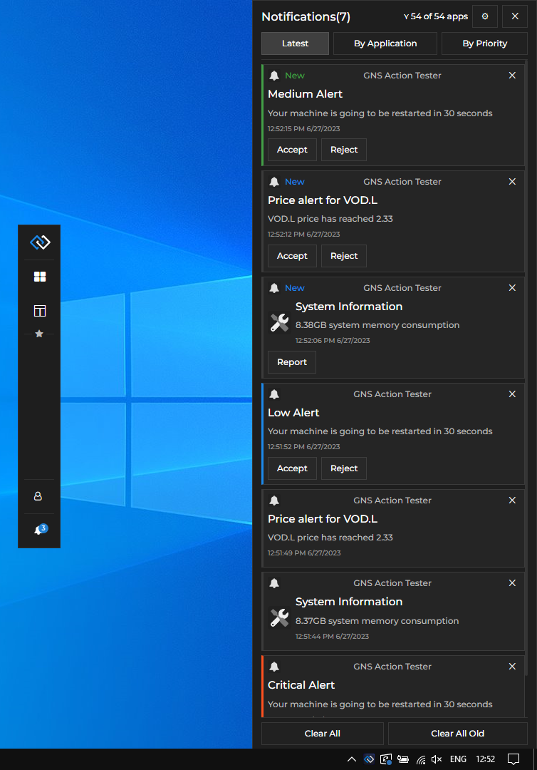
The default Glue42 Notification Panel:
Prerequisites
For a Glue42 Enterprise project, you must have Glue42 Enterprise 3.17 or later.
Install
To use the library in your project, execute the following command:
npm install @glue42/notifications-ui-react
npm install @glue42/desktop
Configuration
By default, notifications are enabled in Glue42 Enterprise. The notification settings are in the system.json configuration file located in the %LocalAppData%\Tick42\GlueDesktop\config folder:
{
    "notifications": {
        // Settings for the Glue42 notifications.
        "enabled": true,
        // Specify lists of allowed and/or forbidden URLs.
        "sourceFilter": {
            "allowed": [
                "*"
            ]
        },
        // Amount of time in milliseconds specifying how long the notification toast will be shown.
        "toastExpiry": 15000
    }
}
To use your custom Notifications App built with the @glue42/notifications-ui-react library, modify the notifications.json app configuration file located in %LocalAppData%\Tick42\GlueDesktop\config\apps. Set the "url" property of the "details" top-level key to the URL of your custom Notifications App:
{
    "details": {
        "url": "http://localhost:3000"
    }
}
To change the location of the Notification Panel, use the "placement" property. The following example demonstrates how to place the Notification Panel on the left of the screen and change its width in pixels:
{
    "details": {
        "placement": {
            // Make the Notification Panel preserve its specific position in case of screen resolution changes.
            "snapped": true,
            // Place the Notification Panel on the left of the screen.
            "horizontalAlignment": "left",
            // Stretch the Notification Panel to occupy the entire screen height.
            "verticalAlignment": "stretch",
            // Change the Notification Panel width.
            "width": 350
        }
    }
}
For more details on Glue42 Window placement, see the "placement" property in the application.json schema.
Usage
The @glue42/notifications-ui-react library provides default components and hooks which you can use to build your own Notifications App by using, modifying or replacing the available components and functionalities.
Hooks
The useNotificationsContext() hook provides context information about the Notifications App and the available notifications, as well as methods for the default notification functionalities which you can use directly in your custom components:
const {
    allApplications,
    allApps,
    allowedApplications,
    clearAll,
    clearAllOld,
    configuration,
    hidePanel,
    hideSettingsPanel,
    isPanelVisible,
    isSettingsVisible,
    notifications,
    notificationStack,
    saveFilter,
    saveSettings,
    setAutoHidePanel,
    setHideOnClose,
    settings,
    showPanel,
    showSettingsPanel,
    sortBy
} = useNotificationsContext();
| Property | Type | Description |
|----------|------|-------------|
| allApplications | number | The number of all available Glue42 apps. |
| allApps | object[] | Array of objects describing all available Glue42 apps. Each object has title, name and allowed properties. The allowed property holds a Boolean value specifying whether the app is allowed to raise notifications. |
| allowedApplications | number | The number of Glue42 apps allowed to raise notifications. |
| clearAll() | function | Clears all notifications from the Notification Panel. |
| clearAllOld() | function | Clears all notifications that have already been seen by the user in the Notification Panel. |
| configuration | object | Object with configuration for the Glue42 Notifications. |
| hidePanel() | function | Hides the Notification Panel. |
| hideSettingsPanel() | function | Hides the "Settings" section in the Notification Panel. |
| isPanelVisible | boolean | Whether the Notification Panel is currently visible. |
| isSettingsVisible | boolean | Whether the "Settings" section in the Notification Panel is currently visible. |
| notifications | object[] | A list of all available notification objects. |
| notificationStack | object[] | A list of all available notification stacks. Each notification stack object has key and items properties. The key property holds a string value which is either the name of the app which has raised the notifications in the stack, or the notification severity, depending on the criteria by which the notifications are grouped in stacks. The items property holds an array of all notification objects in the stack. |
| saveFilter() | function | Accepts an array of objects as an argument, each object describing a Glue42 app (same object structure as the objects in the allApps array). This array is used as a filter for determining which app is allowed to raise notifications. |
| saveSettings() | function | Accepts as an argument an object describing the updated notification settings (same object structure as the object in the settings property). Saves the current notification settings. |
| setAutoHidePanel() | function | Accepts a Boolean value as an argument and specifies whether the Notification Panel should hide automatically when it loses focus. |
| setHideOnClose() | function | Accepts a Boolean value as an argument and specifies whether the Notification Panel should be hidden or closed when the user presses ALT + F4. |
| settings | object | Object describing the current notification settings (see below). |
| showPanel() | function | Shows the Notification Panel. |
| showSettingsPanel() | function | Shows the "Settings" section in the Notification Panel. |
| sortBy() | function | Sorts the notifications in the Notification Panel. Accepts a string value as an argument. Pass "timestamp" to show the latest notifications, "priority" to sort notification by priority, or "application" to sort the notifications by the name of the app that has raised them. |
The settings object has the following properties:
| Property | Type | Description |
|----------|------|-------------|
| alwaysOnTop | boolean | Whether the Notification Panel should always be on top. |
| autoHidePanel | boolean | Whether the Notification Panel should hide automatically when it loses focus. |
| enabledNotifications | boolean | Whether notifications are enabled or disabled globally. |
| stackBy | "application" | "severity" | Whether the notifications are to be stacked by the app that has raised them, or by severity. |
| toastStacking | boolean | Whether grouping notifications in stacks is enabled or disabled. |
Components
Use or customize the provided library components to modify or entirely replace the Notification Panel, the notification toasts wrapper, or the notification itself. If you want to use a default functionality (e.g., for clearing or sorting notifications) in your custom components, use the useNotificationsContext() hook to acquire it and pass it to your component.
The following example demonstrates a basic usage of the library:
import React from "react";
import {
    NotificationsProvider,
    useNotificationsContext
} from "@glue42/notifications-ui-react";
import CustomPanel from "./CustomPanel";
import CustomToasts from "./CustomToasts";

// Create a wrapper component that will render either the Notification Panel or
// the toasts wrapper when a notification is received based on whether the panel is visible.
const NotificationsWrapper = () => {
    const { isPanelVisible } = useNotificationsContext();

    return isPanelVisible ? <CustomPanel /> : <CustomToasts />;
};

const App = () => {
    return (
        <NotificationsProvider>
            <NotificationsWrapper />
        </NotificationsProvider>
    );
};

export default App;
Creating a custom Notification Panel with custom header, footer and custom text on the buttons for clearing notifications. The header contains two custom buttons for sorting notifications that use the default functionality for sorting by timestamp and by priority:
import {
    useNotificationsContext
    Panel,
    PanelFooterButtons,
    PanelFooterClearAllButton,
    PanelFooterClearAllOldButton
} from "@glue42/notifications-ui-react";

// Get the default method for sorting notifications.
const { sortBy } = useNotificationsContext();

// Custom header for the Notification Panel containing
// custom buttons with default sorting functionality.
const CustomPanelHeader = () => {
    return (
        <div>
            <button onClick={() => sortBy("timestamp")}>Show Latest</button>
            <button onClick={() => sortBy("priority")}>Sort by Priority</button>
        </div>
    );
};

// Custom footer for the Notification Panel.
const CustomPanelFooter = ({ className, ...rest }) => {
    return (
        <div className={className} {...rest}>
            <div>Custom Footer</div>
            <PanelFooterButtons />
        </div>
    );
};

const CustomPanel = () => {
    return (
        <Panel
            // The Notification Panel will remain visible when it loses focus.
            hideOnFocusLost={false}
            components={{
                Header: CustomPanelHeader,
                // Providing a custom class for the footer.
                Footer: props => <CustomPanelFooter className={"my-custom-class"} {...props}/>,
                // Providing custom text for the Notification Panel footer buttons.
                FooterButtonsClearAll: () => <PanelFooterClearAllButton text="Remove All" />,
                FooterButtonsClearAllOld: () => <PanelFooterClearAllOldButton text="Remove All Read" />
            }}
        />
    );
};

export default CustomPanel;
Creating a custom toasts wrapper containing a custom header and footer. The toasts wrapper will contain a maximum of three notifications at a time and will appear at the top of the screen, instead of at its default location at the bottom of the screen. The functionality for getting a list of the active notifications (the ones for which the time limit set in the "toastExpiry" notification configuration property hasn't elapsed yet) and limiting it up to the number specified in the maxToasts property is taken directly from the default <Body /> component, part of the <ToastsWrapper /> component, provided by the library:
import { useEffect, useState } from "react";
import { Toasts, Notification, NotificationsList } from "@glue42/notifications-ui-react";

const CustomToastsBody = ({ className, notifications, maxToasts, ...rest }) => {

    const [activeNotifications, setActiveNotifications] = useState([]);

    // Getting the active notifications and limiting the list of notification toasts
    // displayed in the toasts wrapper up to the number specified in the `maxToasts` property.
    useEffect(() => {
        const active = notifications?.filter(n => n.state === "Active").slice(0, maxToasts);

        setActiveNotifications(active);
    }, [notifications]);

    return (
        // Using the `"toast-top"` class to make the toasts wrapper appear at the top of the screen.
        <div className={`toast-top ${className}`} {...rest}>
            <NotificationsList
                Notification= {Notification}
                notifications={activeNotifications}
                noNotificationText=""
            />
        </div>
    );
};

const CustomToasts = () => {
    return (
        <Toasts
            // Specifying the number of notifications that can appear in the toasts wrapper.
            maxToasts={1}
            components={{
                Header: () => <div>Custom Header</div>,
                // Passing a custom class.
                Body: props => <CustomToastsBody className={"my-custom-class"} {...props} />,
                Footer: () => <div>Custom Footer</div>
            }}
        />
    );
};

export default CustomToasts;
Creating a custom notification for the Notification Panel that has a customized header and body titles. The color of the notification titles will change depending on the severity of the received notification:
import { Panel, Notification } from "@glue42/notifications-ui-react";

const CustomNotification = ({ notification }) => {
    const { severity, appTitle, title } = notification;
    let textColor;

    // Assign a color value according to the notification severity.
    switch (severity) {
        case "Low": textColor = "#0066c0";
            break;
        case "Medium": textColor = "#43a047";
            break;
        case "High": textColor = "#f9a825";
            break;
        case "Critical": textColor = "#ff511f";
            break;
        default: textColor = "grey"
    };

    return (
        <Notification
            notification={notification}
            components={{
                HeaderTitle: () => <div style={{color: textColor}}>{appTitle}</div>,
                BodyTitle: () => <h1 style={{color: textColor}}> {title}</h1>
            }}
        />
    );
};

const CustomPanel = () => {
    return (
        <Panel
            components={{
                Notification: CustomNotification
            }}
        />
    );
};

export default CustomPanel;