@farango/calendar_library
v0.0.31
Published
The **Event Calendar** is a simple and responsive React component that displays a **monthly calendar** with support for events. This component is built with React and SCSS and can be easily integrated into your React applications.
Downloads
627
Maintainers
Readme
Event Calendar Component
The Event Calendar is a simple and responsive React component that displays a monthly calendar with support for events. This component is built with React and SCSS and can be easily integrated into your React applications.
Overview
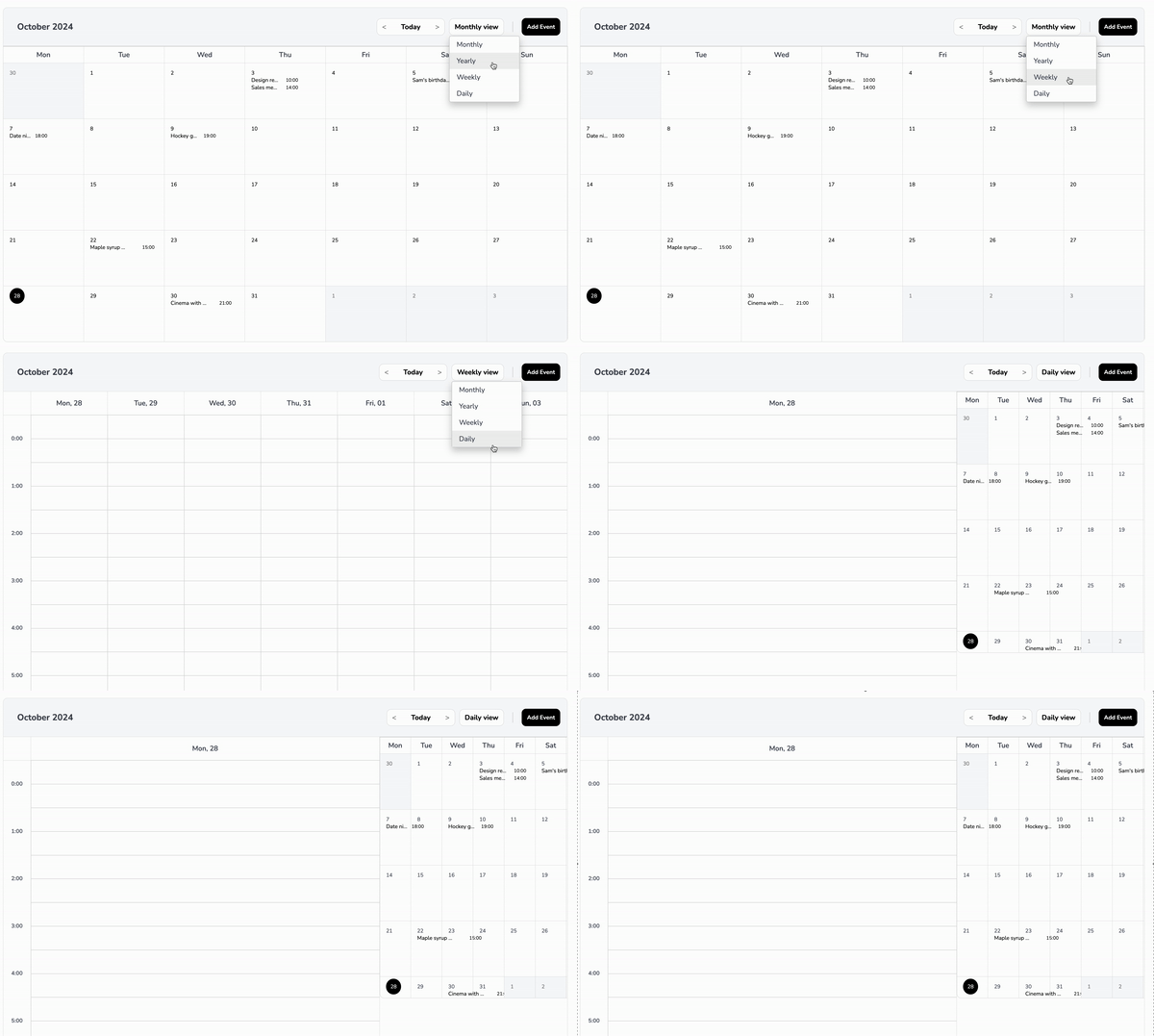
The Event Calendar component provides a visual representation of a calendar month, where users can see events for each day. It highlights the current day, handles long event titles by truncating them, and separates event times to ensure a clean layout.
Preview

Key Features
- Monthly View: Displays a complete month with days and events.
- Current Day Highlighting: Highlights the current day with a circular background.
- Event Handling:
- Events are displayed under each day.
- Event titles are truncated with ellipses to prevent overflow.
- Each event occupies a single line, with the title taking up 60% of the width and the time taking up 40%.
- Responsive Design: Adjusts the layout and font size based on screen size to maintain readability and usability.
- Customizable Title and Button: Allows setting custom titles for the calendar and the "Add Event" button.
Table of Contents
Installation
Install the @farango/calendar_library package:
npm install @farango/calendar_libraryBasic Usage
Here's how to use the EventCalendar component with default settings:
import React from 'react';
import { EventCalendar } from '@farango/calendar_library';

const App = () => {
  const events = [
    { date: '2024-10-21', title: 'Meeting', time: '10:00 AM' },
    { date: '2024-10-22', title: 'Workshop', time: '2:00 PM' },
    { date: '2024-10-23', title: 'Webinar', time: '11:00 AM' },
  ];

  return (
    <div>
      <EventCalendar eventsData={events} />
    </div>
  );
};

export default App;
Customizing Styles
| Property | Description | Default |
|---------------------------|-----------------------------------------------------------|-----------------------|
| colorActualDay | Sets the background color of the current day. | #FFC107 |
| colorFontTitle | Changes the font color of the calendar title. | #1E90FF |
| colorFontButtons | Changes the font color of buttons. | #2ECC71 |
| colorFontNameDays | Changes the font color of the day names (Mon, Tue, etc.). | #34495E |
| colorFontDays | Changes the font color of the calendar days. | #000 |
| sizeFontAppointment | Adjusts the font size of event titles. | 1rem |
| sizeFontButtons | Adjusts the font size of buttons. | 0.9rem |
| sizeFontNameDays | Adjusts the font size of the day names. | 0.8rem |
| sizeFontDays | Adjusts the font size of the calendar days. | 0.85rem |
| bgHeader | Sets the background color of the header. | #E0E0E0 |
| bgDaysNames | Sets the background color of the day names row. | #F8F8F8 |
| bgCells | Sets the background color of the calendar cells. | #FFFFFF |
| bgActualDay | Sets the background color of the current day. | #FFC107 |
| eventTitleSpacing | Adjusts spacing between event titles and their times. | '' (default) |
| eventTimeColor | Sets the font color of event times. | #000 |
| eventTitleColor | Sets the font color of event titles. | #000 |
You can customize the appearance of the calendar by passing a styles object as a prop:
const customStyles = {
  colorActualDay: '#FF5733',
  colorFontTitle: '#1E90FF',
  colorFontButtons: '#2ECC71',
  colorFontNameDays: '#34495E',
  colorFontDays: '#000',
  sizeFontAppointment: '1rem',
  sizeFontButtons: '0.9rem',
  sizeFontNameDays: '0.8rem',
  sizeFontDays: '0.85rem',
  bgHeader: '#E0E0E0',
  bgDaysNames: '#F8F8F8',
  bgCells: '#FFFFFF',
  bgActualDay: '#FFC107',
  visibilityOptions: {
    todayButton: true,
    dropdownFilter: true,
    addEventButton: false,
    header: true,
    daysNames: true,
  },
};

<EventCalendar eventsData={events} styles={customStyles} />
Visibility Options
The component allows you to toggle visibility for specific elements:
- todayButton: Shows/hides the "Today" button.
- dropdownFilter: Shows/hides the filter dropdown.
- addEventButton: Shows/hides the "Add Event" button.
- header: Shows/hides the calendar header.
- daysNames: Shows/hides the row of day names.
Additional Props
title
- Type: String
- Default:
"Event Calendar" - Description: Sets a custom title for the calendar.
- Example:
<EventCalendar title="My Custom Calendar" />
titleButton
- Type: String
- Default:
"Add Event" - Description: Sets a custom label for the "Add Event" button.
- Example:
<EventCalendar titleButton="Create New Event" />
onSelectedEvent
- Type: Function
- Default:
() => {} - Description: Callback function triggered when an event is selected.
- Example:
const handleEventSelection = (event) => {
  console.log('Selected Event:', event);
};

<EventCalendar onSelectedEvent={handleEventSelection} />
addEvent
- Type: Function
- Default:
() => {} - Description: Callback function triggered when the "Add Event" button is clicked.
- Example:
const handleAddEvent = () => {
  console.log('Add Event clicked');
};

<EventCalendar addEvent={handleAddEvent} />
Props
eventsData
Type: Array
Default:
[]Description: An array of event objects. Each event should have:
date(in YYYY-MM-DD format)title(string)time(string)
Example:
const events = [
  { date: '2024-10-21', title: 'Meeting', time: '10:00 AM' },
  { date: '2024-10-22', title: 'Workshop', time: '2:00 PM' },
];
styles
- Type: Object
- Default: See
defaultStylesin the component - Description: An object to customize the appearance of the calendar. It contains properties for colors, font sizes, background colors, and visibility options.
Examples
Example 1: Simple Calendar with Default Styles
<EventCalendar eventsData={events} />Example 2: Calendar with Custom Styles
<EventCalendar eventsData={events} styles={customStyles} />Example 3: Custom Title and Add Event Callback
<EventCalendar
  title="Team Calendar"
  titleButton="Schedule Event"
  addEvent={() => alert('Add Event clicked')}
/>
License and Author Information
License
- Type: MIT Lic
Author
- Name: Andrés Arango
