@etchteam/storybook-addon-css-variables-theme
v3.0.0
Published
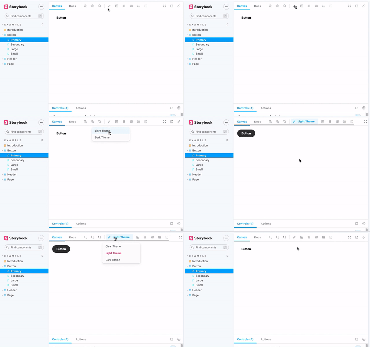
Switch CSS files to change themes
Downloads
55,124
Readme
Storybook Addon CSS Variables Theme
Storybook CSS Variables Theme can be used to switch out CSS files in Storybook.

Installation
npm install @etchteam/storybook-addon-css-variables-theme --save-devConfiguration
Step 1: Add the addon
Create a file called main.js in your .storybook folder.
Add the following code to it:
module.exports = {
  addons: ['@etchteam/storybook-addon-css-variables-theme'],
};
Step 2: Include your CSS files
Create a file called preview.js in your .storybook folder.
In this file you will need to import your style files using a loader. Here's an example of how to do this:
import light from '!!style-loader?injectType=lazyStyleTag!css-loader!../src/styles/light.css'
import dark from '!!style-loader?injectType=lazyStyleTag!css-loader!../src/styles/dark.css'
This code calls style-loader with ?injectType=lazyStyleTag so that it doesn't run the CSS immediately.
You can swap out css-loader for your preferred SCSS/Less/etc loaders.
Any loaders used here will need to be installed in your project: npm i -D style-loader css-loader
Step 3: Add the Decorator
In the same preview.js file import the decorator from the CSS Variables Theme addon
import cssVariablesTheme from '@etchteam/storybook-addon-css-variables-theme'

export const decorators = [
  cssVariablesTheme,
];
Then pass the CSS files to the addon via the exported parameters.
export const parameters = {
  cssVariables: {
    files: {
      'Light Theme': light,
      'Dark Theme': dark,
    }
  }
}
If a default theme should be selected from first load add 'defaultTheme' to the options.
export const parameters = {
  cssVariables: {
    files: {
      'Light Theme': light,
      'Dark Theme': dark,
    },
    defaultTheme: 'Light Theme'
  }
}
How to
Set a specific theme for a story
Pass the theme key as the theme parameter on the story to default to a specific theme:
export default {
  title: 'Example/Header',
  component: Header,
  parameters: {
    cssVariables: {
      theme: 'dark'
    }
  }
};
Get the currently enabled theme within stories
You can access the currently set theme from the context object provided by storybook as the second parameter.
const Template: ComponentStory<typeof Button> = (args, context) => (
  <Button {...args}>{context.globals.cssVariables ?? 'No theme'}</Button>
);
Alternatively watch the custom storybookcssvariables:theme:change event on the document.
document.addEventListener(
  'storybookcssvariables:theme:change',
  (event: CustomEvent) => {
    console.info(`The theme changed to ${event?.detail?.theme}`);
  },
);
Set a Theme by Query String
Themes are stored in storybook globals.
Pass the theme to the url as a query by adding &globals=cssVariables:mytheme to the url.
If multi word theme query is &globals=cssVariables:my+theme
Use in MDX docs
This addon applies styles through a decorator.
So, within MDX files, styles will only apply to a <Story> or <Canvas>.
Made with ☕ at Etch
