@ds-ale-projects/ds-cupcake-ui-twcss-002
v0.0.1
Published
UI Kit for a startup
Downloads
10
Maintainers
Readme
Cupcake UI
A design system for a fintech startup that is changing the world.
Screenshots
- Storybook home page
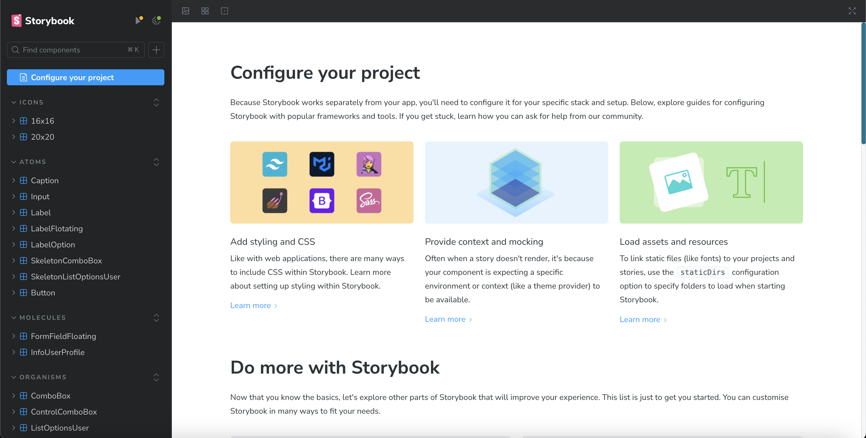
- Atomic design: stories
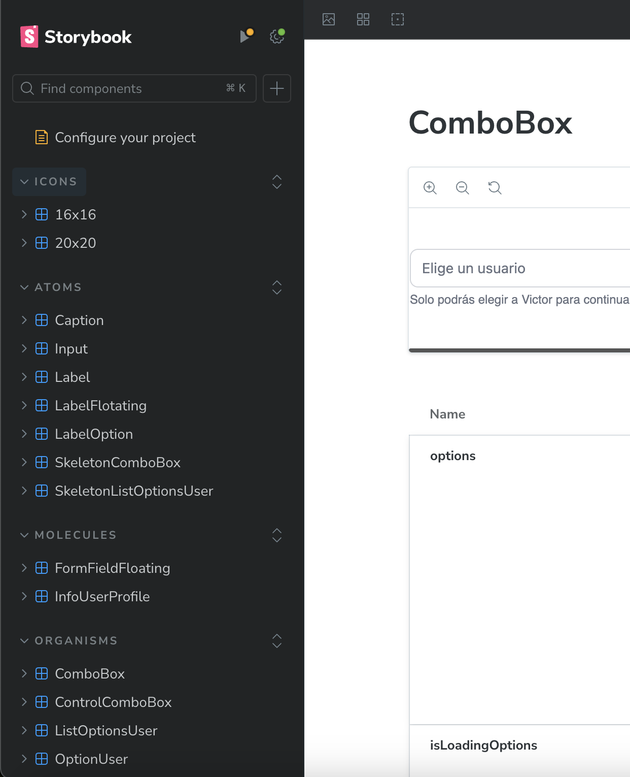
- Combobox storybook: default
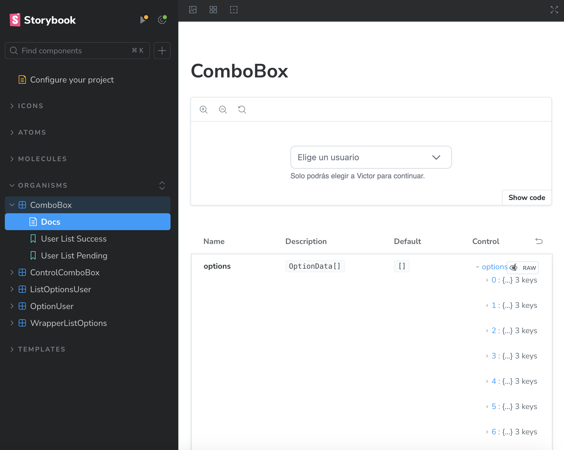
- Combobox storybook: open
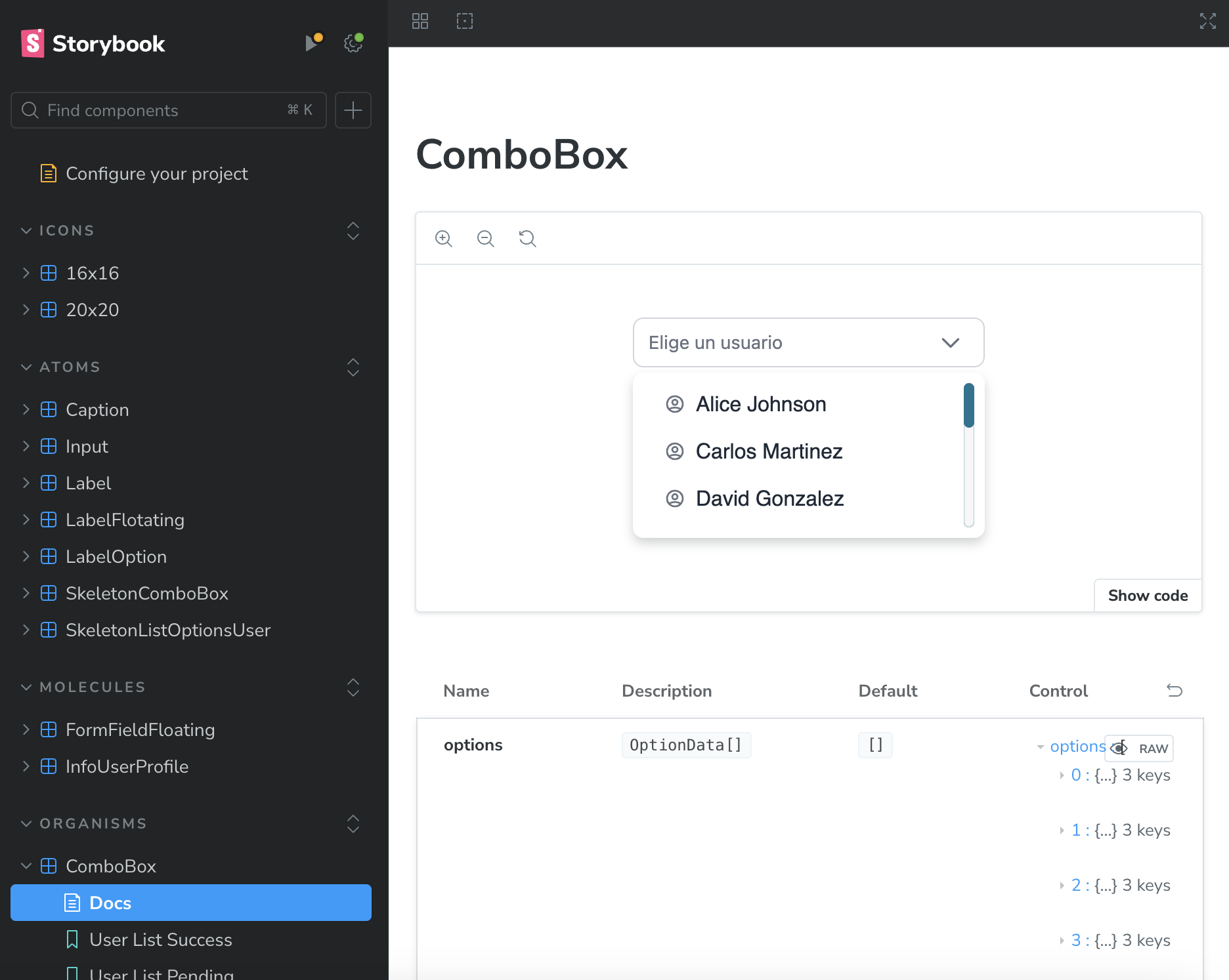
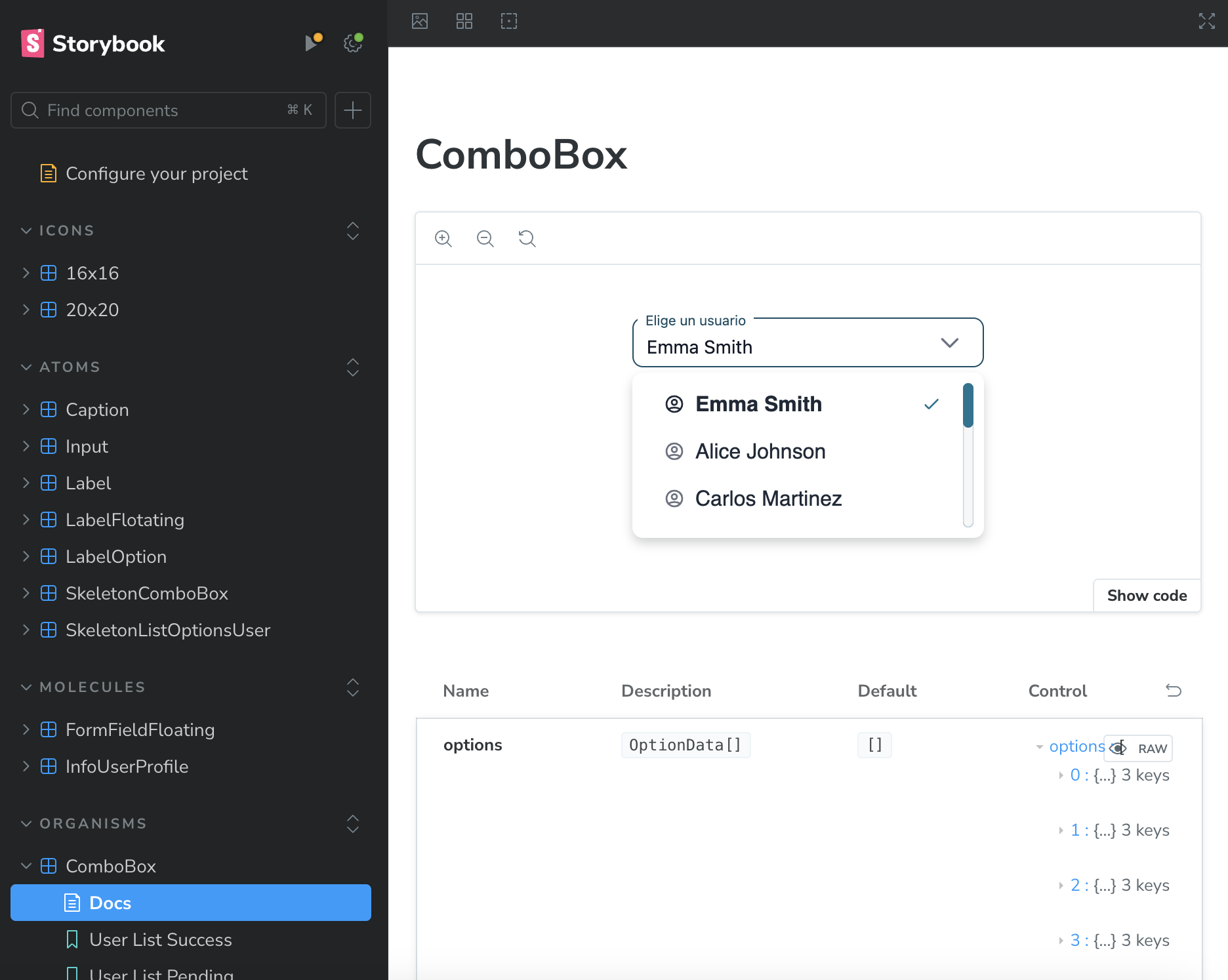
- Combobox storybook: select
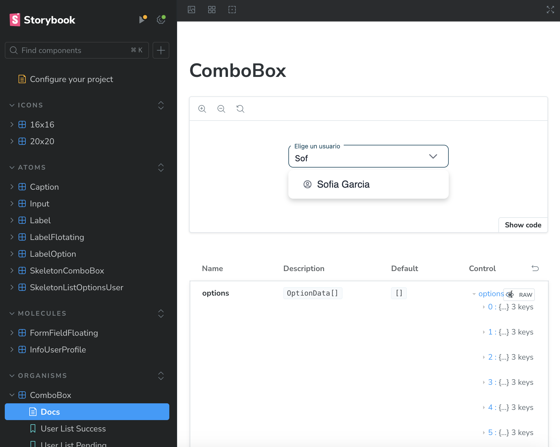
- Combobox storybook: search
Tech Stack
Client: Typescript, React, React hooks, React Router, TailwindCSS, Storybook
Server: Vite.js
Storybook
(*) Chromatic: you need to create an account at chromatic.com
Environment Variables
To run this project, you will need to add the following environment variables to your .env or .env.local file: VITE_APP_PORT
For example:
VITE_APP_PORT=7012
Run Locally
Clone the project
git clone https://github.com/alxmcr/cupcake-uiGo to the project directory
cd cupcake-uiInstall dependencies
npm installStart the storybook server
  npm run storybook

  # http://localhost:6006/
Start the development server
  npm run dev

# http://localhost:<your_port>/<your_port>: on enviroment variables (.env, .env.local).
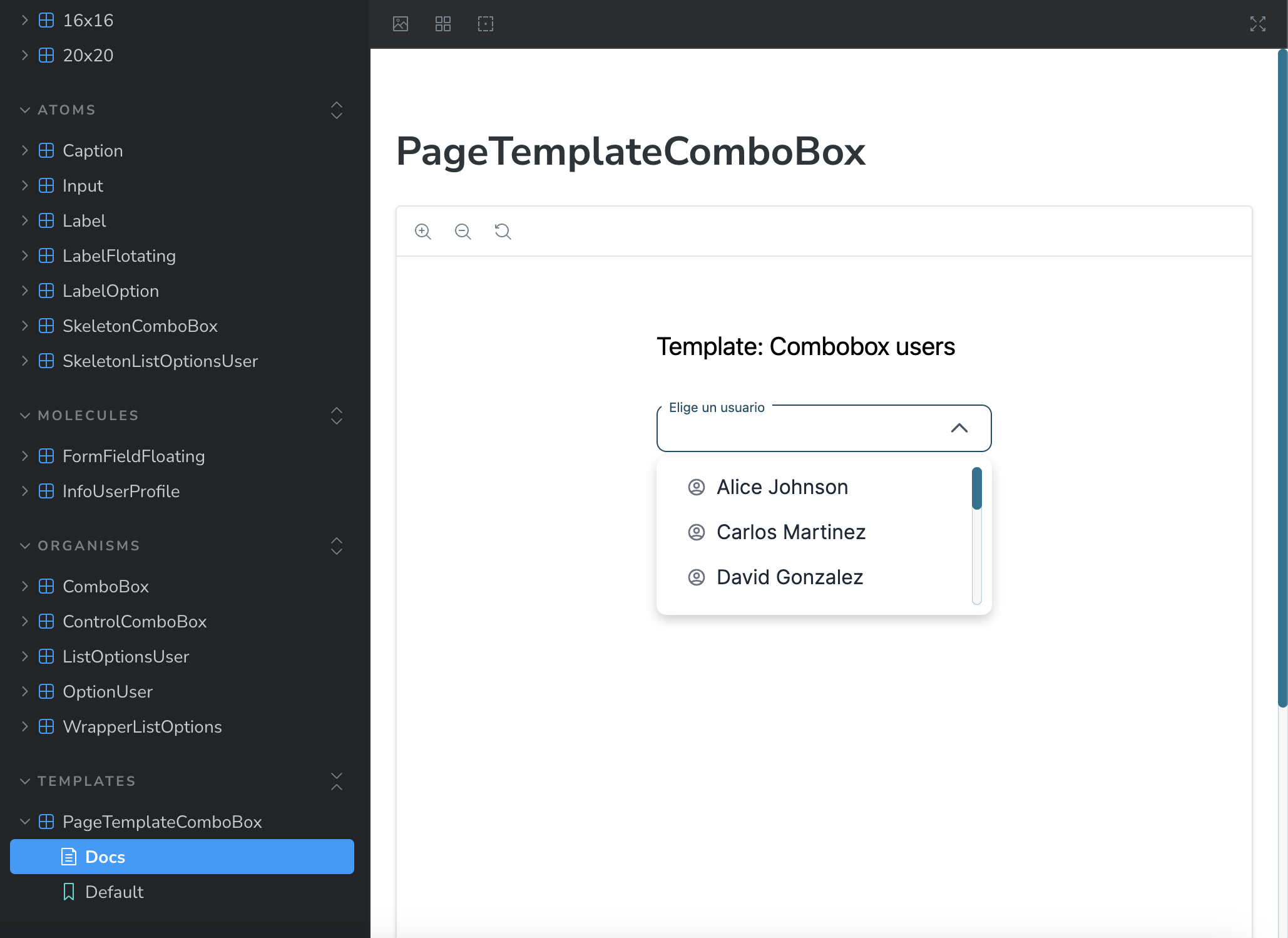
Combobox in Action
import { ComboBox } from '../../../components/03_organisms/ComboBox';
import mockUsersData from '../../../mocks/data/sample-options-user.json';

type Props = {
  title: string;
};

export default function PageTemplateComboBox({ title = '' }: Props) {
  return (
    <div className="flex h-[500px] flex-col gap-4">
      <h1 className="my-4 text-[20px]">{title}</h1>
      <ComboBox
        captionText="Solo podrás elegir a Victor para continuar."
        id="ControlComboBox-Users"
        labelText="Elige un usuario"
        name="combobox-users"
        options={mockUsersData}
      />
    </div>
  );
}
Discoveries
(*) Some comments left on Figma design.
- Multiple color palette - Follow TailwindCSS customization.
- Different spacing: line-height and letter-spacing - Follow TailwindCS custom values.
- Research about more box-shadow best practices with Tailwind - Work together inline CSS classes with default CSS classes on CSS files.
- Reduce scope about scrollbar and styles definition - centralize the global styles to
tailwind.css. - Atomic design and naming conventions - Methodology to help mem with a fast development, maintain, and reduce time to development.
Next steps, next releases
- Add more unit testing with React Testing Library.
- Improve components considering web accessibility (a11y).
- Enable on components with internationalization (i18n).
- Apply more Tailwind.css customization.
- Enable Dark/Light modes.
- Research, implement multibranding for multiple companies and customers.
- Add more use cases about components built.
- After more uses cases, work on integration testing.
- Research about a customization developers documentation (on top Storybook)
- Publish NPM package and GitHub Package.
