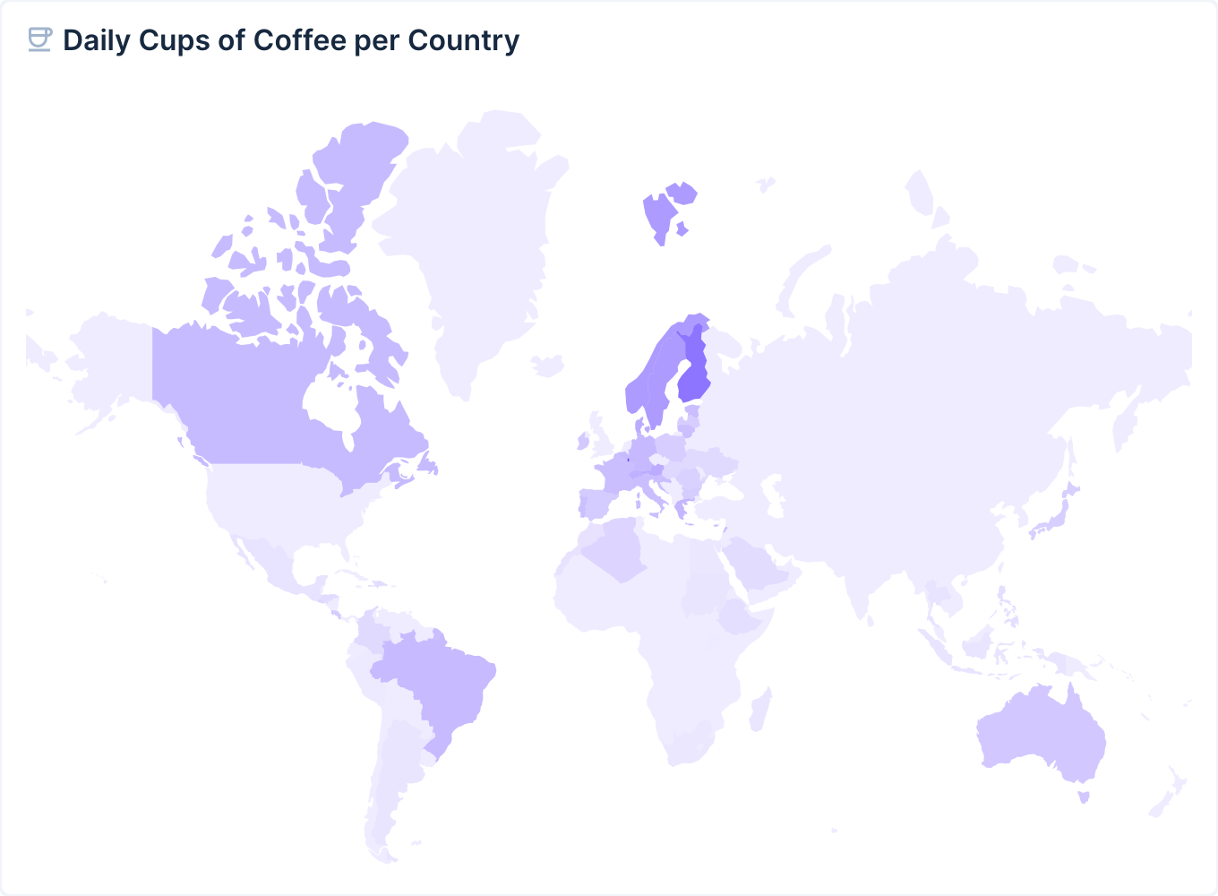
@directus-labs/choropleth-map-panel
v1.0.0
Published
Display your data divided into colored geographical areas
Downloads
77
Readme
Choropleth Map Panel
Add a map panel (powered by D3) to your dashboard that displays countries in different colors based on their value.

Installation
Refer to the Official Guide for details on installing the extension from the Marketplace or manually.
Usage
Add the Choropleth Map Panel to your Insights Dashboard. In the panel options, select the collection you want to use as data source, then select a Country Field, Aggregated Field and Aggregate Function. The Country Field must be a string field containing either the country name, a 2-letter country code (e.g. US), a 3-letter country code (e.g. USA) or an M49 country code (e.g. 840). You can optionally refine the results with a Filter.
