
@dev.mohe/mwc-button
v0.19.3
Published
Material Design button web component
Downloads
26
Maintainers
 dev.mohe
Readme
<mwc-button> 
IMPORTANT: The Material Web Components are a work in progress and subject to major changes until 1.0 release.
Buttons allow users to take actions, and make choices, with a single tap.
Material Design Guidelines: Button
Installation
npm install @dev.mohe/mwc-buttonNOTE: The Material Web Components are distributed as ES2017 JavaScript Modules, and use the Custom Elements API. They are compatible with all modern browsers including Chrome, Firefox, Safari, Edge, and IE11, but an additional tooling step is required to resolve bare module specifiers, as well as transpilation and polyfills for IE11. See here for detailed instructions.
Example Usage
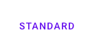
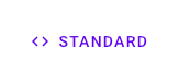
Standard
<mwc-button label="standard"></mwc-button>
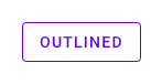
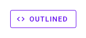
<mwc-button label="standard" icon="code"></mwc-button>Outlined
<mwc-button outlined label="outlined"></mwc-button>
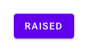
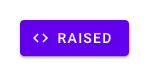
<mwc-button outlined label="outlined" icon="code"></mwc-button>Raised
<mwc-button raised label="raised"></mwc-button>
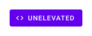
<mwc-button raised label="raised" icon="code"></mwc-button>Unelevated

<mwc-button unelevated label="unelevated"></mwc-button>
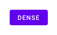
<mwc-button unelevated label="unelevated" icon="code"></mwc-button>Dense
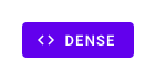
<mwc-button dense unelevated label="dense"></mwc-button>
<mwc-button dense unelevated label="dense" icon="code"></mwc-button>
Trailing Icon
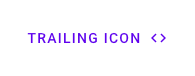
<mwc-button label="trailing icon" icon="code" trailingIcon></mwc-button>Disabled
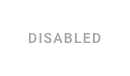
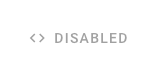
<mwc-button disabled label="disabled"></mwc-button>
<mwc-button disabled label="disabled" icon="code"></mwc-button>
Customize Colors

mwc-button {
  --mdc-theme-primary: #e9437a;
  --mdc-theme-on-primary: white;
}
API
Slots
| Name | Description
| -------------- | -----------
| icon | Leading icon. Overrides icon property. Use label or the icon property to set the aria-label.
| trailingIcon | Icon to show after the label. Overrides trailingIcon property. Use label or the trailingIcon property to set the aria-label.
| default | Default content to display between both icons and after label. NOTE: It is highly recommended to set the label property instead of projecting text as it will also set the aria-label
Properties/Attributes
| Name | Type | Default | Description
| ---- | ---- | ------- | -----------
| icon | string | '' | Icon to display, and aria-label value when label is not defined.
| label | string | '' | Label to display for the button, and aria-label.
| raised | boolean | false | Creates a contained button that is elevated above the surface.
| unelevated | boolean | false | Creates a contained button that is flush with the surface.
| outlined | boolean | false | Creates an outlined button that is flush with the surface.
| dense | boolean | false | Makes the button text and container slightly smaller.
| disabled | boolean | false | Disabled buttons cannot be interacted with and have no visual interaction effect.
| trailingIcon | boolean | false | When true, icon will be displayed after label.
| 'expandContent' | boolean | false | When true, the space after the label and before any trailing icon, where default slotted content is rendered, is expanded to fit the available space inside the button.
TODO update properties
Methods
None
Events
None
CSS Custom Properties
| Name | Default | Description
| ------------------------------------- | -------------------------------------------------- | ---
| --mdc-button-horizontal-padding | filled: 16px outlined: 15px default: 8px | Left and right padding of the button label (for outlined buttons the outline width is automatically subtracted).
| --mdc-button-outline-width | 1px | width of the outline of an outlined button and attempts to keep the component size constant.
| --mdc-button-outline-color |  | Color of the outline of an outlined element.
|
| Color of the outline of an outlined element.
| --mdc-button-disabled-fill-color | rgba(0,0,0,0.12) | Background fill color of a disabled raised or unelevated button.
| --mdc-button-disabled-ink-color | 
rgba(0,0,0,0.37) | Text color of a disabled button as well as the outline color of a disabled outlined button.
| --mdc-button-disabled-outline-color | | Sets the color of the outline of a disabled outlined button.
| --mdc-button-raised-box-shadow | mdc elevation 2 | Sets the box shadow of the raised button.
| --mdc-button-raised-box-shadow-hover | mdc elevation 4 | Sets the box shadow of the raised button when focused or hovered.
| --mdc-button-raised-box-shadow-active | mdc elevation 8 | Sets the box shadow of the raised button when active.
| --mdc-button-raised-box-shadow-disabled | mdc elevation 0 | Sets the box shadow of the raised button when disabled.
Global Custom Properties
This component exposes the following global theming custom properties.
| Name | Description
| ------------------------------------ | -----------
| --mdc-theme-primary | Color of a flat or outlined button. Background color of a raised button.
| --mdc-theme-on-primary | Text color of a raised button.
| --mdc-icon-font | Font to use for the icon.
| --mdc-typography-button-<PROPERTY> | Styles the typography of the button label.
Elevation values
| Elevation Level | CSS Value
| --- | ---
| 2 | 0px 3px 1px -2px rgba(0, 0, 0, 0.2), 0px 2px 2px 0px rgba(0, 0, 0, 0.14), 0px 1px 5px 0px rgba(0, 0, 0, 0.12)
| 4 | 0px 2px 4px -1px rgba(0, 0, 0, 0.2), 0px 4px 5px 0px rgba(0, 0, 0, 0.14), 0px 1px 10px 0px rgba(0, 0, 0, 0.12)
| 8 | 0px 5px 5px -3px rgba(0, 0, 0, 0.2), 0px 8px 10px 1px rgba(0, 0, 0, 0.14), 0px 3px 14px 2px rgba(0, 0, 0, 0.12)
| 0 | 0px 0px 0px 0px rgba(0, 0, 0, 0.2), 0px 0px 0px 0px rgba(0, 0, 0, 0.14), 0px 0px 0px 0px rgba(0, 0, 0, 0.12)