@dafcoe/vue-swappable-card
v0.1.2
Published
Swappable Card Component Using Vue3
Downloads
7
Maintainers
Readme


@dafcoe/vue-swappable-card
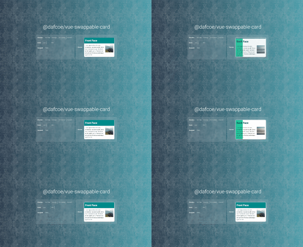
Easy to use, customisable swappable card library built using Vue3. See it action on demo page.
Installation
Install the package as a project dependency using yarn or npm:
$ yarn add @dafcoe/vue-swappable-card

--- or ---

$ npm install --save @dafcoe/vue-swappable-card
Usage
Import VueSwappableCard component, either globally (on your main.js / main.ts file) or locally (on your component):
// Globally
import VueSwappableCard from '@dafcoe/vue-swappable-card'
const app = createApp(App)
app.use(VueSwappableCard).mount('#app')

// Locally
import { VueSwappableCard } from '@dafcoe/vue-swappable-card'
Import default styles (optional - you can define your own styling):
import '@dafcoe/vue-swappable-card/dist/vue-swappable-card.css'Use it in the template as follows:
<vue-swappable-card>
    <template #content-primary>
        <h1>Face A</h1>
        <div>
            <p>Lorem ipsum dolor sit amet...</p>
        </div>
    </template>
    <template #content-secondary>
        <h1>Face B</h1>
        <div>
            <p>Lorem ipsum dolor sit amet...</p>
        </div>
    </template>
</vue-swappable-card>
Options
Direction
By default, the swap direction is from bottom to top. You can use "from-top", "from-bottom", "from-left" or "from-right" on direction prop:
<vue-swappable-card direction="from-top|from-bottom|from-left|from-right">
    ...
</vue-wappable-card>
Event
By default, the card swaps when overing it. You can use "over" or "click" on event prop:
<vue-swappable-card event="over|click">
    ...
</vue-wappable-card>
Swapped
By default, the primary content / front face is shown as main content/face. You can change this using swapped prop:
<vue-swappable-card swapped>
    ...
</vue-wappable-card>
Please check the demo page to easily see options in action.

