
@dafcoe/vue-file-uploader
v0.0.4
Published
File uploader built using vue3. It allows multiple file selection / drag and drop
Downloads
152
Maintainers
 dafcoe
Readme


@dafcoe/vue-file-uploader
Easy to use, customisable, multiple file uploader with drag&drop library built using Vue3.
Installation
Install the package as a project dependency using yarn or npm:
$ yarn add @dafcoe/vue-file-uploader

--- or ---

$ npm install --save @dafcoe/vue-file-uploader
Usage
Import VueFileUploader component, either globally (in your main.js / main.ts file) or locally (in your component):
// Globally
import VueFileUploader from '@dafcoe/vue-file-uploader'
import '@dafcoe/vue-file-uploader/style.css'

const app = createApp(App)
app.use(VueFileUploader).mount('#app')

// Locally
import { VueFileUploader } from '@dafcoe/vue-file-uploader'
import '@dafcoe/vue-file-uploader/style.css'
Use it in the template as follows:
<VueFileUploader upload-url="http://www.file-host.test" />Customization
Upload url
An endpoint which handles the files and stores them. This property is required.
<VueFileUploader upload-url="http://www.file-host.test" />Heading
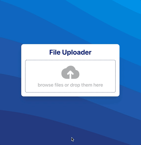
The title of the file uploader. The default value is "File Uploader". If an empty string is provided nothing will be shown above the drop area.
<VueFileUploader
    upload-url="http://www.file-host.test"
    heading="My Multiple File Uploader"
/>
Label
The text used in the drop area. The default value is "browse files or drop them here". If an empty string is provided nothing will be shown below the cloud icon.
<VueFileUploader
    upload-url="http://www.file-host.test"
    heading="My Multiple File Uploader"
    label="you can drop multiple files here..."
/>
Colors
There are multiple css variables available so the layout can be customized:
| Variable Name | Description | Default Value | |-------------------------------------------- |------------------------------------------ |------------------- | | --file-uploader-bg-color | background | #ffffff | | --file-uploader-heading-color | title | #061e7c | | --file-input-border-color | drop area border | #061e7c | | --file-input-icon-color | drop area icon | #aeaeae | | --file-input-icon-color-hover | drop area icon (active) | #061e7c | | --file-input-label-color | drop area label | #aeaeae | | --file-input-label-color-hover | drop area label (active) | #061e7c | | --file-list-item-bg-color | file item background | #e2f0fe | | --file-list-item-icon-file-color | file item icon | #061e7c | | --file-list-item-icon-status-syncing-color | file item syncing icon | #246fff | | --file-list-item-icon-status-synced-color | file item synced icon | #589f00 | | --file-list-item-name-color | file item name | #333333 | | --progress-bar-bg-color | file item progress bar background | #ffffff | | --progress-bar-color | file item progress bar text | #061e7c | | --progress-bar-over-bg-color | file item progress bar filled background | #061e7c | | --progress-bar-over-color | file item progress bar filled text | #ffffff | | --scrollable-area-fade-from | file list fade gradient start | #ffffff | | --scrollable-area-fade-to | file list fade gradient end | transparent |
As an example, the following css variables definition represent a dark mode look:
:root {
    --file-uploader-bg-color: #333;
    --file-uploader-heading-color: #fff;
    --file-input-border-color: #fff;
    --file-input-icon-color: #aeaeae;
    --file-input-icon-color-hover: #fff;
    --file-input-label-color: #aeaeae;
    --file-input-label-color-hover: #fff;
    --file-list-item-bg-color: #262626;
    --file-list-item-icon-file-color: #fff;
    --file-list-item-icon-status-syncing-color: #246fff;
    --file-list-item-icon-status-synced-color: #589f00;
    --file-list-item-name-color: #aeaeae;
    --progress-bar-bg-color: #333;
    --progress-bar-color: #fff;
    --progress-bar-over-bg-color: #fff;
    --progress-bar-over-color: #333;
    --scrollable-area-fade-from: rgba(51, 51, 51, 1);
    --scrollable-area-fade-to: rgba(51, 51, 51, 0);
}