@builder.io/plugin-sfcc-commerce-api
v0.0.16
Published
Easily connect your SalesForce B2C Commerce API to your Builder.io content!
Downloads
47
Maintainers
Keywords
Readme
Builder.io Salesforce Commerce Api plugin
Easily connect your SalesForce B2C Commerce API to your Builder.io content!
Setup Salesforce Commerce API Access
Read through this get started guide to make sure you have your Shopper Login and API Access Service (SLAS) client setup ready.
Installation
On any builder space, go to the integrations tab and find the Salesforce B2C Commerce API integration

enable,
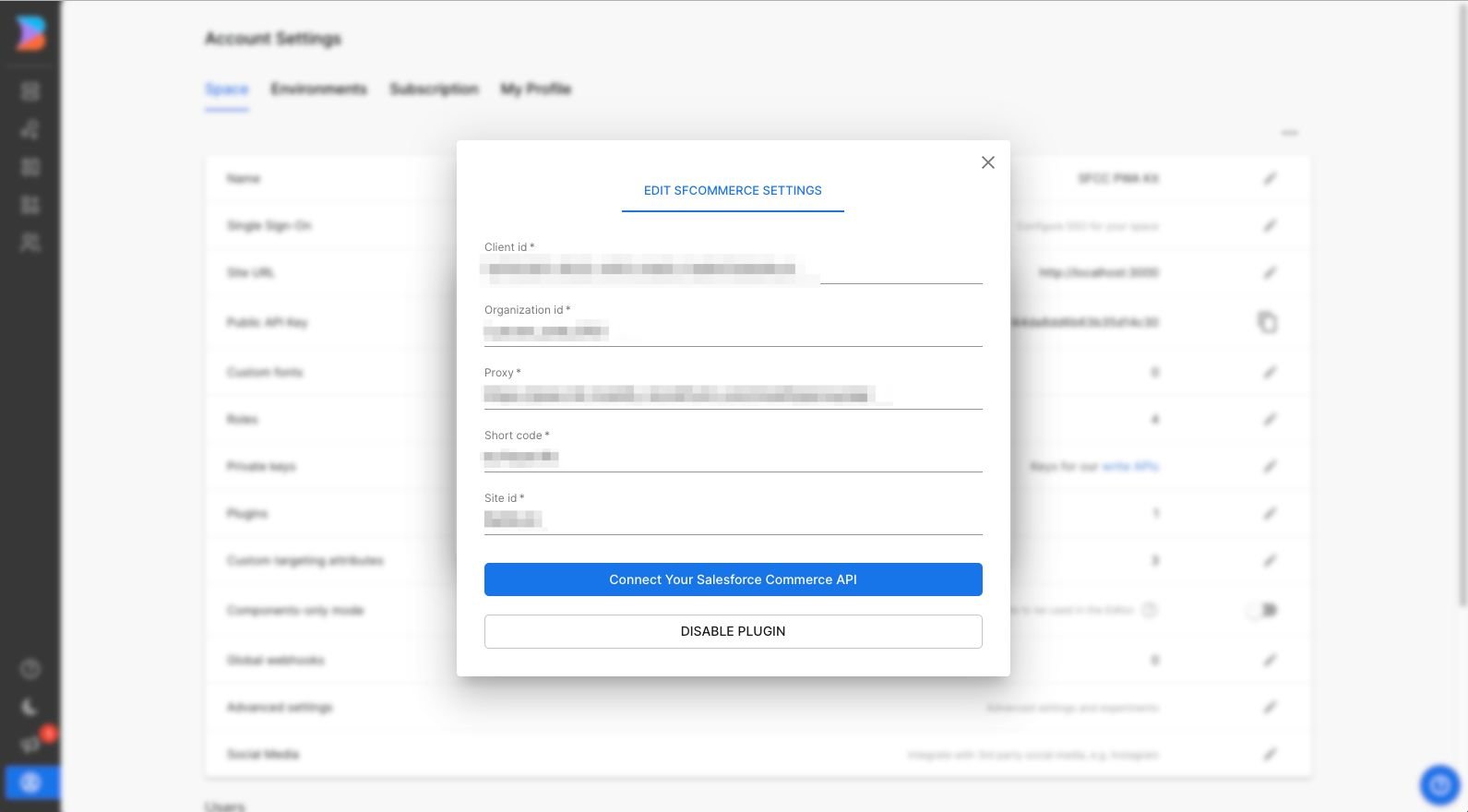
Following, you'll be prompted to enter the following data:
- Client ID
- Organization ID
- Proxy Address
- Short Code
- Site ID
And optionally:
- Einstein API Client ID.
- Einstein Site ID.
If you're using Salesforce's Composable Storefront kit it should be the same configuration you find at your config/default.js file
Then enter it in your Builder's space integration configuration options:
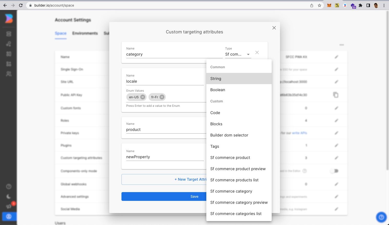
After putting the required info, hit the connect button. You will now see a few new field types (for model fields, symbol inputs, custom components fields), and custom targeting attributes that can be used in three different contexts:
Custom targeting
Custom targeting in Builder.io allow users to target content by a multitude of attributes, and in this plugin you'll be able to add specific content from SFCC products, for this you'll need first to set the target attributes on the host site, either by setting the userAttributes if you're rendering client side:
// example for fetching content specific for a product in a product details page
const productFooterContent = await builder.get('product-footer', {
  userAttributes: {
    product: product.productId,
  },
});
Or by passing it as a query param to the content API call, or in graqhql query for e.g in Gatsby or nextjs.
Custom Components and input types
Once you install the plugin, you will also be able to use the SFCC types as inputs for your components, such as:
SFCommerceProductwhen used as an input type, you will be able to search and select a specific Product to provide to your component and consume the product data however you want from inside the component.SFCommerceCategorywhen used as an input type, you will be able to search and select a specific category of products to provide to your component, as example you can fetch products from a specific category from inside your component.SFCommerceProductsListwhen used as an input type, it enables users to select multiple products to provide to your component. As an example you can select multiple products and display them on a grid.SFCommerceCategoriesListwhen used as an input type enables users to select multiple categories to provide to your component.
Example of a Custom Component with SFCommerceProduct input type:
Example of a custom component called 'ProductBox' that receives a SFCommerceProduct as input:
import React from 'react'
import {Builder} from '@builder.io/react'
import ProductBox from './ProductBox' // this is your component with it's logic

Builder.registerComponent(ProductBox, {
    name: 'ProductBox',
    image: 'https://unpkg.com/[email protected]/icons/svg/box.svg',
    inputs: [
        {
            name: 'productRef',
            friendlyName: 'Product',
            type: 'SFCommerceProduct',
            required: true
        }
    ]
})
To see more details about the usage of this component see here.
To understanding more about custom components also see this article.
Fetch Content and References
On our docs, you can check more about how to fetch content from builder.io and also see how the option includeRefs=true works, fecthing any specific content from a given reference, such as a chosen SFCommerceProduct in the example above to support server side rendering.
Auto-resolving the Product/Categories data
In an effort to support SSR and making sure all the input data are available at the time of render, Builder’s support the resolving of the inputs for your custom components, for example if you have a product box with input of SFCommerceProduct you can get the json value of that product by passsing includeRefs: true when you fetch the content json:
const page = await builder.get('page', {
  url: '...',
  options: {
    includeRefs: true
  }
})
Also passing the same option to the rendering component to auto-resolve while editing:
<BuilderComponent model="page" options={{ includeRefs: true}} content={page} />For more information on the available options check our Content API documentation.
Seeing the plugin in action
Try creating a custom model, component, or symbol using any of the SFCC field types, and edit away!


