
@bonosoft/sveltekit-progress
v0.0.1
Published
Progress component for SvelteKit
Downloads
9
Maintainers
 bonosoft
Readme
Progress circle for SvelteKit
With this module, you are able to add circular or square progress bars to you Sveltekit site.
Install
Use your package manager to install the module:
npm install @bonosoft/sveltekit-progressAdding Progress to a svelte file in SvelteKit
Now you can start adding circular progress components to your pages.
<script lang="ts">
	import Progress from "@bonosoft/sveltekit-progress"
</script>

<Progress progress="50"/>
The standard progress bar can be modefied by adding different parameters.
Sample code
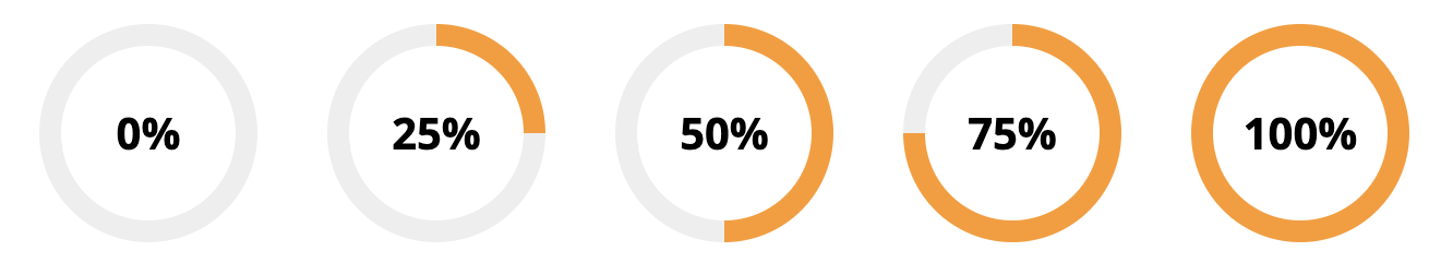
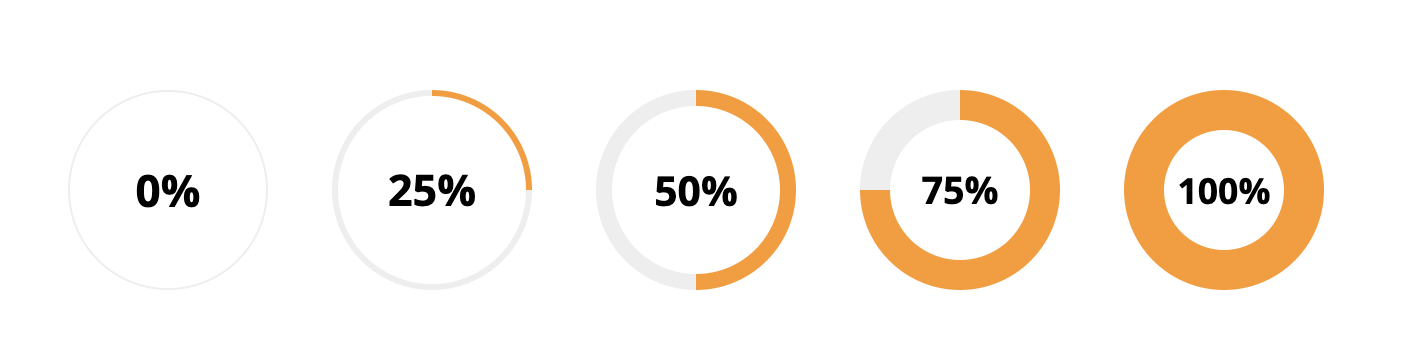
<Progress progress="0"/>
<Progress progress="25"/>
<Progress progress="50"/>
<Progress progress="75"/>
<Progress progress="100"/>
Parameter progress is use to set the shown progress.
Front, back and border colors, for use in dark mode
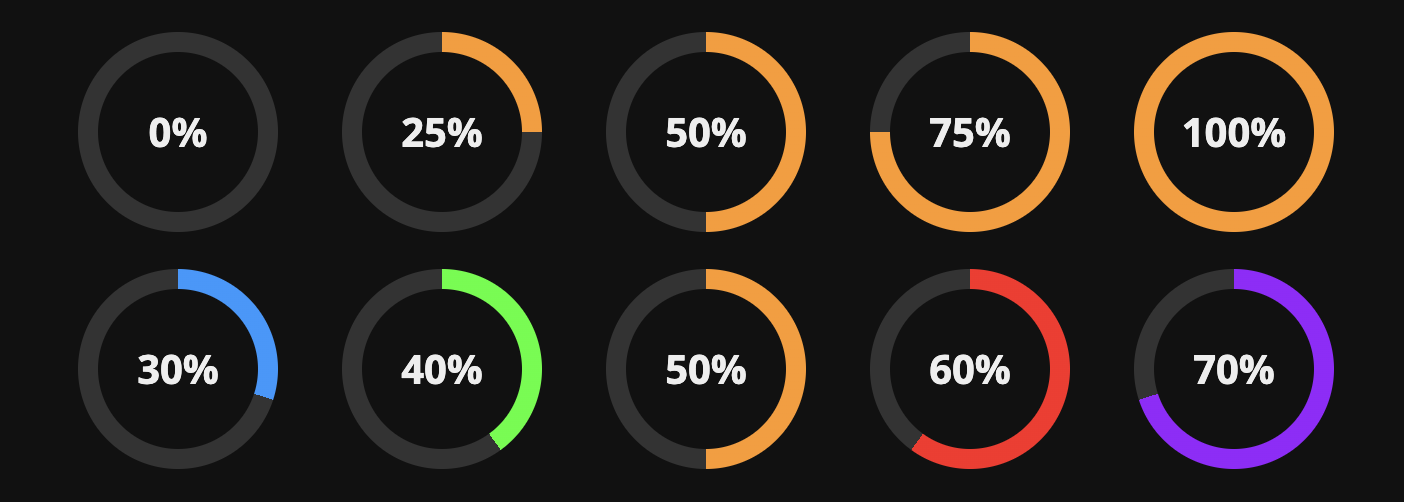
<Progress progress="0"   textColor="#eee" bgcolor="#111" borderColor="#333"/>
<Progress progress="25"  textColor="#eee" bgcolor="#111" borderColor="#333"/>
<Progress progress="50"  textColor="#eee" bgcolor="#111" borderColor="#333"/>
<Progress progress="75"  textColor="#eee" bgcolor="#111" borderColor="#333"/>
<Progress progress="100" textColor="#eee" bgcolor="#111" borderColor="#333"/>

<Progress progress="30" color="#29F" textColor="#eee" bgcolor="#111" borderColor="#333"/>
<Progress progress="40" color="#2F2" textColor="#eee" bgcolor="#111" borderColor="#333"/>
<Progress progress="50" color="#F92" textColor="#eee" bgcolor="#111" borderColor="#333"/>
<Progress progress="60" color="#F22" textColor="#eee" bgcolor="#111" borderColor="#333"/>
<Progress progress="70" color="#92F" textColor="#eee" bgcolor="#111" borderColor="#333"/>
With parameters for color, textcolor, bgcolor and bordercolor, you are able to style the color of the progress bar, the text inside, the background inside and the rest part of the progress area.
Front, back and border colors
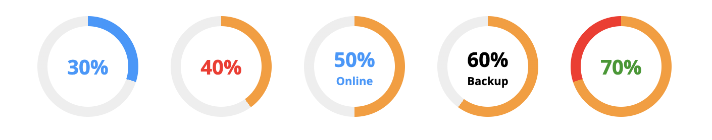
<Progress progress="30" color="#29F" textColor="#29F"/>
<Progress progress="40" textColor="#F22"/>
<Progress progress="50" textColor="#29F" labelText="Online"/>
<Progress progress="60" labelText="Backup"/>
<Progress progress="70" textColor="#292" borderColor="#F22"/>
Here are samples of different colors for progress, text and the area between progress and 100%. The samples also shows how to add an extra text label.
Size
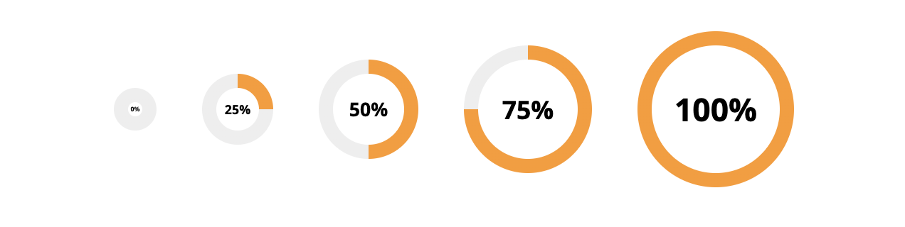
<Progress progress=0 size=30/>
<Progress progress=25 size=50/>
<Progress progress=50 size=70/>
<Progress progress=75 size=90/>
<Progress progress=100 size=110/>
With the size parameter, you are able to control the size of the progress bar.
Border width
<Progress progress=0 borderWeight="1"/>
<Progress progress=25 borderWeight="3"/>
<Progress progress=50 borderWeight="8"/>
<Progress progress=75 borderWeight="15"/>
<Progress progress=100 borderWeight="20"/>
This borderWeight controls the width of the progress bar, so you are able to make thin or really thick bars.
Border radius
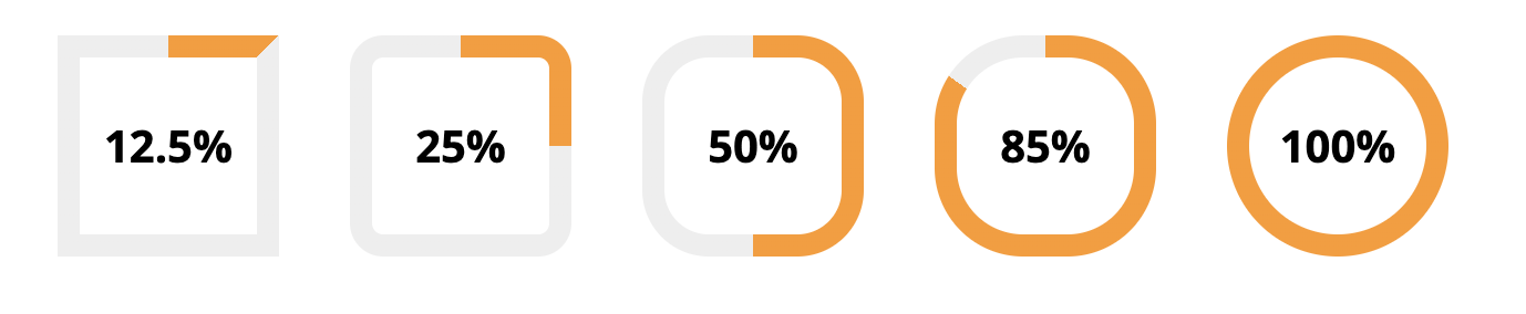
<Progress progress=12.5 borderRadius=0/>
<Progress progress=25 borderRadius=15/>
<Progress progress=50 borderRadius=30/>
<Progress progress=85 borderRadius=40/>
<Progress progress=100 borderRadius=50/>
Don't like the clasic circle design, change the borderRadius to get a square or rounded square.
Showing you own center content
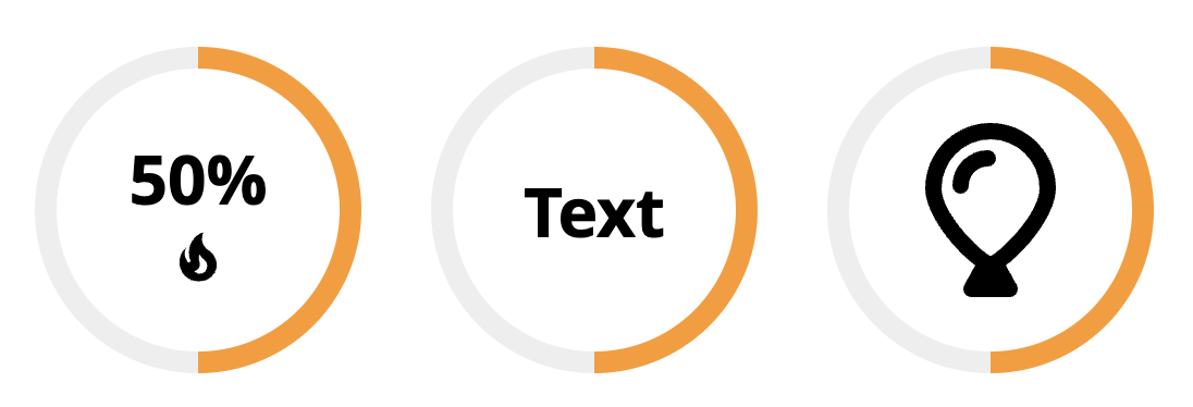
<Progress size="150" progress="50" customContent=false>
 <svg width="30" height="30" viewBox="0 0 24 24"> <path.../> </svg>
</Progress>

<Progress size="150" progress="50" customContent="true">
 Text
</Progress>

<Progress size="150" progress="50" customContent="true">
 <svg width="80" height="80" viewBox="0 0 384 512"><path.../></svg>
</Progress>
Want to add special content to the progress circel, just add it inside the Progress module tag. With the customContent parameter you can hide the default content, to provide more space for your content.