
@bizcharts/scaffold-monitor-linecharts
v0.0.8
Published
基于bizcharts的监控预警大屏-折线图
Downloads
14


Keywords
Readme
网络质量监控折线图模版
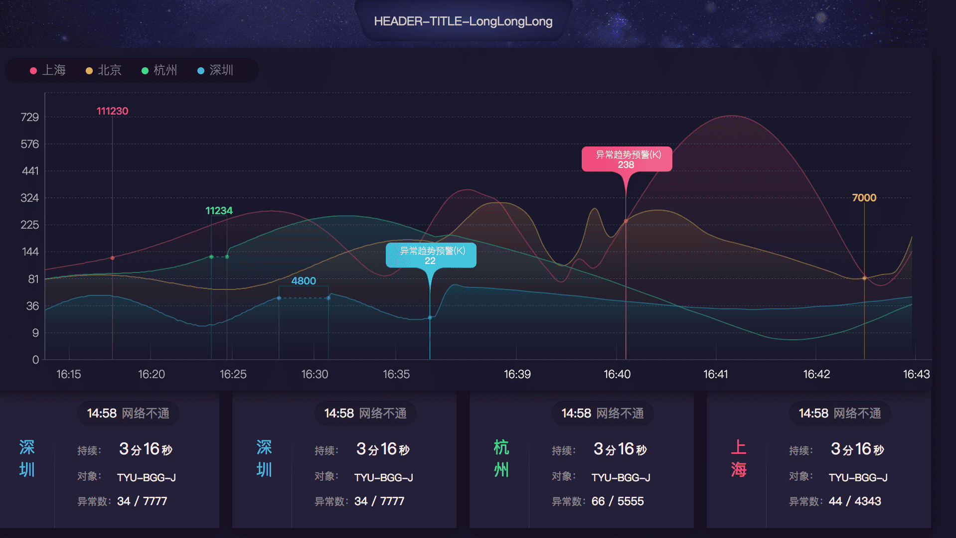
场景适应
适合对单一指标的的实时监控场景。反应指标走势与是否出现峰值与发生异常。并设有告警灯光效果,为强调发生故障异常情况出现。该图以10秒为一个数据单元绘制展示半小时以内的数据。
设计思考
折线图常用来分析数据随时间的变化趋势,但半小时的数据量还是比较大的,实时变化位置移动点的变化变得不明显。考虑到监控场景,我们跟多的在意近5分钟内的数据变化。所以图中X轴分为两个区域:[前半小时, 近5分钟, 当前],于是我们不仅可以清晰看到近5分钟内的变化,也能全局的把我整体趋势和周期。监控数据通常还会遇到一个问题:当偶然发生抖动的情况,即短暂性出现一个高峰值后瞬间回归正常,这样的场景我们通常会区分与故障。但这样的值会把其他正常值压成在图表底部的一条直线,导致折线图看不清数据。这里我们将数据区分为三种状态,0:正常值,1: 抖动的峰值,2:异常值 。其中0/2都正常表达,而1则用虚线链接抖动前后的数据点,不精确展示而是提供一个具体的text表示。即可以只是发生了抖动,又不影响正常值展示。当发生故障,我们会关注故障值的变化,这时候则正常值被压平则可被忽略。
核心技术实现
- Bizcharts
- d3-scale