@bboxx/mentions
v1.2.0
Published
Mentions component for Angular.
Downloads
304
Readme
Angular @Mentions Component
@bboxx/mentions
An extension of the awesome @flxng/mentions's library, with optional support to use cdk overlay for rendering overlay and few critical bug fixes like:
- Open Issue #33 for @flxng/mentions,
- choice selection doesn't work with closeMenuOnBlur=true
- multiple scrollbar appearance for both highlight and autocomplete components.
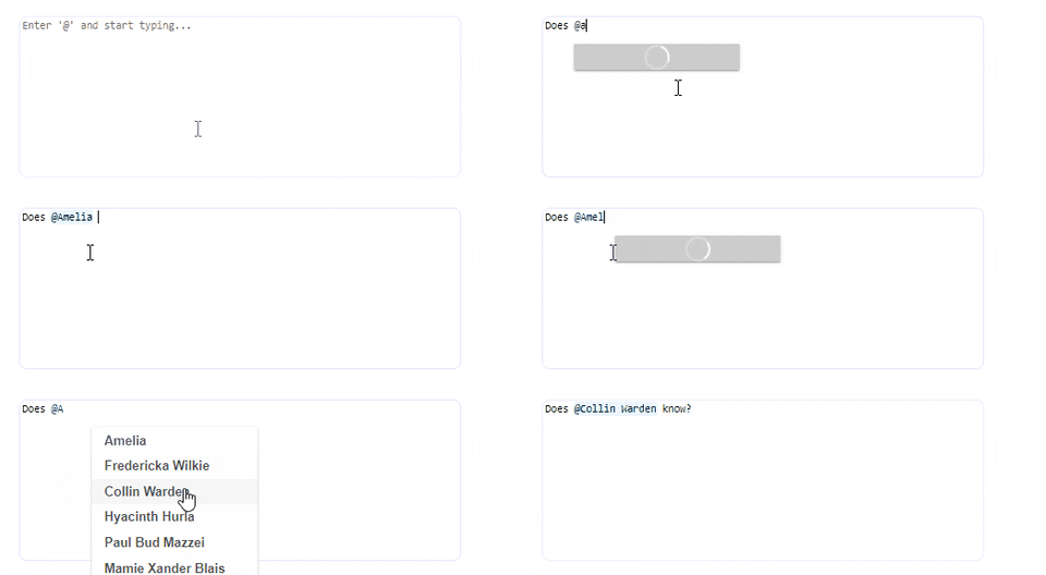
Flexible, lightweight, easy-to-use, without external dependencies - Mentions component for Angular.
Docs and Demo
https://flxng.codeeve.com/#/mentions

Getting Started
Installation:
$ npm i @bboxx/mentionsAfter importing the module the lib is ready to use:
import { MentionsModule } from '@bboxx/mentions';

@NgModule({
  imports: [MentionsModule],
  declarations: [],
})
export class DemoModule {}
Usage
Check also Docs and Demo.
@Inputs
Name | Description | Type | Default
--- | --- | --- | ---
textInputElement | Reference to the text input element. | HTMLTextAreaElement | Required
menuTemplate | Reference to the menu template (used to display the search results). | TemplateRef | Required
getChoiceLabel | A function that formats the selected choice once selected. The result (label) is also used as a choice identifier (e.g. when editing choices). | (choice: any) => string | Required
triggerCharacter | The character which will trigger the search. | string | @
searchRegexp | The regular expression that will match the search text after the trigger character. No match will hide the menu. | RegExp | /^\w*$/
closeMenuOnBlur | Whether to close the menu when the host textInputElement loses focus. | boolean | false
selectedChoices | Pre-set choices for edit text mode, or to select/mark choices from outside the mentions component. | any[] | []
tagCssClass | The CSS class to add to highlighted tags. | string | ''
useCDKOverlay | Boolean to control whether overlay should be displayed using pure CSS or using @angular/cdk Overlay implementation. | boolean | false
@Outputs
Name | Description | Output type
--- | --- | ---
search | Called on user input after entering trigger character. Emits search term to search by. | string
menuShow | Called when the choices menu is shown. | void
menuHide | Called when the choices menu is hidden. | void
choiceSelected | Called when a choice is selected. | ChoiceWithIndices
choiceRemoved | Called when a choice is removed. | ChoiceWithIndices
selectedChoicesChange | Called when a choice is selected, removed, or if any of the choices' indices change. | ChoiceWithIndices[]
tagClick | Called when the area over a tag is clicked. | TagMouseEvent
tagMouseEnter | Called when the area over a tag is moused over. | TagMouseEvent
tagMouseLeave | Called when the area over the tag has the mouse removed from it. | TagMouseEvent
Basic example
<div class="relative-block-container">
  <textarea cols="42"
            rows="6"
            #textareaRef
            placeholder="Enter '@' and start typing..."
            [(ngModel)]="text"></textarea>

  <flx-mentions [textInputElement]="textareaRef"
                [menuTemplate]="menuTemplate"
                [triggerCharacter]="'@'"
                [getChoiceLabel]="getChoiceLabel"
                [searchRegexp]="'^([-&.\\w]+ *){0,3}$'"
                (search)="loadChoices($event)"
                (selectedChoicesChange)="onSelectedChoicesChange($event)"
                (menuShow)="onMenuShow()"
                (menuHide)="onMenuHide()"></flx-mentions>

  <ng-template #menuTemplate
               let-selectChoice="selectChoice">
    <ul class="flx-selectable-list">
      <li *ngFor="let user of choices"
          class="flx-selectable-list-item"
          (click)="selectChoice(user)">
        <span title="{{user.name}}">{{user.name}}</span>
      </li>
    </ul>
  </ng-template>
</div>
More examples here.
Support
All suggestions and improvements are welcome and appreciated.
License
The MIT License.
