@barthachijuu/circularmenu
v1.2.0
Published
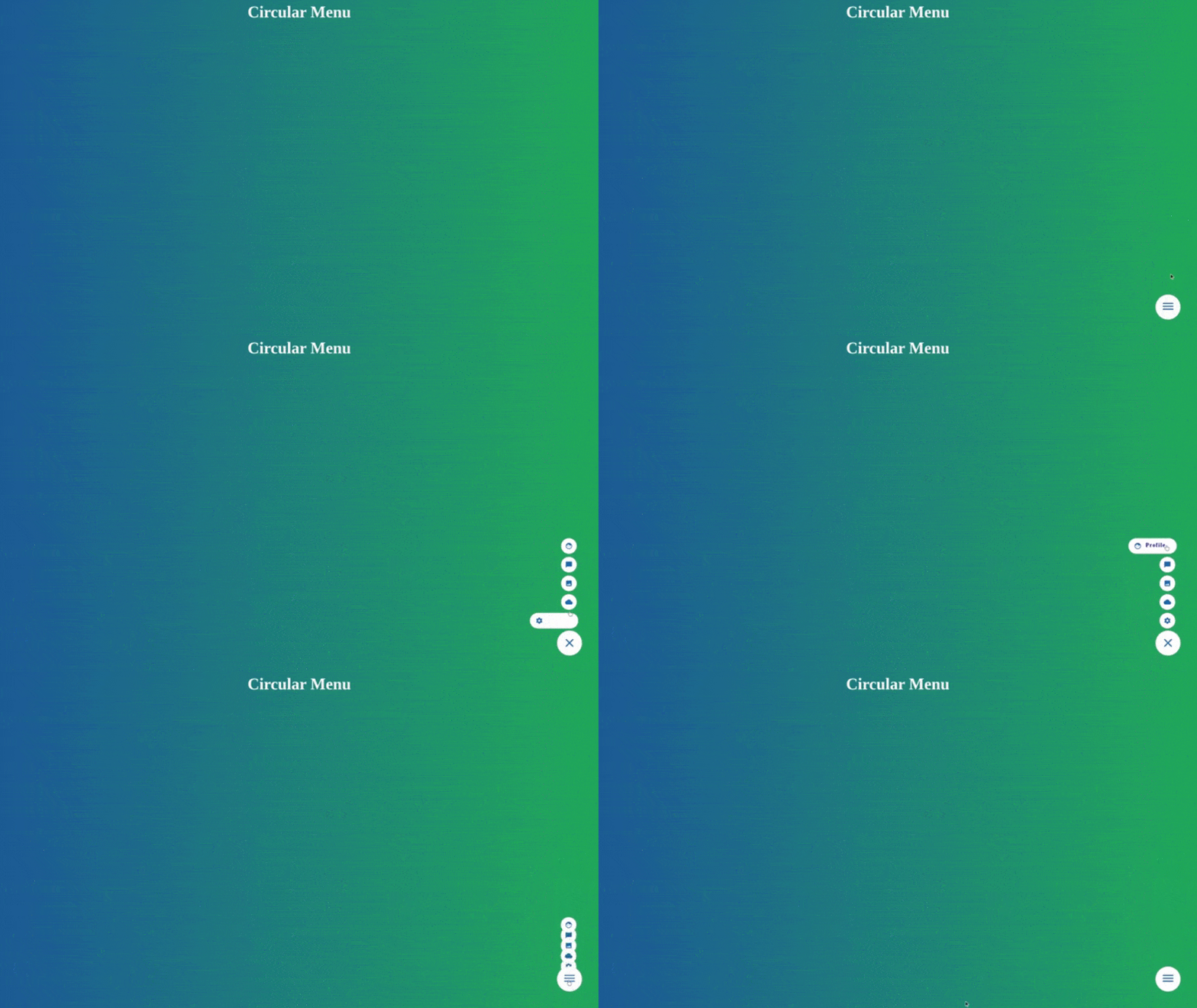
A circular menù animated with css transition
Downloads
8
Maintainers
Readme
circularmenu
Browsers Support
| | | | | | | ------------------------------------------------------------ | ------------------------------------------------------------ | ------------------------------------------------------------ | ------------------------------------------------------------ | ------------------------------------------------------------ | | Edge+ | latest | latest | latest | latest |
🚀 Getting Started
npm install --save-dev @barthachijuu/circularmenuor
yarn add -D @barthachijuu/circularmenu📝 Usage
<div id="your_container"></div> import CircularMenu from '@barthachijuu/circularmenu';
const menu = new CircularMenu('your_container');
menu.init();You can set options to new CirclueMenu('your_container', options); example:
const CircularMenu = require("@barthachijuu/circularmenu");

const options = {
  iconColor: 'blue-7',
  animationIn: 'ease-in',
  animationEntrance: 'bounce',
  animationOut: 'ease-out',
  animationType: 'onTop',
  menuElem: [...],
  ...
};
const menu = new CircularMenu('your_container', options);
  menu.init();
Below is available a description of options values.
🧰 Options
| Parameter | Description | Values | Default value | Available since | | --- | --- | --- | --- | --- | | iconcolor | Set the color of icons | string | blue-7 | v1.0.0 | | iconIn | Set the animtion entance | string [ease/linear/ease-in/ease-out/ease-in-out] | ease-in | v1.0.0 | | iconOut | Set the animation exit | string [ease/linear/ease-in/ease-out/ease-in-out] | ease-out | v1.0.0 | | menuElem | Set the number of elements in the menu | array | [an example list] | v1.0.0 | | animationEntrance | Set the animation entrance of the menu | string [bounce/puff-in/slide-in] | bounce | v1.2.0 | | animationType | Set the animation when over a voice | string [onTop/onside/explode] | onTop | v1.2.0 |
Note: At the moment, the maximun number of elements in menuElem, is limited to 8 If you want more animation type don't esitate to open a pull request
🎨 Palette
Below, the possible color combination to use for the icon. (If you want more, don't esitate to open a pull request)
| Class | Color | Gradation |
| --- | --- | --- |
|icon-gray-{0-7} | Gray | from
#f8f9fa to
#343a40 |
|icon-red-{0-7} | Red | from
#fff5f5 to
#c92a2a |
|icon-pink-{0-7} | Pink | from
#fff0f6 to
#a61e4d |
|icon-grape-{0-7} | Grape | from
#f8f0fc to
#862e9c |
|icon-violet-{0-7} | Violet | from
#f3f0ff to
#5f3dc4 |
|icon-indigo-{0-7} | Indigo | from
#edf2ff to
#364fc7 |
|icon-blue-{0-7} | Blue | from
#e7f5ff to
#1864ab |
|icon-cyan-{0-7} | Cyan | from
#e6fcf5 to
#0b7285 |
|icon-teal-{0-7} | Teal | from
#e6fcf5 to
#087f5b |
|icon-green-{0-7} | Green | from
#ebfbee to
#2b8a3e |
|icon-lime-{0-7} | Lime | from
#f4fce3 to
#5c940d |
|icon-yellow-{0-7} | Yellow | from
#fff9db to
#e67700 |
|icon-orange-{0-7} | Orange | from
#fff9f1 to
#d9480f |
|icon-brown-{0-7} | Brown | from
#f5deb3 to
#a52a2a |

You can view a demo by click here
🎁 Support: Donate
This project is free, open source and I try to provide excellent free support. Why donate? I work on this and other project for several hours in my spare time between my job and my lovely family, and try to keep it up to date and working. THANK YOU!
👑 Sponsors
Support this project by becoming a sponsor. 🙏 Become a sponsor on patreon or become top3 sponsor on ko-fi. Your logo will show up here with a link to your website.
👔 Backers
Thank you to all our backers! 🙏 Become a backer on patreon.
Contributors ✨
Thanks goes to these wonderful people (emoji key):
This project follows the all-contributors specification. Contributions of any kind welcome!
License
This project is licensed under the MIT license, Copyright (©) 2020 Bartolomeo Amico. For more information see LICENSE.md


