
@atomic-framework/design-system
v1.5.8
Published
From Designer params to read-to-use Frontend material
Downloads
163


Readme
Important notice
@atomic-framework/design-system module relies on webfonts-generator.
We recommend to add a npm-force-resolutions to force ttf2woff and ttf2woff2 submodules to updated versions.
"resolutions": {
  "ttf2woff": "3.0.0",
  "ttf2woff2": "4.0.4"
},
"scripts": {
  "preinstall": "npx npm-force-resolutions"
}
Atomic Framework: design-system
From designer params to ready-to-use Frontend material css/scss files based on set of json config files
Industrialize design system building process and automate-it for your development team
Allow you to possibly iterate on the design system until the end of the project
Usage
- 1: Require module
npm install --save-dev @atomic-framework/design-system - 2: Create an
index.jsfile at your project's root and put the following code
const DesignSystem = require('@atomic-framework/design-system').DesignSystem;

(async () => {
  const ds = new DesignSystem(
    './design-system',
    './dist'
  );
  await ds.setup();
  ds.writeFiles();
})();- 3: Create a
./design-systemfolder at your project's root - 4: Fork default colors.json config file and put your own colors (see all defaults)
- 5: run command
node index.js - 6: Open
./dist/design-system.cssand./dist/design-system.scssfile to see the result
Note - Handles the following frontend features:
- Css vars
- Sass Placeholders
- Icons (both to dataUrl and to webfont usage)
- Typefaces following type-scale best practice
Examples
From...
{
  "brand": {
    "primary": {
      "value": "#545afb"
    }
  }
}
...to
:root {--DS-colors-brand-primary: #545afb;}%DS-colors-brand-primary-color {color: var(--DS-colors-brand-primary);}
%DS-colors-brand-primary-background {background-color: var(--DS-colors-brand-primary);}
%DS-colors-brand-primary-border {border-color: var(--DS-colors-brand-primary);}
// ...$DS-colors: (
"brand": (
"primary": (
"value": #545afb",
)
)
)From...
"popins": {
    "name": "Popins",
    "responsive": {
      "mobile": {
        "root": 16,
        "typescale": "Perfect Fourth"
      },
      "tablet": {
        "root": 18,
        "typescale": "Golden Ratio"
      }
    }
  }
}
...to
%DS-typeface-popins-up-6 {
  @extend %DS-typeface-popins;

  @include breakpoint("mobile") {
    font-size: 39px;
    line-height: 1.5;
  }

  @include breakpoint("tablet") {
    font-size: 75px;
    line-height: 1.5;
  }
}
// ...
From...
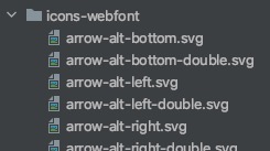
...to
%DS-icons-webfont-arrow-alt-bottom-double {
  @extend %webfont-icons;
  content: "\f101";
  width: 32px;
  height: 32px;
}
%DS-icons-webfont-arrow-alt-bottom {
  @extend %webfont-icons;
  content: "\f102";
  width: 32px;
  height: 32px;
}
%DS-icons-webfont-arrow-alt-left-double {
  @extend %webfont-icons;
  content: "\f103";
  width: 32px;
  height: 32px;
}
// ...
Advanced usages
@todo: Finish advanced usages
@todo
- Finish readme.md
- Write advanced usages in readme
- Add more templates formats for a Styleguide (Expected formats: .twig | .jsx)
- Add Tests
- Unify default icons