@archbee/app-widget
v1.1.33
Published
## Table of Contents
Downloads
581
Readme
Archbee React Component Widget
Table of Contents
Installation
To install, you can use npm or yarn:
$ npm install --save @archbee/app-widget
$ yarn add @archbee/app-widget
If you need to install Archbee Contextual Widget SDK, you can find more details here.
API documentation
The primary documentation for Archbee React component Widget can be found in docs, which describes the API and gives examples of its usage.
Examples
Here is a simple example of Archbee React widget being used in an app with some action variations:
import React from 'react'
import { ArchbeeAppWidget } from '@archbee/app-widget'

function App() {
  return (
    <div>
      <ArchbeeAppWidget
        spaceId={/** published space id **/}
        onWidgetOpen={() => {
          /** ... **/
        }} // callback function called after widget has open
        // onWidgetClose={() => { /** ... **/ }} // callback function called after widget has open
      >
        <button type="button">Open</button>
      </ArchbeeAppWidget>
    </div>
  )
}

ReactDOM.render(<App />, appElement)
Can also be used with ref for a more programmatic approach:
import React from 'react';
import { ArchbeeAppWidget, AbWidgetRef } from '@archbee/app-widget'

function App() {
const widgetRef = useRef<AbWidgetRef>(null);

  return (
    <div>
        <ArchbeeAppWidget
            ref={widgetRef}
            spaceId={ /** published space id **/ }
            onWidgetOpen={() => { /** ... **/ }} // callback function called after widget has open
            onWidgetClose={() => { /** ... **/ }} // callback function called after widget has open
      >
        <button type='button' onClick={() => {
        <!-- Opens widget -->
            widgetRef.current?.open();
        }}>
          Open
        </button>

        <button type='button' onClick={() => {
        <!-- Closes widget -->
            widgetRef.current?.close();
        }}>
          Close
        </button>

        <button type='button' onClick={() => {
        <!-- Gets the instance of the widget if needed for various event manipulations. -->
            widgetRef.current?.instance();
        }}>
          Get widget instance
        </button>
      </ArchbeeAppWidget>
    </div>
  );
}

ReactDOM.render(<App />, appElement);
Component Props
| Property | Type | Required | Description |
| ----------------- | ------------------ | ---------- | ---------------------------------------------------------------------------------------------------------------------------------------------------------------------------------------------------------------------------------------------------------- |
| spaceId | string | required | Pass the desired id to load your docs. |
| docId | string | optional | The doc where you want to open the widget docs. If docId is passed, widgetType is ignored, it will open in docs mode regardless of prop passed. |
| blockId | string | optional | The block where you want to scroll, after a certain document was open. |
| jwt | string | optional | Pass the jwt token in order to see jwt protected docs. |
| shareableToken | string | optional | Pass the shareableToken from your private links to protect your docs. |
| className | string | optional | Pass CSS classes to the div wrapper |
| widgetType | docs \| search | optional | Default value is docs. This opens the widget with the desired behaviour. docs`` type will open the widget with the default behaviour, searchwill open a search widget bar that shows a search bar with AI support (if included in your subscription) |
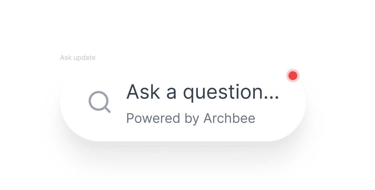
|bubble |ask | invisible|optional| Default value isinvisible. This prop will display an ask bubble in the bottom-right of your screen. Whenever someone clicks on it, the search widget will open. |
| loadingStrategy|eager | lazy |optional| Default value islazy. While lazyloading delays the initialization of a resource,eagerloading initializes or loads the widget as soon as the code is executed. |
|anchor |string |optional| You can provide yourclass, idorpathto a DOM element where you would like the widget to anchor and instantiate. The container provided should haveposition: relativeas the widget will be displayed based on the first relative parent found. |
|onWidgetOpen |void |optional| Callback that is called after widget opens. |
|onWidgetClose |void |optional| Callback that is called after widget closes. |
|hideNavbar |boolean |optional| Default value isfalse`. It hides the header navbar from the modal. |
Bubble
Use bubble prop whenever you want an easy search button to browse your entire documentation.

Ref Methods
If ref is not passed to ArchbeeAppWidget, the children will automatically open the modal popup upon click.
| Property | Type | Description |
| ---------- | -------- | ----------------------------------- |
| open | method | Opens widget programatically. |
| close | method | Closes widget programatically. |
| instance | method | Returns the instance of the widget. |
Demos
Down below is a demo setup in CodeSandbox, which demonstrate various features of archbee-app:
