@akshays/react-json-view
v1.0.1
Published
Interactive react component for displaying javascript arrays and JSON objects.
Downloads
19
Maintainers
Readme
![]()
react-json-view
RJV is a React component for displaying and editing javascript arrays and JSON objects.
This component provides a responsive interface for displaying arrays or JSON in a web browser. NPM offers a distribution of the source that's transpiled to ES5; so you can include this component with any web-based javascript application.
Check out the Interactive Demo
Implementation Example
// import the react-json-view component
import ReactJson from 'react-json-view'

// use the component in your app!
<ReactJson src={my_json_object} />
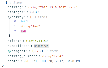
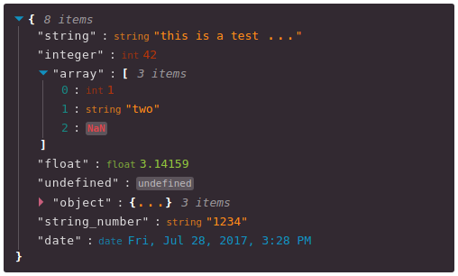
Output Examples
Default Theme

Hopscotch Theme, with Triangle Icons:

Installation Instructions
Install this component with NPM.
npm install --save react-json-viewOr add to your package.json config file:
"dependencies": {
    "react-json-view": "latest"
}
Props
Name|Type|Default|Description
|:---|:---|:---|:---
src|JSON Object|None|This property contains your input JSON
name|string or false|"root"|Contains the name of your root node. Use null or false for no name.
theme|string|"rjv-default"|RJV supports base-16 themes. Check out the list of supported themes in the demo. A custom "rjv-default" theme applies by default.
style|object|{}|Style attributes for react-json-view container. Explicit style attributes will override attributes provided by a theme.
iconStyle|string|"circle"| Style of expand/collapse icons. Accepted values are "circle", triangle" or "square".
indentWidth|integer|4|Set the indent-width for nested objects
collapsed|boolean or integer|false|When set to true, all nodes will be collapsed by default. Use an integer value to collapse at a particular depth.
collapseStringsAfterLength|integer|false|When an integer value is assigned, strings will be cut off at that length. Collapsed strings are followed by an ellipsis. String content can be expanded and collapsed by clicking on the string value.
shouldCollapse|(field)=>{}|false|Callback function to provide control over what objects and arrays should be collapsed by default. An object is passed to the callback containing name, src, type ("array" or "object") and namespace.
groupArraysAfterLength|integer|100|When an integer value is assigned, arrays will be displayed in groups by count of the value. Groups are displayed with bracket notation and can be expanded and collapsed by clicking on the brackets.
enableClipboard|boolean or (copy)=>{}|true|When prop is not false, the user can copy objects and arrays to clipboard by clicking on the clipboard icon. Copy callbacks are supported.
displayObjectSize|boolean|true|When set to true, objects and arrays are labeled with size
displayDataTypes|boolean|true|When set to true, data type labels prefix values
onEdit|(edit)=>{}|false|When a callback function is passed in, edit functionality is enabled. The callback is invoked before edits are completed. Returning false from onEdit will prevent the change from being made. see: onEdit docs
onAdd|(add)=>{}|false|When a callback function is passed in, add functionality is enabled. The callback is invoked before additions are completed. Returning false from onAdd will prevent the change from being made. see: onAdd docs
defaultValue|string \|number \|boolean \|array \|object|null|Sets the default value to be used when adding an item to json
onDelete|(delete)=>{}|false|When a callback function is passed in, delete functionality is enabled. The callback is invoked before deletions are completed. Returning false from onDelete will prevent the change from being made. see: onDelete docs
onSelect|(select)=>{}|false|When a function is passed in, clicking a value triggers the onSelect method to be called.
sortKeys|boolean|false|set to true to sort object keys
quotesOnKeys|boolean|true|set to false to remove quotes from keys (eg. "name": vs. name:)
validationMessage|string|"Validation Error"|Custom message for validation failures to onEdit, onAdd, or onDelete callbacks
displayArrayKey|boolean|true|When set to true, the index of the elements prefix values
Features
onEdit,onAddandonDeleteprops allow users to edit thesrcvariable- Object, array, string and function values can be collapsed and expanded
- Object and array nodes display length
- Object and array nodes support a "Copy to Clipboard" feature
- String values can be truncated after a specified length
- Arrays can be subgrouped after a specified length
- Base-16 Theme Support
- When
onEditis enabled:Ctrl/Cmd+ClickEdit ModeCtrl/Cmd+EnterSubmit
Customizing Style
Stock Themes
RJV now supports base-16 themes!
You can specify a theme name or object when you instantiate your rjv component.
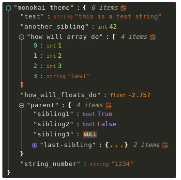
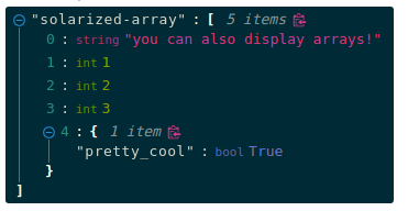
<ReactJson src={my_important_json} theme="monokai" />Check out the list of supported themes in the component demo.
Monokai theme example

Solarized theme example

Use Your Own Theme
You can supply your own base-16 theme object.
To better understand custom themes, take a look at my example implementation and the base-16 theme styling guidelines.
onEdit, onAdd and onDelete Interaction
Pass callback methods to onEdit, onAdd and onDelete props. Your method will be invoked when a user attempts to update your src object.
The following object will be passed to your method:
{
    updated_src: src, //new src value
    name: name, //new var name
    namespace: namespace, //list, namespace indicating var location
    new_value: new_value, //new variable value
    existing_value: existing_value, //existing variable value
}
Returning false from a callback method will prevent the src from being affected.
Contributing to the source code
Run the Dev Server
# clone this repository
git clone [email protected]:mac-s-g/react-json-view.git && cd react-json-view
# install dependencies
npm install --save-dev
# run the dev server with hot reloading
npm run dev
Webpack Dev Server should automatically open up http://localhost:2000 in your web browser. If it does not, open a browser and navigate to port 2000. The hot reloader will automatically reload when files are modified in the /src/ directory.
Run the Production Build
# run the build (note: you may need to use `sudo` priveledges to run the build successfully)
npm run build
Please add tests for your code before posting a pull request.
You can run the test suite with npm run test or npm run test:watch to automatically reload when files are modified.
Docker Tools
I recommend using docker for development because it enforces environmental consistency.
For information about contributing with Docker, see the README in ./docker.
Inspiration
I drew a ton of design ideas from react-json-tree. Thanks to the RJT contributors for putting together an awesome component!
I'm also inspired by users who come up with interesting feature requests. Reach out to me with ideas for this project or other projects you want to collaborate on. My email address is listed on my github user page.


