
@ajuvercr/inquirer-autocomplete-standalone
v0.8.1
Published
Standalone autocomplete cli prompt based on inquirer core
Downloads
7
Maintainers
 ajuvercr
Readme
inquirer-autocomplete-standalone
Standalone autocomplete prompt for the CLI based on inquirer core.
Allows you do do show dynamic choices in a list based on user input, both synchronous or asynchronous allowing you to connect to an external service.
Installation
npm install inquirer-autocomplete-standaloneThis is a native ES module package. If you are using it with commonjs you need to import it like this:
async function main() {
  const { default: autocomplete, Separator } = await import(
    'inquirer-autocomplete-standalone'
  );
  const answer = await autocomplete({});
}

main();
If you are using it with typescript see here for examples of how to use it if emitting commonjs or esm from your typescript.
If you want the legacy version used with inquirer version 9 and below then that is located here and can be installed with:
npm install inquirer-autocomplete-promptThat version will still be maintained for bugs and other issues, but is not the recommended way to use this prompt. This is following the change that Inquirer itself chose. Now the preferred way is to have standalone prompts that you can pick and choose from.
Demo
Run a quick demo locally with
npx inquirer-autocomplete-demoUsage
import autocomplete from 'inquirer-autocomplete-standalone';
import { searchCountries } = './some-external-api';

const answer = await autocomplete({
  message: 'Travel from what country?',
  source: async (input) => {
    const filteredCountries = await searchCountries(input)
    return filteredCountries.map(country => {
      return {
        value: country,
        description: `${country} is a great place to visit`
      }
    })
  }
})

// user searches and selects a country from the returned list
console.log(answer) // Norway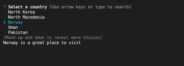
Options
The generic type Value is whatever type the value of your choices are.
| Property | Type | Required | Description |
| ----------- | --------------------------------------------------------------------------------------- | -------- | ------------------------------------------------------------------------------------------------------------------------------------------------------------------------------------------------------------------------------------------------------------------------------------------------------------------------------------ |
| message | string | yes | The question to ask |
| source | (input?: string) => Promise<Choice<Value> \| Separator> \| Choice<Value> \| Separator | yes | A function that will be called first once with undefined at the start. Then later with whatever value the user has typed. See table below for full description of the Choice<Value> type. Can also return choices synchronous. |
| transformer | (string, { isFinal: boolean }) => string | no | Transform/Format the raw value entered by the user. Once the prompt is completed, isFinal will be true. This function is purely visual, modify the answer in your code if needed. |
| validate | (value: Value) => boolean \| string \| Promise<string \| boolean> | no | On submit, validate the filtered answered content. When returning a string, it'll be used as the error message displayed to the user. Note: returning a rejected promise, we'll assume a code error happened and crash. |
| default | string | no | If suggestOnly is true: will select that value if pressing enter and no input. If false: will select the choice with this value in the list when source resolves. |
| emptyText | string | no | The text shown if the source function returns no results. Default: No results... |
| pageSize | number | no | By default, lists of choice longer than 7 will be paginated. Use this option to control how many choices will appear on the screen at once. |
| searchText | string | no | The text shown when the promise is pending. Default: Searching... |
| suggestOnly | boolean | no | Default false. If false you must select one of the supplied choices in the list. You select by pressing enter. If true, pressing enter will select any text currently entered, regardless if of what is selected in the list. To choose one of the choices in the list, press tab to make your input the value of that choice. |
Choice type and description
type Choice<Value> = {
  value: Value;
  name?: string;
  description?: string;
  disabled?: boolean | string;
};
| Property | Type | Required | Description |
| ----------- | ------------------- | -------- | ---------------------------------------------------------------------------------------------------------------------------------------------------------------- |
| value | any | yes | The value that will be returned from the prompt when the question has been answered. Should be string if name is absent. If not it is stringified for display. |
| name | string | no | The text to display for the choice. |
| description | string | no | Any extra description to show below the list when that choice is selected. |
| disabled | boolean \| string | no | Set to false to disable the choice for selection and to a string to disable it but with a custom text. |
Separator
You can also render any Separator to group choices.
import autocomplete, { Separator } from 'inquirer-autocomplete-standalone';

const answer = await autocomplete({
  message: 'Travel from what country?',
  source: async (input) => {
    return [
      new Separator('Africa'),
      new Separator(),
      {
        value: 'Egypt',
      },
      new Separator('Europe'),
      new Separator(),
      {
        value: 'Norway',
      },
    ];
  },
});
? Travel from what country? (Use arrow keys or type to search)
Africa
──────────────
❯ Egypt
Europe
──────────────
NorwayCredits
License
ISC