@acctglobal/shareproduct
v0.2.2
Published
<!-- ABOUT THE PROJECT -->
Downloads
186


Keywords
Readme
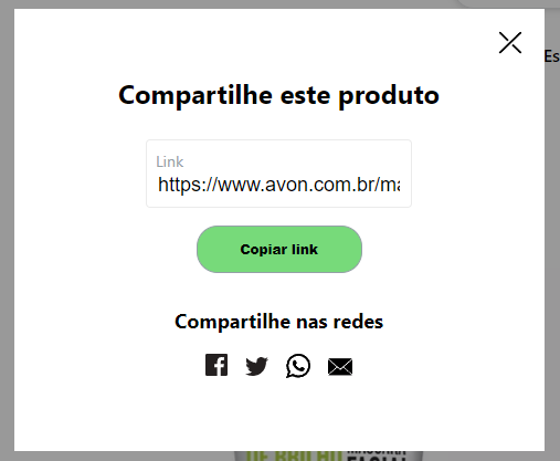
Share Product
About The Component
This component aims to generate product sharing links in an agnostic way..
Getting Started
This component can be used anywhere you want in ecommerce, in a responsive and agnostic way.

- Mobile
- Desk
Installation
To use Share Product install the package via yarn or npm and import it wherever you want to use it.
- Install package
yarn add @acctglobal/shareproduct or npm installUsage
- Import component
import ShareProduct from '@acctglobal/shareproduct';- Just call the component and pass with a children to customize label.
<ShareProduct
  shareWebSocials="Compartilhar"
  shareProductText="ShareText"
  ShareIcon={ShareIcon}
  CloseIcon={CloseIcon}
  productURL={'LinkUrl'}
  shareLinks={shareLinks}
/>
Styling
There are one way to customize the component
By data styles
[data-open-modal-button] {
  display: flex;
  align-items: center;
  cursor: pointer;
  font-size: 14px;
  text-decoration: none;
  color: #000;
}
| Data for styles |
| :------------------------------------ |
| [data-open-modal-container] |
| [data-open-modal-button] |
| [data-open-modal-icon] |
| [data-open-modal-text] |
| [data-modal-background] |
| [data-modal-container] |
| [data-close-modal-button] |
| [data-close-modal-icon] |
| [data-modal-share-product-text] |
| [data-modal-product-link-container] |
| [data-modal-product-text] |
| [data-modal-product-link-input] |
| [data-modal-copy-link-button] |
| [data-modal-share-links-container] |
| [data-modal-links-social] |
| [data-modal-share-link] |
| [data-modal-share-link-icon] |
| [data-additional-overlay] |
Props
| Parameter | Type | Description |
| :------------------ | :------------------ | :-------------------------------------------------------------------------------------------------------------------------------------------------------------------------------- |
| productURL | string | Mandatory. onClick function to the button |
| share | string | Optional. string optional change share text |
| shareProductText | string | Optional. string optional change shareProductText |
| productLinkText | string | Optional. string optional change productLinkText |
| shareWebSocials | string | Optional. string optional change shareWebSocials text |
| ShareIcon | () => JSX.Element | Optional. function return JSX.Element ShareIcon, has default ShareIcon if not specified you icon |
| CloseIcon | () => JSX.Element | Optional. function return JSX.Element CloseIcon, has default CloseIcon if not specified you icon |
| shareLinks | Array | Mandatory. Array contain object with 4 elements [{ target: string, name: string, url: string, SocialIcon: () => JSX.Element }] |
| target | string | Optional. target link to share as default has '_blank' |
| name | string | Mandatory. id link name |
| url | string | Mandatory. url to share link to social network |
| SocialIcon | () => JSX.Element | Mandatory. Desired social network icon |
| AdditionalOverlay | boolean | Optional. Adds an additional overlay for customization. Created to show the overlay behind the share modal and making it possible to close it when clicking outside the modal |
Contributing
If you have a suggestion that would make this better, please fork the repo and create a pull request. You can also simply open an issue with the tag "enhancement". Don't forget to give the project a star! Thanks again!
- Fork the Project
- Create your Feature Branch (
git checkout -b feature/AmazingFeature) - Commit your Changes (
git commit -m 'Add some AmazingFeature') - Push to the Branch (
git push origin feature/AmazingFeature) - Open a Pull Request
- And don't forget to update the changelog
Contact
Tiago Albuquerque - [email protected]
Acknowledgments
Use this space to list resources you find helpful and would like to give credit to. I've included a few of my favorites to kick things off!